It’s been awhile December 2013 since the market imagination has consorted with a major crash analog.
But now – what with all the horrific Pompeii trailers (alternately titled “Spartacus, Dark Lord of the Arena, Forges a Great Ring in the All-Consuming Fires of Mt. Vesuvius”) circulating – the fascination has been rekindled with Tom DeMark’s Scary Parallel, a historical market analogy that implies 2014 may very well go the way of the 1929 crash.
 Time to cash in your chips, bar the door, and make permaskeptical amends with the Delphic Oracle of Zero Hedge?
Superficially powerful, the problems surrounding this chart are several and even more catastrophic than its message for the plausibility of its implications. Here are a few:
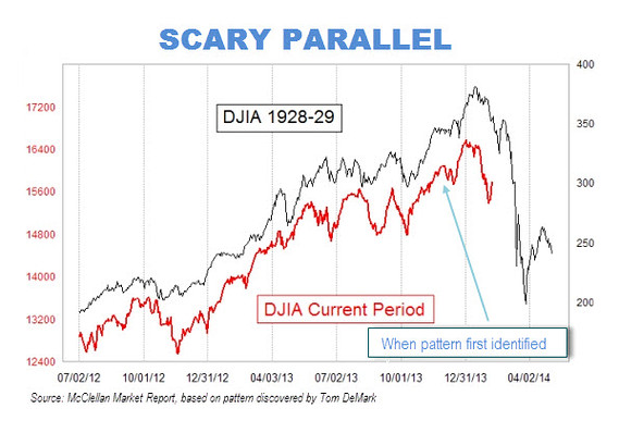
False equivalency: At face value, the chart above makes a startling analogy – the “scary parallel”. But there’s some rudimentary technical sleight-of-hand at work here that makes the chart’s historic comparison disingenuous, at best: namely, 2 independent Y-axes are at work. On the left (red) is the current period Y-axis: from bottom to top, taking in a range comprising +45%. On the right is the 1928-1929 period Y-axis, taking in a range comprising +300%.
In and of itself, this isn’t objectionable; but whether unwittingly or intentionally, the analog has been optimized through adjustment of its axes to create a false equivalency of scale. The asymmetry between “red” and “black” prices is such that any given price change in the first is almost 7 times smaller than an equivalent change in the second.
As Ryan Detrick notes, the current period doesn’t begin to measure up to the sheer relief of 1929’s blow off. Here are the two periods measured in terms of relative performance (sidebar: no longer even vaguely parallel):
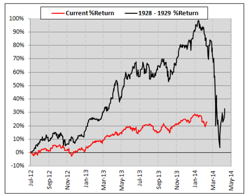
Now look back at the first chart: the percentage drop from 12/31/13’s all-time closing high at 16577 to today’s 13300 equivalent of the 1929 crash nadir is -19.77%. That figure is all anyone really cares about, and the only relevant basis of comparison with today’s Dow 40-50 times greater on raw index points alone. In fact, the depth and duration of the spooky parallel seems familiar: to 2011.
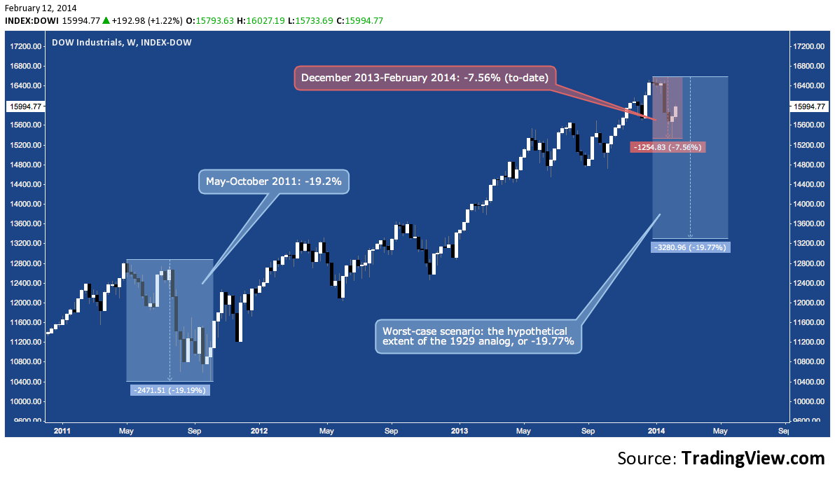 Set amidst the throes of the Eurozone’s debt crisis and the US debt ceiling debacle, May-October 2011 was more than a bumpy ride; but it wasn’t 1929’s -89% death spiral. 4 months after it’s October 2011 lows, the Dow had fully recovered.
Conclusion? Even if this analogy proves flawlessly predictive in time and price, the most dire outcome is a ~20% correction from the Dow’s all-time high by April. In terms of scale, that’s the current pullback, top-to-bottom, plus 1.6 more just like it stacked together. No picnic; but in an ironic twist, it’s comforting to hear from Tom DeMark that his 1929 Armageddon scenario doesn’t even break down to a legitimate bear market.
That’s enough to settle the question of the chart’s implications. A second problem: it’s representative of the “problem of market analogs”, in general.
Correlation, Causation and Combinatorial Explosion: So the analog isn’t a “scary parallel” in spite of the notoriety and apparent legitimacy it garners from the two Toms (McClellan and DeMark).
“But it is uncanny,” you might say: “even with 2012-2014 justly flattened out, the positive correlation between the two periods is a striking one.” And I’d agree: for whatever it’s worth (nothing?), that is the utility of optimizing the Y-axes in the first chart. How close the correlation runs throughout the time series is what makes the alleged predictive implications of the parallel so compelling. Look at a perfectly proportioned human face or the facade of Parthenon: this isn’t the first time symmetry has had a beguiling effect.
To which I say, “so what?” The running correlation isn’t entirely by accident. Though 85 years apart, the same human propensity toward “animal spirits” that ultimately drove the speculative, leverage-ridden blow off then is at work now, to some degree. But, the causal antecedents – i.e. the mix of people, progression of events and persistence of trends – that set up the market event we call “The Crash of 1929” are not the causal antecedents leading up to whatever 2014 holds in store. There are themes and trends these periods hold in common, some of which are plausibly unsettling.
But let’s not kid ourselves: there’s a great combinatorial explosion of variables – that unique mix of “stuff” that comes together just so – violently expanding in every moment in financial markets. This is where “animal spirits” doesn’t quite cut it on the explanatory work and “85 years apart” becomes a yawning gap. For this correlation to hold any predictive value – other than marketing and demagoguery – it has to denote something approaching a causal identity between two periods: something self-evidently untrue.
The closer we are to supposing there’s an identity between these two (or any two) passages in market history, the more we’ve delusively generalized from the market crash mythos (i.e. what “1929” is versus what 1929 was) in a search for similarity that necessarily purges difference.
In general, market analogs are the worst kind of historical revisionism: price has a memory, but not variable homogeneity.
The last problem I’ll mention views the chart as the symptom a broader condition:
Market Disaster Tourism
All throughout last year, an abiding infatuation unfolded with comparing the environment for stocks in 2013 to 1999. In the Fall, October 1987 analogs became the fashion. Throughout the year, more erudite market observers and historians produced less common analogs, including the early to mid-1960s, early-to-mid-1970s and the early 1980s. Just like the “scary parallel“, these all enjoyed their 15-minutes (maybe 15 seconds in those more obscure cases). Permabears received vital (if ill-fated) reinforcement, iconoclastic market observers dispatched their apparent silliness with glee; and the faceless crowd observed these passing skirmishes with wary interest from the gallery high above the arena of competing market memes. Through it all, countless opportunistic page views were tallied as each crash narrative came and went without incident.
Maybe it’s just the current route along which speculation is climbing the wall of worry, but even nominally off all-time highs the market seems sordidly obsessed with panic and crashes. Elsewhere recently I looked at why this might be the case (also here):
We are acculturated by our crisis-engendered negativity bias to weight our present set of market variables against the still-heavy shadows of 2000 and 2008 – always anxiously comparing, and often looking for and finding points of commonality. With those outlier events as a baseline that is nearly impossible to put aside or extricate ourselves from, confirmation bias constantly kicks in to sort, sift and filter for the miasmic mix of data and developments that will signal the next crisis.
At least part of our preoccupation has to do with maintaining an instinctively heightened awareness of our surroundings so we can better confront the next “crashy” environment when we see it foreshadowed. The will to survive has a long and vivid memory; and there are few more universally accepted ways to keep one’s claws sharp for the battle with volatility and drawdowns that will come than to embark on historic market disaster tourism.
Counterintuitively, this seems like a tragic distraction for those on the lookout for the next major downturn. In the context of bubbles (the customary precursor to crashes), I further noted:
Bearishly seek out signs of or taking bullish encouragement from the absence of conditions adhering to the standard bubble archetype inhabiting the market mythos could prove a tragic distraction when the next major correction or bear market shows up with other characteristics.
The scary parallel is easily debunked. It’s trick is naive or that of the charlatan (surprising, coming from a veteran technician as it purportedly does); or it may be analytical chicanery designed to induce shock, spark debate and invite notoriety.
Whatever the case, it’s reception is more telling, indicative as it is of a market groping for narrative cohesion, even – or especially – of the pessimistic kind to make sense of the stubbornly uncertain. Facile though it is, it captures the derision of some because of its innate bombast; and the genuine interest of others because it provides investors and traders with the salve of a plausible future – a nice dream that rationally frames the unknowable.
Legitimate concerns will appear (if they haven’t already) suggesting the next major correction is around the corner, but they won’t be found abroad in an arbitrary – if bewitchingly dire – correlation of the present to early events from a fading century comprised of a different set of market conditions, regulations, fail safes and technologies.
When risk is staring in just outside your window, the last thing you’ll want is to be gazing far away into the other country of the past, seeking direction from grand signs through a fallaciously-lensed telescope.
Twitter: @andrewunknown and @seeitmarket
Author holds no exposure to instruments mentioned at the time of publication. Commentary provided is for educational purposes only and in no way constitutes trading or investment advice.
“Mt. Doom” image copyright New Line Cinema.
Any opinions expressed herein are solely those of the author, and do not in any way represent the views or opinions of any other person or entity.


