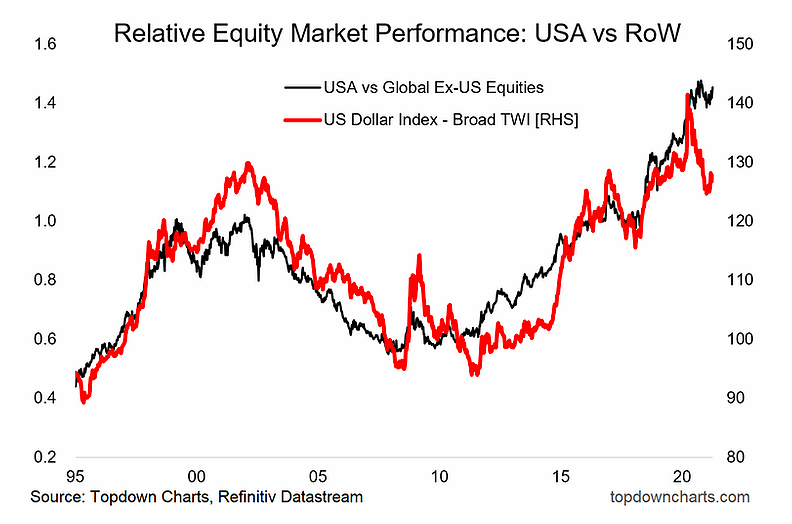
6. US vs the Rest of the World: As alluded to in the first chart, there had been some fairly decent moves e.g. the swift downward move in the US dollar which saw nearly every analyst & their dog turning bearish. Even global vs US equities relative performance had begun to turn the corner… but we’re seeing a bit of giveback on both fronts. I say stay the course on both: the case remains compelling, especially for global vs US equities.
“All the key pieces of the puzzle seem to be falling into place for the rest of the world to start outperforming vs US equities. Along with that, I expect ongoing weakness in the US dollar.”
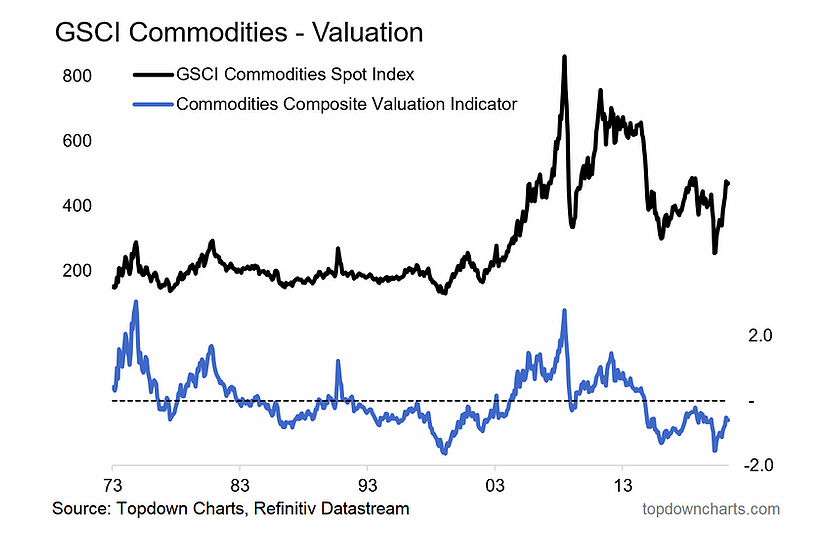
7. Commodities: The case for commodities remains very compelling medium/long-term for a decent list of reasons (I have charts, just ask me)… BUT: short-term sentiment & positioning have become very stretched (and actually starting to rollover), meanwhile …although the pandemic looks to be turning the corner, it is still here, and there are still downside risks. Furthermore, there is clearly a backlog/supply chain disruption premium in commodities – if that gets resolved quickly then that premium comes back out and prices go down short-term. Remain bullish medium/long-term but mindful of the short-term risk outlook.
“Given cheap valuations, a prolonged period of weak capex (i.e. futures supply tailwinds to price), pandemic disruption, an expected weaker USD, and economic recovery (with potential overshoot), remain decidedly bullish here.”
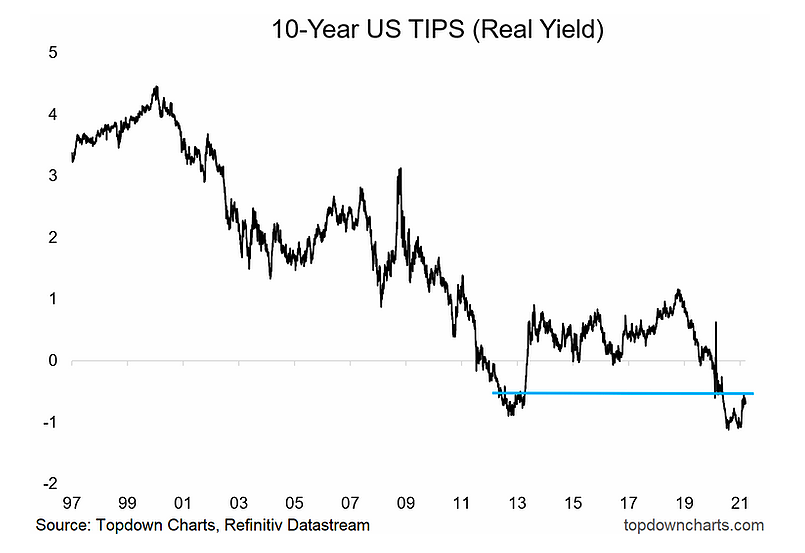
8. Real Yields: Adroit observers will notice that I re-drew the line here… previously I had it lower down as support, but now I think this overhead resistance area is the more important thing to pay attention to. I still see the risks clearly skewed to the upside for real yields given the evolving macro-thematic picture, but that line is meaningful: it’s a clear and logical resistance level that will need to be cleared before any real upside in real yields is on the table. And as noted, with various risk bogeymen still lurking, that glass ceiling could prove tough to break in the short-term.
“In my view the two key drivers of US real yields are risk sentiment and growth expectations. Naturally on both fronts it was entirely rational to see real yields plunge this year. Going forward I expect improved risk sentiment and a rebound in growth expectations; therefore I expect higher real yields (and nominal yields).”
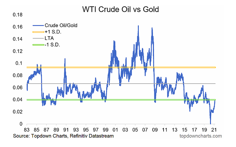
9. Crude Oil vs Gold: One of my fav charts of last year – was such a non-consensus call at the time, perhaps less so now as the market has come round and realized how big the relative price has moved. Strictly speaking it’s still “cheap” vs long-term average. Stay the course… but that has been one BIG move already.
“The logical next question should then be “what about gold?”. All else equal, a prospective environment of higher real yields would present a headwind to the consensus and crowded long gold trade. Aside from that, I believe a prospective passing of the torch from monetary to fiscal in the US is strong possibility (incoming Treasury Sec. Yellen has a deep appreciation for the limits of monetary policy and the need for fiscal policy to do more of the heavy lifting). This along with post-vaccine normalization should disproportionately benefit oil at the expense of gold, so I suspect we see some mean reversion in this chart.”
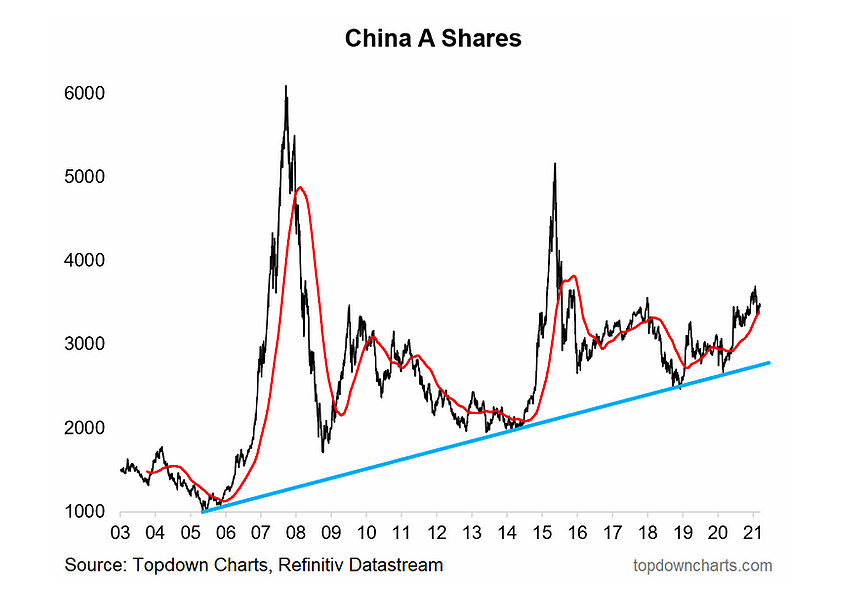
10. China: Despite a circa -10% correction, China A-shares remain above their 200dma and bigger picture; above their long-term uptrend line. To update the view, sentiment on Chinese assets remains broadly negative in the US as anti-China politics linger heavy despite the change in President (seems to have become a relatively bi-partisan issue at this point). Aside from that though, the earnings/macro pulse has turned up materially, and although the overall policy picture is a bit more muted this time around – it is still a tailwind at this point. Yet valuations are not exactly cheap, indeed, I see better value in EM ex-Asia (as you might have picked-up in the first chart).
“Last but not least is China. While I continue to watch a wide range of indicators, one in particular focus will be China A-shares, particularly as they brush up against a key overhead resistance level, and as policy makers in China possibly move toward actually tightening monetary policy in 2021. Indeed, in many respects, I suspect it will be more of China zigging, while the rest of the world is zagging. In any case, I remain convinced that it is still one of the most important economies and markets to watch in understanding the global macro/market picture.”
Summary and Key Takeaways:
– Monetary policy remains of critical importance, but expect less monetary and more fiscal stimulus going forward.
– Anticipate follow-through on the global economic recovery as stimulus, green shoots, and clearing of backlogs coalesce.
– Clear upside risk to inflation near-term given backlogs, base effects, and commodities
– Expect the risk-on/reflation/recovery macro environment helps some of the previously unfavored asset classes, and drives rotation within and across markets.
– Anticipate a more nuanced approach to global equity allocations will be more appropriate than just market cap weights: fade passive.
– Likely further upside for commodities, higher bond yields, and weaker USD.
– Still plenty of interesting opportunities (and risk) out there!
Twitter: @Callum_Thomas
Any opinions expressed herein are solely those of the author, and do not in any way represent the views or opinions of any other person or entity.


: Showing Some Signs of Emerging Strength")
