Following last week’s Final Q1 2014 GDP Print at a staggering – but by many accounts, transitory – -2.96%, the gentlemen at J. Lyons Fund Management (JLFMI) took up the task of checking the number against the 25 Worst Quarterly U.S. GDP Prints In History.
A couple interesting datapoints emerged:
- Q1 2014’s GDP was the 17th worst (in 2009 dollars) since quarterly records began in 1947.
- Q1 2014’s GDP is the only print among the Top 25 that occurred outside (so far: this depends on whether Q2 is also negative, according to the official NBER rule) the context of a recession.

Among other things, Q1’s GDP cliff drop has been pinned on a poisonous witches brew of blizzard-like conditions, inventory depletion, an ebb in private fixed investment, and accounting shenanigans related to ACA/Obamacare, among other reasons. Whatever the case, it’s a massive outlier. As GDP history goes, where there’s smoke in the form of one negative quarter there’s often fire in the form of recession.
But, as the fashionable quote of the day goes, “the stock market is not the economy”. To illustrate that point (I’d echo Josh Brown here, btw: this kind of exchange is the financial twittersphere at it’s best), @marginalidea posted the following modified J. Lyons chart, illustrating simply and persuasively that the negative GDP prints associated with recession over the past 70 years do not signal poor performance for the S&P 500 (SPX) over the next 12 months. Much to the contrary:
@ReformedBroker @JLyonsFundMgmt what happens next is that the S&P500 is up 79% of the time in the year after pic.twitter.com/fVQ36vmDoI
— marginal idea (@marginalidea) June 29, 2014
Maybe the stock market isn’t the economy after all. Or maybe GDP is a backward-looking indicator of negligible value that is too often pressed into the service of casting a pall of gloom over what history suggests will be a great period for stocks.
But that backward look gives us a unique insight that makes the above table of returns much less compelling.
I chose to look at the trailing 12-month (or trailing 4-quarter) returns on the Dow Jones Industrial Average (chosen for comparative ease of access to rolling performance data) for each one of these quarters. Here’s what the study turned up:
- DJIA’s trailing annual return prior to each of these quarters was negative 20-of-25, or 80% of the time.
- The average trailing annual return excluding 2014 is -7.74%. Including it, -6.37%.
This is remarkable, because:
- Q1 2014’s trailing annual return (i.e. 2013) was +26.5% – that’s a spread of +34.4% from the historic norm for all 25 quarters.
Sound’s a little crazy, but 2013 was way out on the bell curve in more ways than one.
- Only one of the four other periods with a positive trailing return surpassed +7%: Q2 1981 at +27.97%. That’s even higher than Q1 2014.
Just one problem there:
- Q2 1981’s (during a cheery period where the U-3 unemployment rate exceeded 10% for 10 months in a row) return over the next 12 months (beginning July 1981): -16.09%. In fact, all of Q2 1980-Q1 1981’s gains were reversed in a -22.67% decline by June 1982.
If you want precedent for this quarter, Q2 1981 is really the best (only) one we’ve got; and for whatever it’s worth, it says last year’s outstanding returns and Q1’s GDP abomination could mean a pretty awful period from April 2014-March 2015. Even then, the 45 months (i.e. back to the 2009 low) prior to the current 12 month, +26.5% window saw the Dow advance 85%. By comparison, in the 45 months prior to 1980-1981’s +27.97% window, DJIA lost almost 22%. In other words, the 1976-1982 period the only other historically-simlar pop occurred in saw some huge swings but ended mostly unchanged.
But that’s a single datapoint, easily disregarded. So how about this:
- Of the 4 recessionary GDP prints that had a positive trailing annual return (Q4 1949, Q2 1980, Q2 1981, Q1 2008), only 2 of 4 had a positive return over the next 12 months.
- The average return for those quarters over the next 12 months: -7.04%
Here’s the table this is pulled from (post continues below):
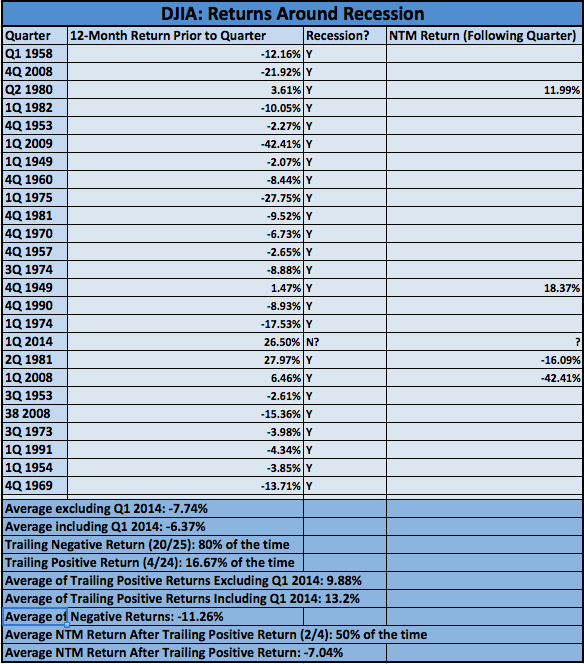
Prior to a recession, it is common for the market to sell off aggressively. This is resonant with the widely-held notion the stock market is a forward-looking discount mechanism. If the market does its job well, returns ought to be negative prior to recession – and they usually are as the table shows (even while reflexivity suggests the market isn’t just discounting, but co-creating the emergent conditions that cause the market to decline and recession to eventually unfold).
But 2013 (2014’s trailing annual period) didn’t sell off – instead, it was the best year for US stocks since 1997. Does that mean the market wasn’t discounting a recession? I’d say, “yes”. Does that guarantee a recession isn’t going to occur? No: the data above shows there were 3 recessions (i.e., 1949, 1980-1982, 2008-2009) preceded by at least 12 months of positive returns.
Nonetheless, will returns over the next 12 months be positive as they have been almost 80% of the time as @marginalidea pointed out? The 4 historic occurrences with a combination of a negative GDP print and a positive trailing 12-month return – just like Q1 2014 – say it’s a coin toss, with a weighted average of -7.04%. Meanwhile, the only quarter on record (Q2 1981) with a huge trailing double digit return – and at -2.92%, a very similar GDP – like Q1 2014 offers a much more somber assessment of where the market could head over the next year.
Twitter: @andrewunknown and @seeitmarket
Author holds no exposure to securities mentioned at the time of publication. Commentary provided is for educational purposes only and in no way constitutes trading or investment advice.

: Worrisome to Broader Market?")
