by Chris Kimble Warren Buffett famously said he’s not a fan of technical analysis because he got the same answer when he turned the charts upside down. Yet as a technical analyst, I’ve found that inverting a chart can sometimes give a valuable fresh perspective and help overcome any preconceived notions, also known as investor bias.
The interesting field of behavioral finance has documented the often-harmful biases that we all share as investors. One of these is “recency bias.” For example, no matter how hard you and I try, we tend to think that what has happened recently in the market will continue in the future. Even financial pros are guilty of this type of investor bias.
Take the current bull market. The S&P 500 has nearly tripled from the depths of the financial crisis.
And looking at recent history, the S&P 500 hasn’t had a 10% correction since 2011. The market keeps grinding higher, volatility appears dead, and investors have been almost conditioned to buy every dip.
During times like these, it’s important not to get complacent. Whatever his thoughts on technical analysis, I’m a great admirer of Buffett, and he’s fond of saying the time to be fearful is when others are greedy.
Of course, that doesn’t mean we should sell everything and hide out in cash. After all, the S&P 500 is only down about 4% from its all-time high.
That said, recently I’ve been wondering when is the right time to take profits during major rallies. As they say, no one rings the bell at the top. And I’ve found that turning the charts around has helped me see things differently and formulate interesting trading ideas. I’m not exactly sure why this works. Maybe it’s because most of us as investors are so interested in what to BUY.
“What are you buying?” It’s a question we hear over and over when portfolio managers are interviewed in financial media. Yet we almost never hear about what folks are SELLING. Maybe it just doesn’t make for good financial TV.
So in an effort to protect against recency bias, I started looking at upside-down charts in the first quarter when everyone seemed to assume we would get another big year for stocks like 2013. Some of my friends know I’m a charts junkie, and have joked I could recognize patterns standing on my head. But then I started thinking they were on to something.
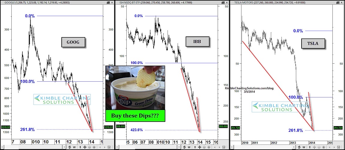
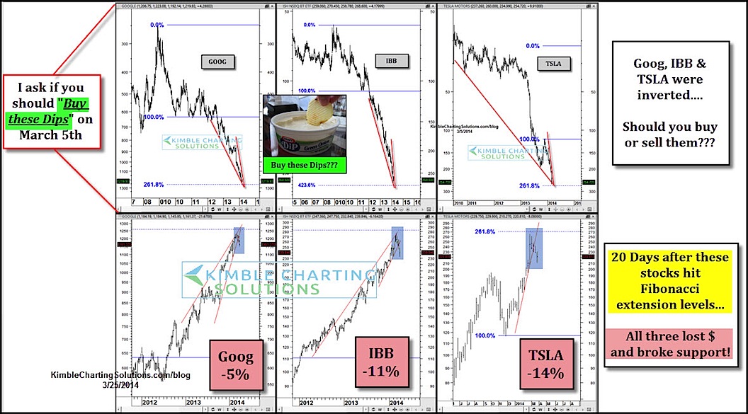
In early March, I started looking at inverted charts of white-hot stocks and sectors – the ones that practically everyone thought couldn’t go down. Specifically, I examined Wall Street darlings Google (GOOG) and Tesla (TSLA), and the iShares Biotech ETF (IBB). All three had incredible price momentum.
Yet I noticed something else they shared. All three patterns displayed “bullish” falling wedges (remember the charts are upside down) and had “fallen” to key Fibonacci retracement levels. They looked like “buys” in the inverted charts, but actually they were “sells.” So flipping the charts gave me a unique perspective that wasn’t clouded by the mainstream view and investor bias. And it turns out it wasn’t a bad time to harvest some gains in those three names.
Fast forward three weeks, and the trio had all broken support and were falling fast. Again, it paid to harvest. (see post here)
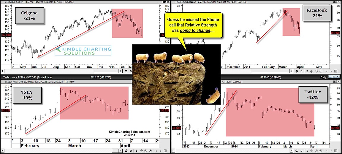
So the past month has been a tough lesson for investors about the dangers of trying to ride momentum stocks, especially when late to the party. With these stocks, the old adage is that investors ride the escalator on the way up, and drop with the elevator on the way down. When buying “high beta” momentum stocks like Facebook (FB) and Twitter (TWTR), it’s even more important to have clearly defined exits and stops. These stocks can fall fast when they break support, so you need to be aware of key technical levels and potential turning points. Josh Brown of the Reformed broker shares how important trend lines can be in, “Honoring Thy Trend line” as he addresses the charts below.
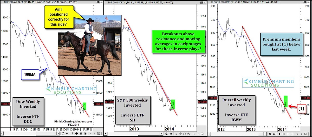
Now, we know that highflying stocks and hot sectors like biotech have been kicked in the face the past month or so. Yet for investors tracking the major indices like the S&P 500 and Dow Jones Industrial Average, the losses have been minor. The question is whether the turmoil under the surface will spread to the broader market.
To try and answer that question, I have flipped charts for the major U.S. equity benchmarks. Again, I’m looking for a new perspective and trying to fight my recency bias – that angel (or is it devil?) on my shoulder that says the bull market will continue indefinitely.
If I was looking at these charts and I didn’t know they were inverted, my gut instinct would be to buy them. I see breakouts and charts rising above key moving averages. Now, I’m not saying investors should short the market. However, there are some warning signs for investors on the long side.
The bottom line is that for me, it’s less about being long or short, and more about portfolio construction and which areas to be overweight and underweight. And sometimes, turning things upside down can be a counterintuitive way to find balance and fight investor bias. Using this process can also help manage risk when the rest of the market seems to be leaning the other way. Give it a try, the results may surprise you.
About Chris Kimble: Chris constructs charts to help people capitalize on the excess fear and greed of global investors. He is the author of Kimble Charting Solutions. You can follow him on StockTwits and Twitter @KimbleCharting.
Any opinions expressed herein are solely those of the author, and do not in any way represent the views or opinions of any other person or entity.
: Creating Bullish Divergence?")


: Creating Bullish Divergence?")