It has been eight years since the great financial crisis of 2008, and the Federal Reserve (Fed) is still maintaining an unprecedented level of accommodation in monetary policy. Investors are bidding asset prices with a QE premium (Quantitative Easing), but shuttering at the mere thought of any tightening in policy.
The Federal Funds rate has been pinned at or near zero since 2008. Recent discussions on raising the rate a mere quarter of a percent are met with a palpable level of angst and incredulity by economists and investors alike.
Since the crisis, the Federal Reserve quadrupled their balance sheet using printed money to buy U.S. Treasury and mortgage securities. The economic results, supposedly the justification for these aggressive actions, have mostly been disappointing. That said, one can credit Fed policy actions for driving financial asset valuations to historic levels. But that QE premium may be more in the mind than in the fundamentals.
Over the last eight years investors have adopted a mindset that Fed intervention is good for asset prices, despite clear evidence that it has contributed little to the fundamental rationale for owning such assets. Fixed income yields are at or near record lows. As well, stock market indices are trading at valuations that have only been eclipsed twice in history, just prior to the great depression (1929) and at the height of the technology bubble (2000). High end real-estate and various collectables trade at unparalleled levels. The eye-popping valuations on these less liquid assets further confirm how impactful Federal Reserve policy has been on asset prices.
We have written numerous articles highlighting rich valuations and the infectious behavior that can compel investors to make investment decisions that they would not otherwise make. In this article we employ a cash flow model to quantify the potential ramifications on the equity market. The goal is to provide investors with a simple tool to calculate total return outcomes that could occur if investors were to lose confidence in the Federal Reserve or its “QE premium”. Should that occur, stretched market valuation premiums built up since 2008 may diminish or vanish altogether.
Price/Earnings (P/E) Ratio
The 720 Global cash flow model was built to provide expected total returns associated with changes to the S&P 500 (INDEXSP:.INX) P/E ratio. For instance, if the P/E ratio were to increase to 30 or decrease to 15, what total return should an investor expect? The model uses the Shiller CAPE 10 ratio versus one-year trailing earnings as it provides earnings consistency by eliminating cyclical noise. The graph below offers a long term historical perspective on the wide range of monthly Price/Earnings ratios that have occurred since 1884.
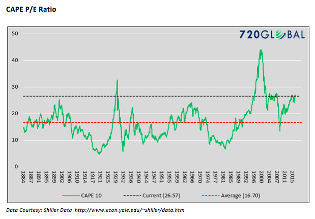
“I would not say that asset valuations are out of line with historical norms.” – Federal Reserve Chairwoman Janet Yellen 9/21/2016
The current P/E ratio of 26.57, denoted by the black dotted line, is approximately 60% above the average and has only been eclipsed by the exuberant periods of 1929 and 2000 and matched in 2007. Since the era of Fed activism began in the 1990’s, the ratio has tended to remain elevated relative to the historical average. This is occurring despite what the recent quote from Janet Yellen would have us believe.
P/E Shifts and Returns
The graph below shows the output of the 720 Global cash flow model. Annualized percentage equity returns on the vertical axis (which includes price changes and dividends paid) are shown for correspondent Price/Earnings scenarios along the horizontal axis. The model assumes: 2.50% annual corporate earnings growth, 3.50% annual dividend growth and a three year term over which cash flows are modeled.
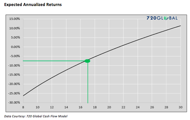
To use the graph to calculate the expected total return for a particular P/E ratio, locate the forecasted P/E ratio on the x-axis, follow it straight up to the total return black line, and read the corresponding figure on the y-axis. The green lines on the graph exhibit how a reversion from the current P/E ratio of 26.57 to a more historically normal P/E of 17.16, imply three consecutive years of –6.73% annualized returns.
Hurdle Rate
Under normal market conditions, investors appropriately require additional levels of return for added levels of risk. Historically, U.S. equities have exhibited approximately 2.5 times the risk (measured by standard deviation of prices) of U.S Treasury bonds. Fittingly, equities have rewarded investors with approximately 4.50% of additional annual returns over the long term. Measured using the Sharpe Ratio, the bond and stock markets have been very efficient over a long time horizon at assessing comparative risk between the two assets.
Currently, 30-year U.S. Treasury bonds yield 2.35, thus equity investors mindful of history should have an investment hurdle rate, or a required annual rate of return of 6.85% (4.50% + 2.35%). Such an annualized return over time compensates them fairly for the additional risk of buying equities.
The 720 Global model can be used to solve for the S&P 500 price that would allow an investor to meet their given hurdle rate or required rate of return for a given Price/Earnings ratio. The graph below charts these prices versus the associated P/E ratios for a hurdle rate of 6.85%.
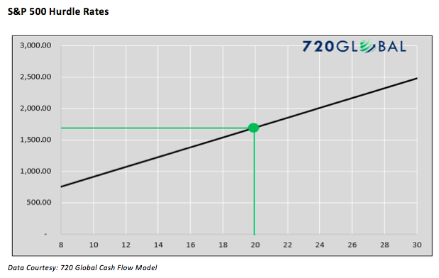
As shown with the green lines, an investor with the aforementioned 6.85% hurdle rate and expectations of P/E ratios decreasing only modestly from 26.57 to 20.00, should feel comfortable meeting their return requirement by purchasing the S&P 500 at any price below 1706.90.
continue reading on the next page…


