 Are there comparisons to be made between the 1995 stock market and the current that we are investing in? This may feel like a stretch, as there is quite a bit of “bubble” talk out there; many traders/investors are looking at the past year or two as a monster run… and labeling it as a “bubble.” While this may indeed prove to be yet another bubble, there’s something to remember: The bubble can keep expanding for much longer than you think. To illustrate this, lets take a look at some charts comparing the current market to that of the 1995 stock market (and its run through 2000).
First, lets look at the periods leading up to some major break out points. Here’s a 2 year daily chart of the S&P 500 (SPX) from 1993-1995:
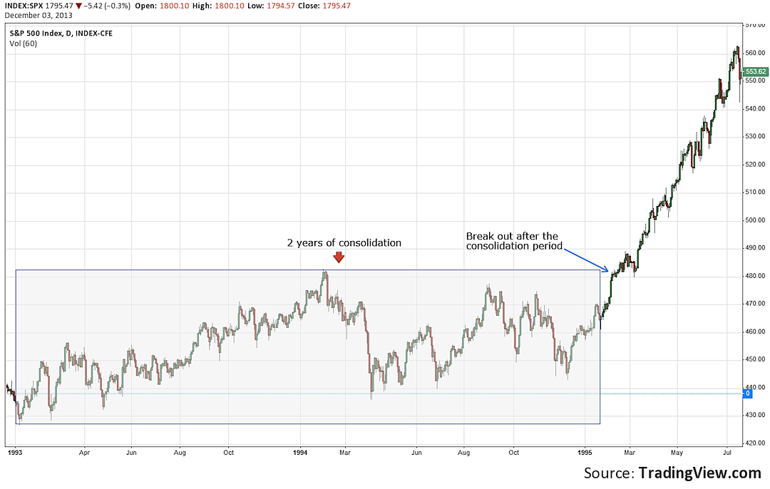
What you’ll notice is a 2 year sideways consolidation phase that took place leading up to the major 1995 stock market break out point (at the 482 level on the S&P 500).
Now, lets look at the consolidation phase that went from 2000-2013. Here’s a weekly SPX chart:
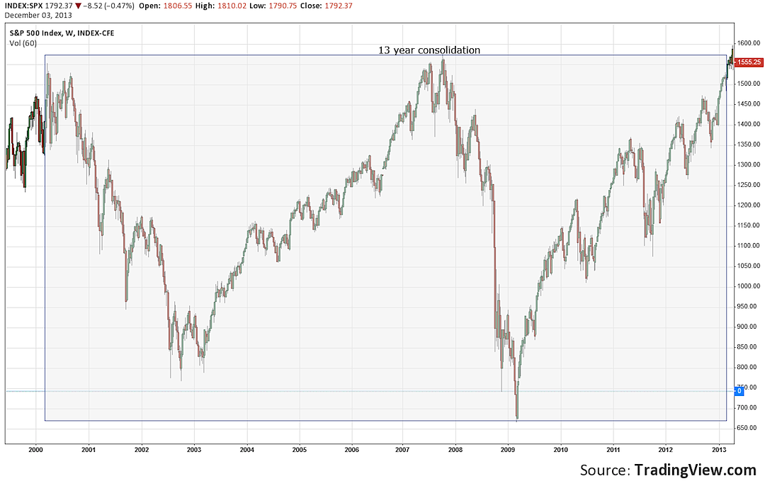
You’ll notice some obvious differences between the 2 charts. The 1993 to 1995 stock market consolidation phase lasted only 2 years, and didn’t have the big wild swings that the 2000 to 2013 did. A big thing that I noticed was that even with those ugly down moves in the last 13 years, the S&P 500 never breached that major previous break out point of 482. Here is a monthly chart to illustrate this :
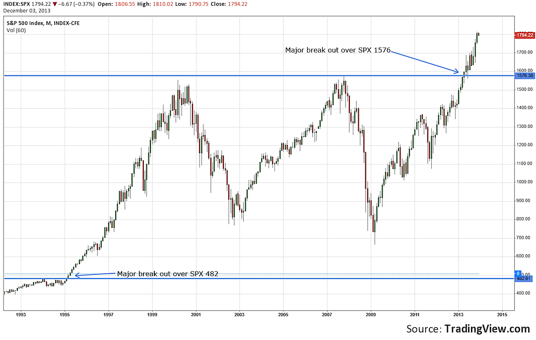
What you’ll also notice in this chart is that another major break out occurred when the SPX broke over the 1576 level, re tested, and has since continued to rally to new highs. Is that SPX 1576 level the new “floor” that the SPX 482 level was? Time will tell.
Lets also take a more in depth look at the 1995 to 2000 stock market. First, here is weekly chart:
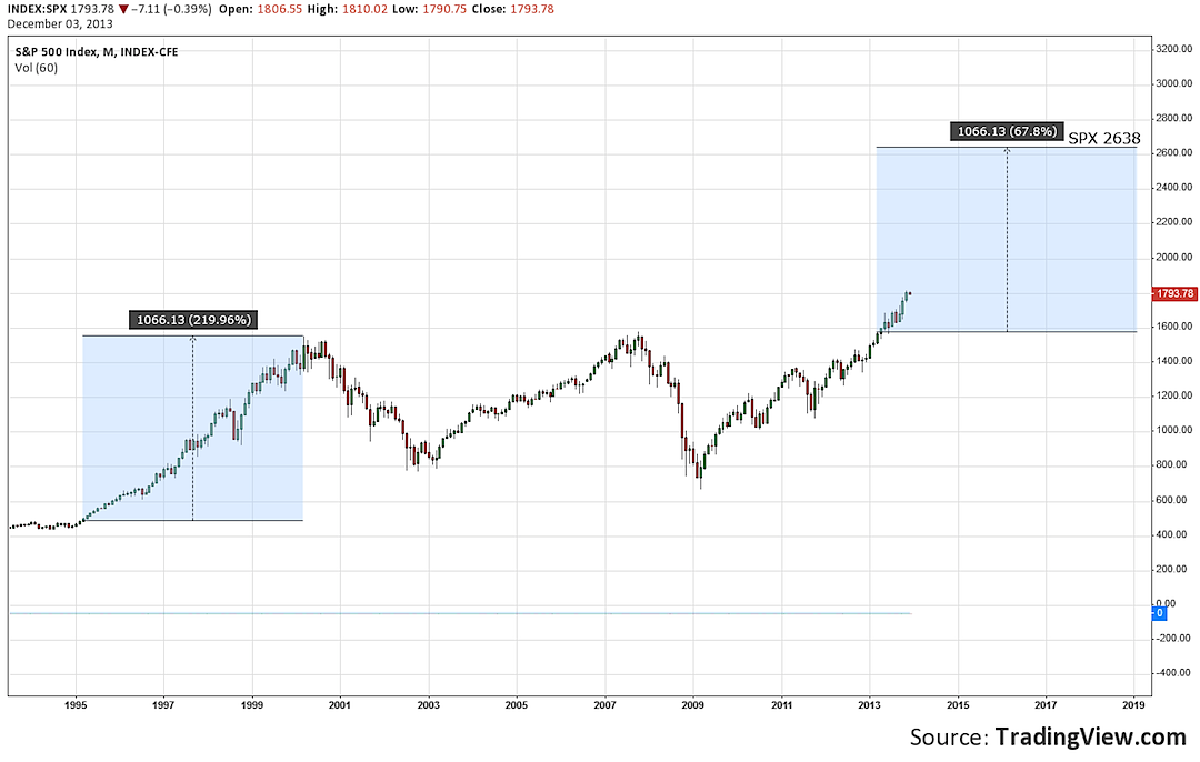
What you can see is that the rally from the break out point of 482 to the eventual top was 1000+ points or 200+%. Projecting that similar point move from the recent 1576 break out level would take the SPX to about 2600. A similar percentage move would take the SPX a lot higher than 2600. Will the S&P 500 trade to those levels? Nobody knows, and only time will tell.
The last group of charts will show you that there were some nasty corrections during that 1995 to 2000 stock market run. Here is a weekly chart of the notable corrections:
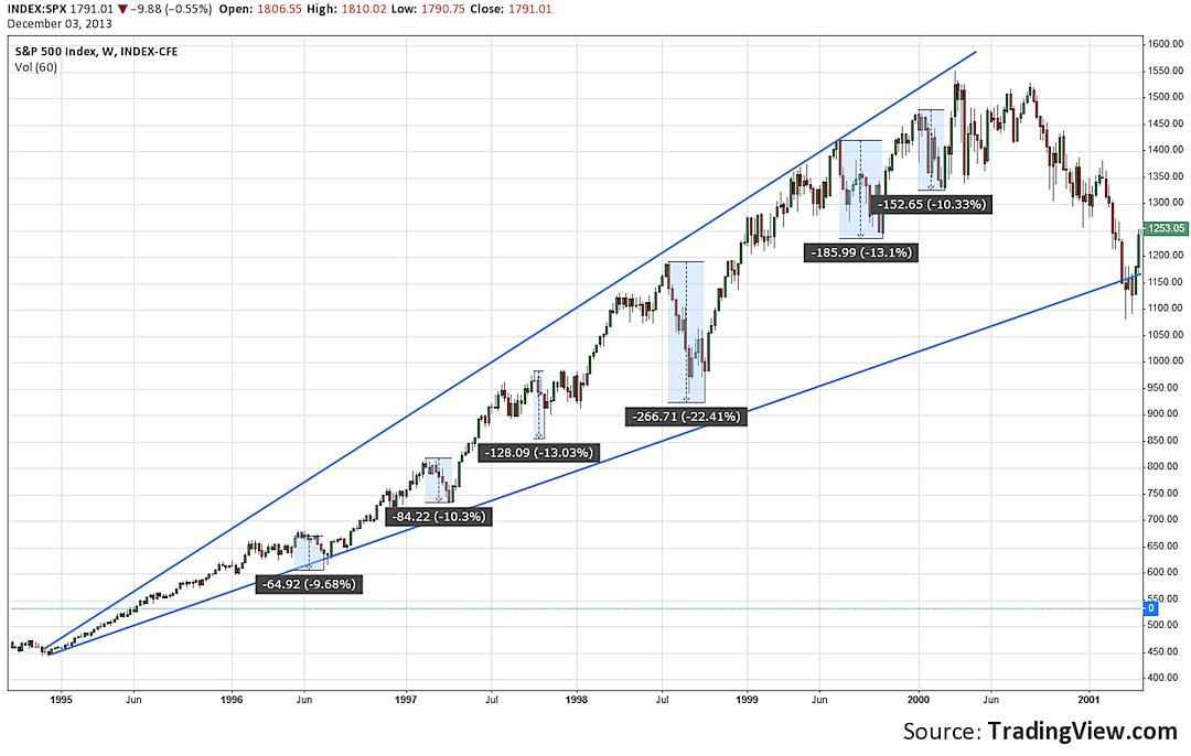
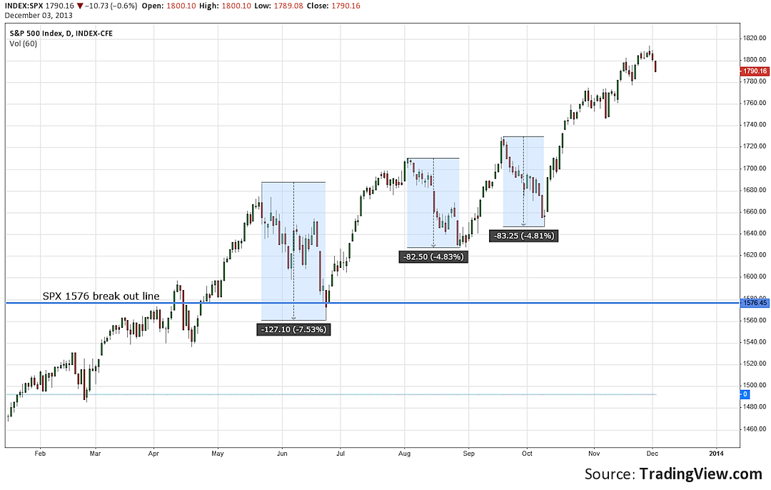
As you can see, there were numerous corrections of more than 10% and a massive 22% down move. Similar moves in today’s markets shouldn’t surprise anyone. We’ve actually yet to see a 10% correction since the major break out above 1576. Here is a daily chart of notable down turns to illustrate:
The fact is no one knows where this market will go in the next few months or years. Perhaps a huge spike in interest rates will cause a massive de- leveraging process in the stock market. Maybe the equity markets will follow the 1995 stock market through 2000, with 10-20% corrections along the way. Nobody knows, but we can look at previous history for potential clues. Thank you for reading.
Twitter: @TraderRL23
No position in any of the mentioned securities at the time of publication. Any opinions expressed herein are solely those of the author, and do not in any way represent the views or opinions of any other person or entity.


 Rolling Over At Key Fibonacci Level?")
 Ready To Break Out?")