Anyone who has been paying attention to emerging markets will have noticed the very interesting price action going on there. But since it’s getting more and more attention, it’s worth revisiting the very definition of EM [Emerging Markets] vs DM [Developed Markets].
The chart in this article comes from a discussion on emerging markets (NYSEARCA:EEM) and developed economies in the latest Weekly Macro Themes report. The main point was a shift in influence of EM and the impact on the global economic cycle.
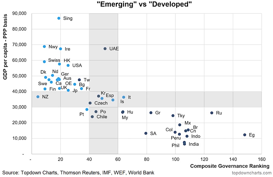
What’s the difference between EM and DM anyway?
Anyway back to the discussion, there has been some talk that it’s no longer appropriate to make a distinction between EM and DM. And to make matters more complicated there is even disagreement between the major index providers on the constituents of emerging market equity indexes (e.g. FTSE vs MSCI).
But the chart ABOVE offers some simplification and clarity on the issue.
The chart shows on one axis the latest data from the IMF on PPP adjusted GDP per capita i.e. the income of that country in relation to its population. In other words, how wealthy the country is.
The other axis shows an indicator I developed to augment our expected return calculations – basically it’s a composite ranking based governance scores from a variety of sources such as the WEF and World Bank. The higher the score the worse the governance (e.g. stability of government, ease of doing business, rule of law, regulation quality, conflict, competitiveness, etc).
Basically it’s pretty black and white of who are definitely Emerging Markets (EM) and who are definitely Developed Markets (DM). That is, EM = lower income, worse governance. DM = higher income, better governance.
It’s a bit of a “chicken vs the egg” issue in terms of what comes first (higher income or better governance) but they are certainly prone to self-reinforce.
The contention comes in the grey areas (the parts of the chart I actually coloured in grey).
Ultimately, those countries with worse governance and lower income have 2 conditions relevant to investors: 1. Upside in the form of scope for catch-up both on income and improving governance and reforms; 2. Required risk premium to account for the risks related to worse governance. When we run the numbers it’s about right, as the ones in the lower right hand corner generally have higher expected return and risk.
So the next time someone protests using the label EM, just point them to this chart.
Thanks for reading.
Twitter: @Callum_Thomas
Any opinions expressed herein are solely those of the author, and do not in any way represent the views or opinions of any other person or entity.


")


")