 The big question we all want answered is if we should buy the dip or if the market has changed character. Given the market’s trend, it’s a buy support market until further notice. Here are a few relative strength ‘tells’ worth watching to see if a major shift in the market is taking place.
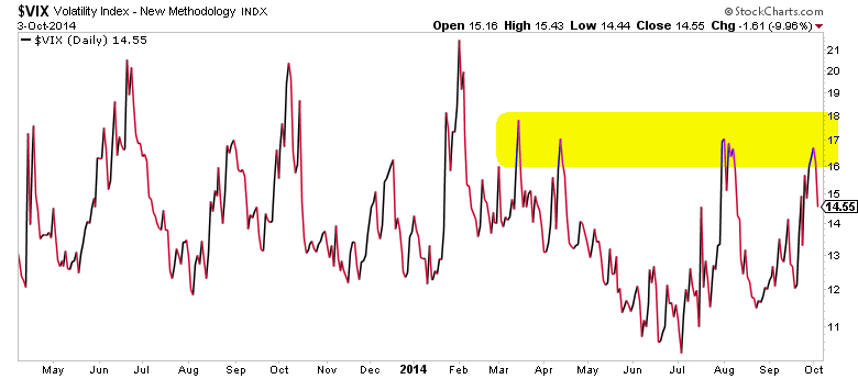
The Volatility Index (VIX) found resistance and closed nearly 20% off its high for the week. The 16 -18 area has been a major resistance level for over half a year.
If market conditions change, I would expect to see this resistance level taken out. And that would likely signal that a deeper pullback/correction is underway.
VIX Daily Chart
Another important item to note is the disconnect between bonds and the economy. More specifically, the fact that long term treasury rates are near 52 week lows, despite strong economic data. We could gather that there is an issue here, but how do we know if it even matters?
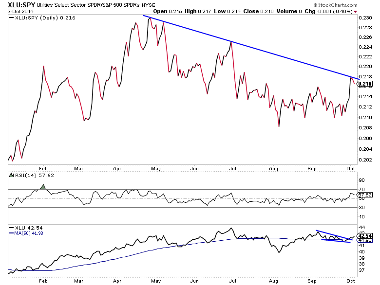
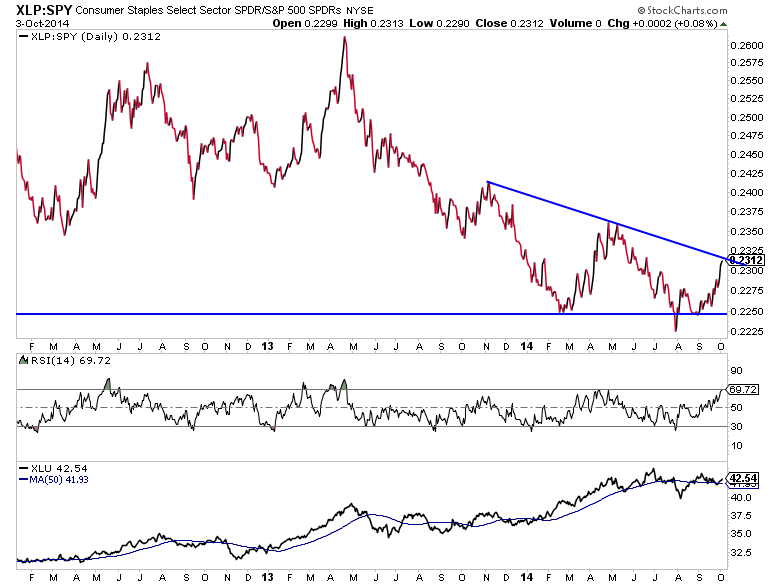
One way is to look at sectors that tend to be more defensive and check in on their relative strength versus the overall stock market. As you can see in the charts below, the stock market doesn’t seem to mind just yet, as defensive sectors such as Utilities Select Sector (XLU) and Consumer Staples Select Sector (XLP) are still underperforming the SPDR S&P 500 (SPY). Both groups tested resistance relative to SPY, but both remain in downtrends for now. If these trends are broken, we can take that as a signal of a shift to defense.
XLU : SPY Relative Strength Performance Chart
XLP : SPY Relative Strength Performance Chart
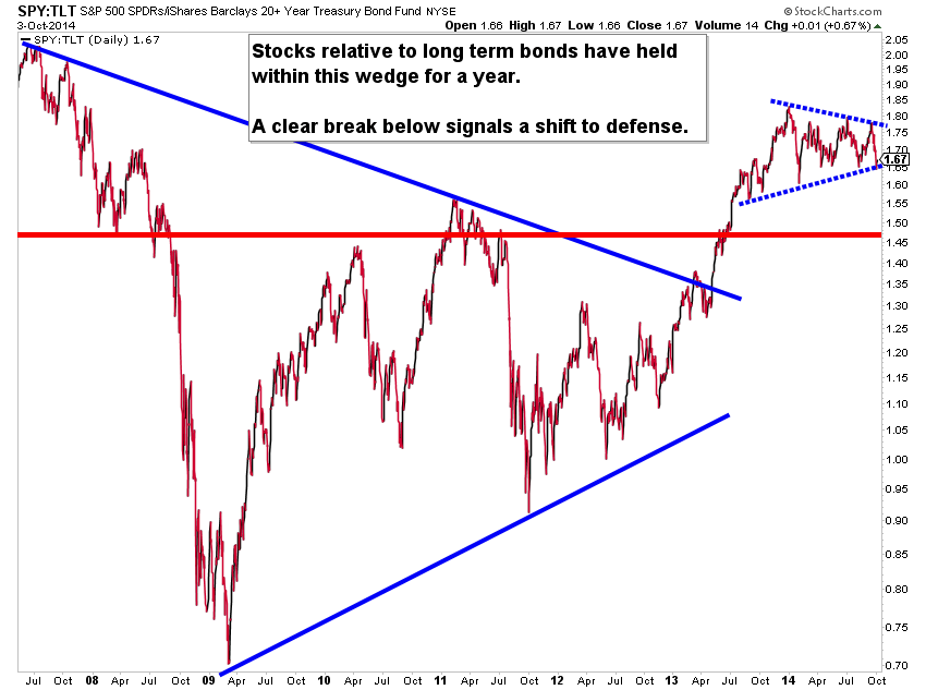
The final chart highlights the stocks to bonds ratio via the SPY and iShares Barclays 20+ Year Treasury (TLT). For the better part of a year, this ratio has traded within a large wedge pattern. As long as the ratio stays within the wedge or breaks higher, the SPY will retain its relative strength advantage. BUT a break below the wedge would signal a defensive move by asset managers from stocks to safe haven long-term treasuries. And this would further confirm the safe haven rush to the US Dollar.
SPY : TLT Performance Chart
Thanks for reading. Trade ‘em well!
Follow Aaron on Twitter: @ATMcharts
No position in any of the mentioned securities at the time of publication. Any opinions expressed herein are solely those of the author, and do not in any way represent the views or opinions of any other person or entity.


