Turn back the clock to September 2007. In the build up to the Federal Reserve rate meeting that month, very few saw a half point cut coming.
What’s interesting about this? While investors were awaiting this key meeting and decision, I presented the PATTERN for institutional clients and said, they are going to do “nothing” or “cut rates.” People thought I was crazy… but I just looked at the chart.
Here’s a chart I pulled from my archived from 8 years ago:
3 Month T-Bill Discount Rate (IRX)
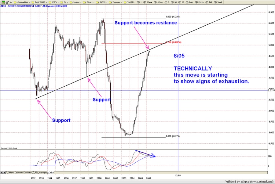
As you’ll see in the chart below, the .786 Fibonacci retracement was hit when the Fed rate cut occurred back in September 2007.
So, all I am trying to show is that the PATTERNS work for the FED and INTEREST RATES. I don’t want to make this a “war and peace” diatribe on fixed income… if you’re interested in more details, please follow (and study) the work that I have done on my blog (Bart’s Charts).
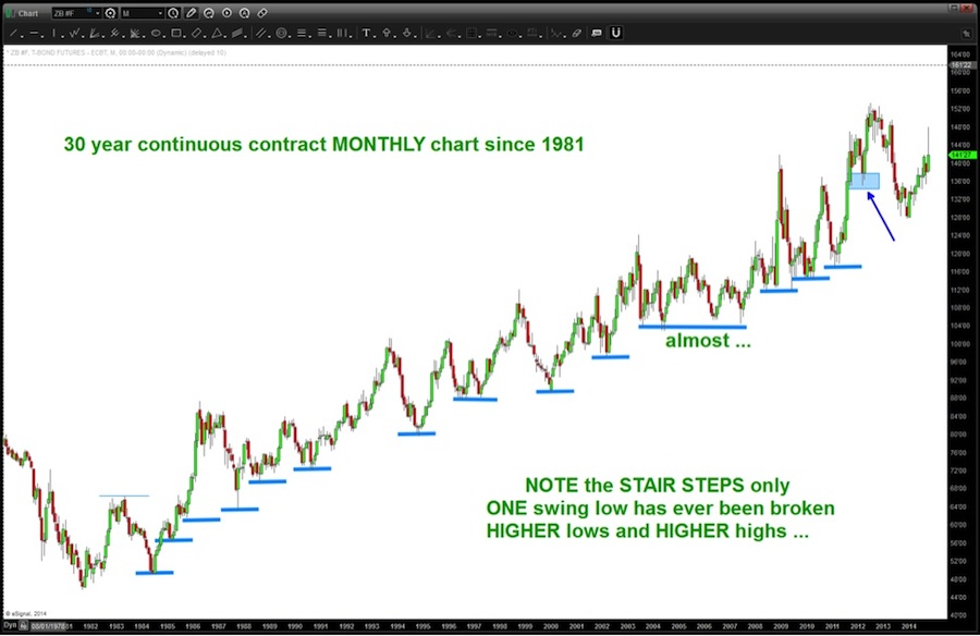
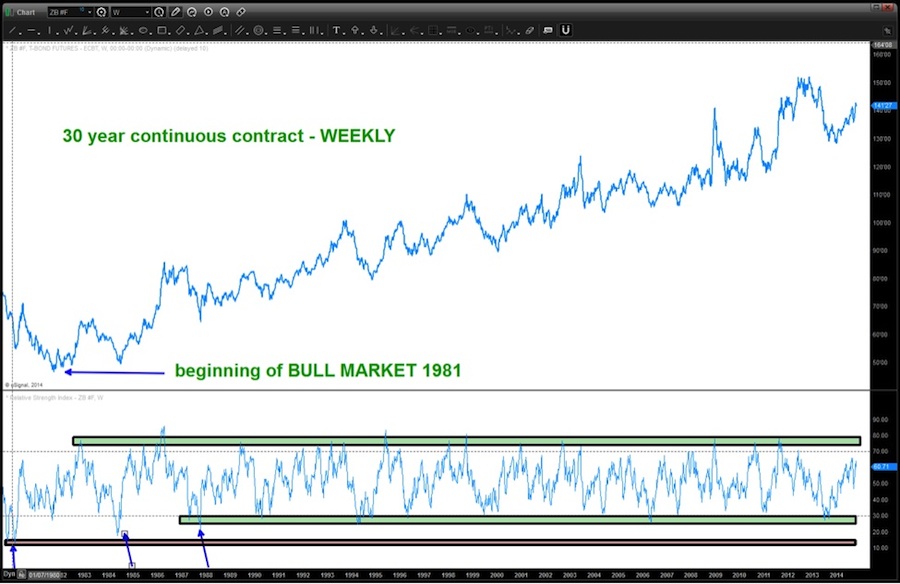
For this study we are going to focus on the continuous contract 30 Year Treasury Bond chart. Why? My data can capture the beginning of the 32 year bull market and allow us to get a big picture of this entire move.
First – ONLY ONE SWING LOW HAS EVER BEEN TAKEN OUT IN THIS 32 YEAR BULL RUN (the blue shaded box shows it on 03/2012 in the chart below). That is an amazing run! Some might even call it a bubble – to a certain extent.
Next, let’s take a look at the RSI bull market zones… as you will see the most recent support came in right in line with all of the other corrective moves. The key to watch is where resistance develops. Note that most of the resistance, in the bull run, has come in/around 60-70 level of the RSI. If we fail below 60 the market is telling us something. Ultimately, the market will signal an end or beginning of a run by finding support or resistance at one of the opposite RSI support/resistance areas. In this case, we will look for a failure at the bearish resistance zone to signal a major shift in the trend for the 30 Year Treasury Bond.
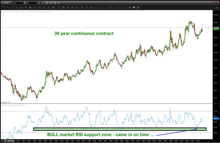
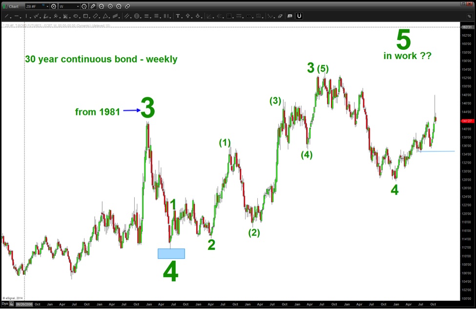
This next chart – a weekly – is extremely important. Why? Go to the far left and note the first blue arrow. Do you see how the “RSI support zone” (red with black outline) was in/around 10-15? That is the key! After that low, note the 2nd blue arrow didn’t go that low and then the 3rd blue arrow found support in the green with black outline BULL zone and off it went. It appears the BULLISH RSI resistance zone is in/around 70-80. The most recent correction landed “perfectly” in the RSI support zone for a bull market.
How about the daily chart for the 30 Year Treasury Bond?
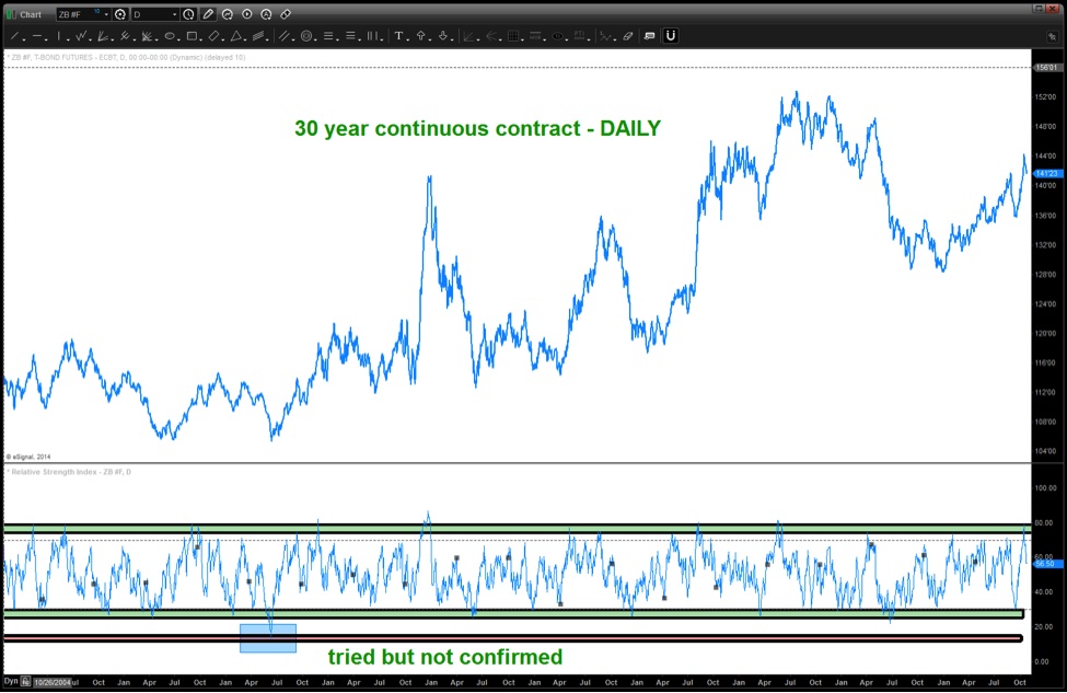
***In the context of the monthly, weekly and daily charts they are telling us the BULL MARKET in BONDS is not over. ****
Ultimately, as we are well aware, interest rates will rise and, quite frankly, it could be the investment of your lifetime – LONG RATES/SHORT BONDS but right now a preponderance of evidence suggests the bull market is still alive. Now, we are definitely at a crucial moment as the first sign of the end could very well be resistance here and rates start back up. But, for the purposes of managing risk, we are in “no man’s land” and we have to be patient.
Is there a “count” that could possibly support new highs in bonds… yes.
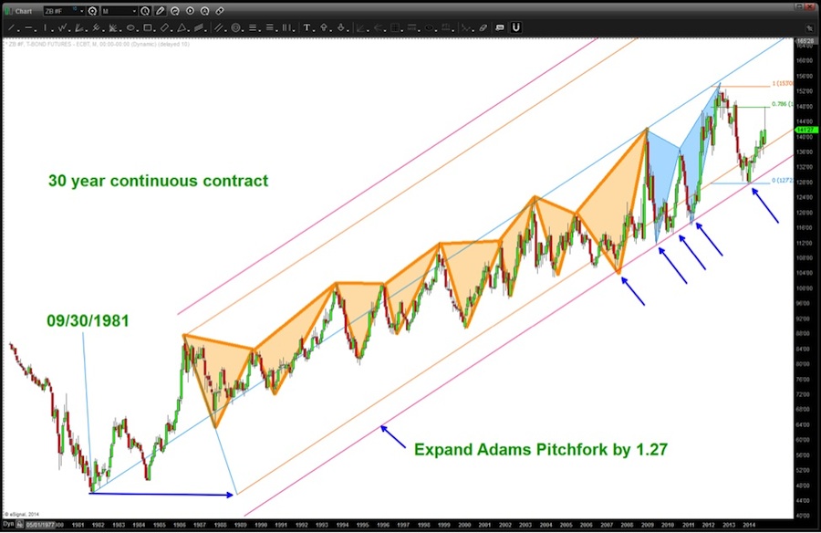
If you did go back to my blog and look at the work that has been done you’ll find the 153 target was the completion of a major “butterfly sell” PATTERN. (“blue shaded” PATTERN below)… but also note that each corrective move in bonds was started with a butterfly pattern and then, after correcting, continued to make new highs (“orange shaded” PATTERNs).
So, in conclusion, there is no definitive CONFIRMATION that the bull market in bonds is over. While we are definitely showing cracks based on the past couple of years I am going to WAIT for a couple things:
- A CLOSE BELOW (weekly) the expanded Adams Pitchfork red line.
- A CONFIRMATION (weekly or monthly) of either “bearish” resistance/support on the RSI
- A move by the bonds into/above 154-158 and back up into the top of trend line resistance.
- A confirmed breakout of the 3 Month T-Bill Discount Rate (IRX) on a weekly chart above the long standing channel.
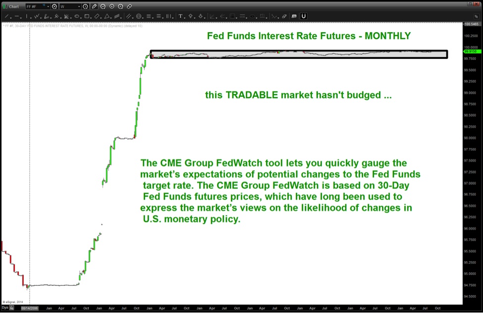
- A BREAKDOWN of the FED FUTURES Monthly chart. (shown below)
Last chart – this is a tradable market and until the lower portion of the box is broken ON CLOSE, low interest rates are here to stay.
Follow Bart on Twitter: @BartsCharts
No position in any of the mentioned securities at the time of publication. Any opinions expressed herein are solely those of the author, and do not in any way represent the views or opinions of any other person or entity.

: Showing Some Signs of Emerging Strength")

