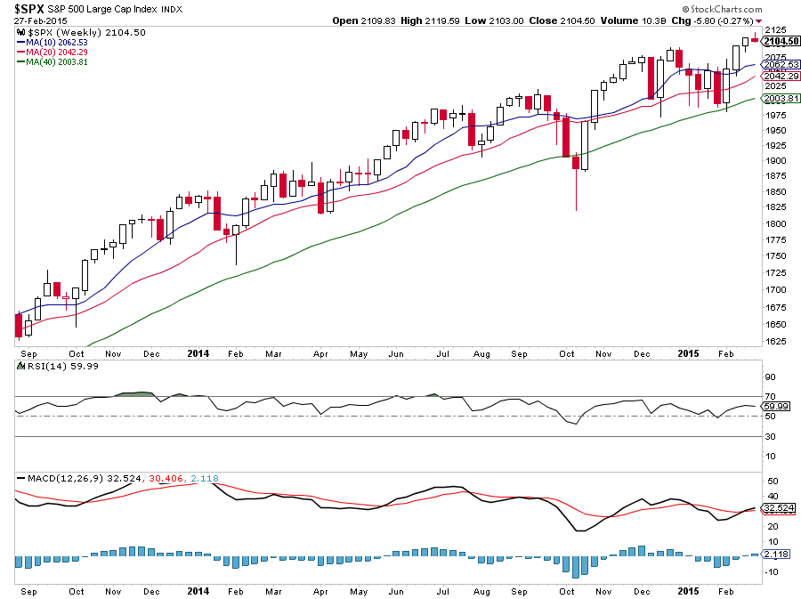
It was a great February for the stock market, as the major market indices literally went straight up. For the month, the broad-based S&P 500 was up 5.5%, it’s best “February” since 1998. But as we enter March, the weekly candlesticks of the S&P 500 (and many leading sectors) are pointing to stock market exhaustion as upside momentum wanes.
This pattern of market exhaustion can be seen in the weekly chart of the S&P 500 as each weekly candle has gotten smaller and smaller over the past 4 weeks. And this is notable as it comes after a breakout into all-time highs.
S&P 500 Weekly Chart
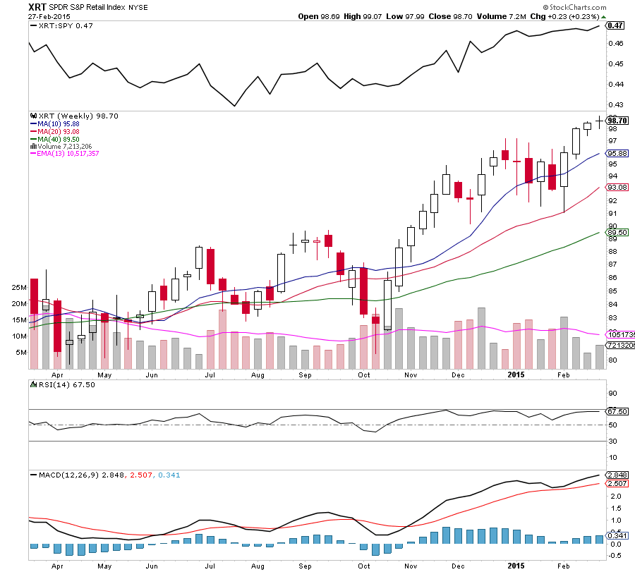
I am also seeing similar signs of market exhaustion occurring in a market leading sector, the Retailers ETF (XRT). Last week, the XRT put in a doji star candle.
The Transportation ETF (XTN) is another sector flashing a similar pattern. It’s also important to note the transports failed to confirm the market’s new highs.
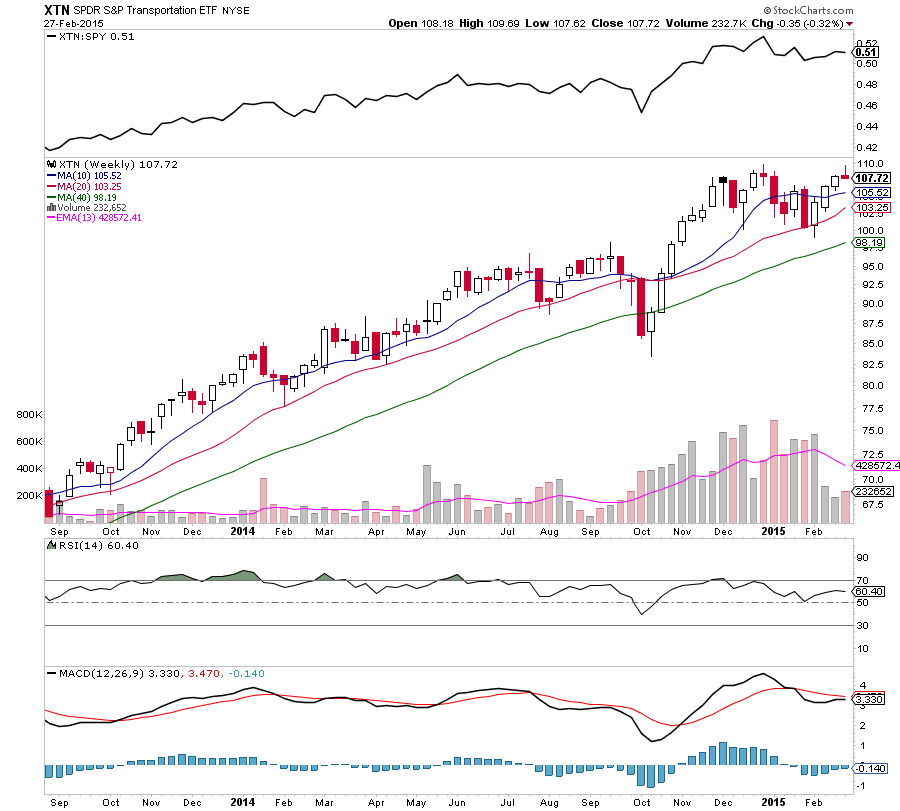
There are more examples, but you get the point. Also note the weekly doji candlesticks on recent leading market sectors such as Biotech (XBI), Housing, Travel and Software. Maybe we’ll see a group or two stand out this week, but this may need a couple weeks to play out.
So what would negate this broad market analysis? A push to new highs in a larger weekly range (including a weekly close over 2140 on the S&P 500).
Thanks for reading.
Follow Aaron on Twitter: @ATMcharts
No positions in any mentioned securities at the time of publication. Any opinions expressed herein are solely those of the author, and do not in any way represent the views or opinions of any other person or entity.


