Stock market volatility is back in a big way lately and the stat below on big market moves sums it up about as good as possible.
My pal Carl Quintanilla quoted me on this on CNBC yesterday:
Number of 2% moves in S&P in the past 13 sessions: seven. Number of 2% moves in prior 167 sessions: one. (via @RyanDetrick)
— Carl Quintanilla (@carlquintanilla) September 9, 2015
One other stat I just did was how many of the 2% moves took place above or below the 200-day moving average. Turns out, since 1928, the S&P 500 has had a 2% move (up or down) 1,488 times. A whopping 64.9% of the time those big moves took place beneath the 200-day moving average. In other words, some of the biggest moves for stocks take place in bear markets. For more on what the 200-day moving average is telling us now, be sure to check out this recent post of mine.
This looks at 1% daily moves and shows that, so far at least, 2015 is about average. 25% of the days this year have closed up or down 1% and this is right in line with the average year since 1970. Given we just had a few years well below the average, a year or to above average wouldn’t come as a shock.
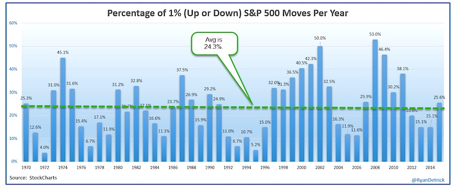
Of course, what is important to note is the first seven months of the year we had very few 1% days, now it is almost surprising when we don’t have one. So nearly all of the stock market volatility has happened since we hit the ‘boring’ month of August.
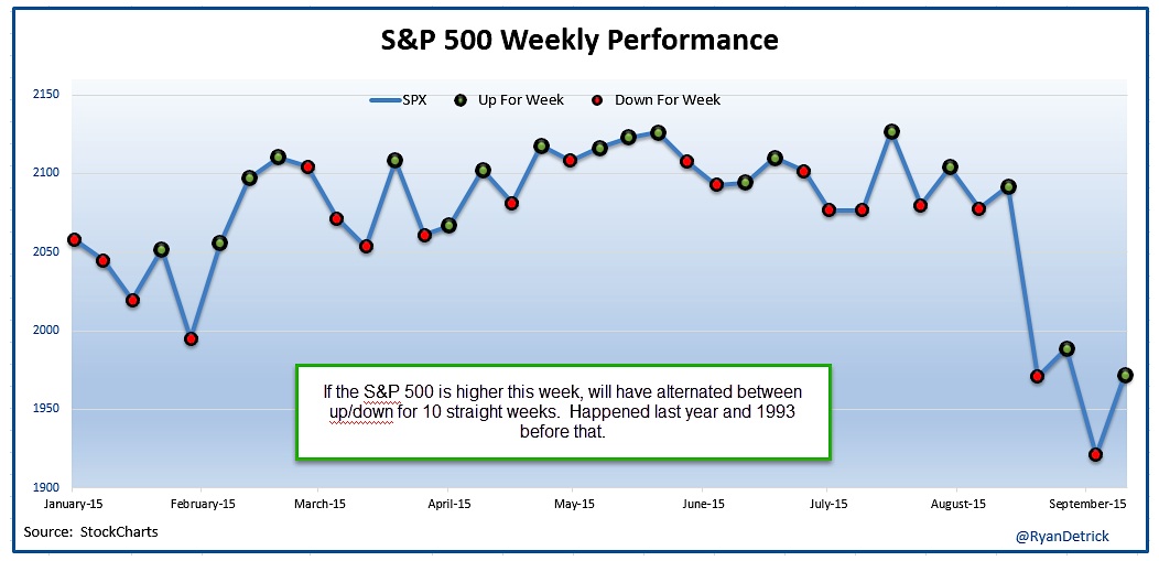
One other way to show just how volatile things have been, we are looking at 10 straight weeks of the S&P 500 alternating between up and down. This happened last year and the other time was 1993 when we saw this much choppiness.
Lastly, one of my favorite bullish indicators could be flashing a major buy signal here. The CBOE options equity put/call ratio 21-day moving average is at its highest level in three years. What I like here is that this indicator shows there is a lot of fear in the options market.
Now what matters to you is once this ratio rolls over, it has been very bullish for the S&P 500. It looks like it is trying to roll over here… but we’ll have to wait and see.
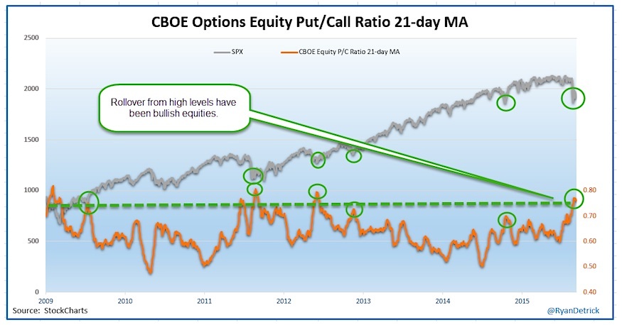
Also, let’s be honest – this one keeps it simple. When this ratio trends higher, it is bearish for stocks and indicative of high stock market volatility. And when it trends lower, it has been bullish for stocks. It isn’t surprising it has been trending higher the past several weeks – before the trouble started.
Thanks for reading.
Twitter: @RyanDetrick
Read more from Ryan on his tumblr.
Any opinions expressed herein are solely those of the author, and do not in any way represent the views or opinions of any other person or entity.


