In early February, the financial markets experienced some turmoil. Volatility spiked, stocks sold off roughly 10 percent and credit spreads widened.
These were strange events given that over the prior 15 months the total return for the S&P 500 was positive each and every month. From November 2016 through January 2018, stocks and most other risky assets enjoyed a historic run of positive performance where temporary downturns were very limited.
There are a lot of explanations for this, ranging from the policy agenda of President Trump to synchronous global growth. Rather than guess, and with the streak of consecutive positive months now broken (February closed down -3.69%), we thought it an opportune time to evaluate some of February’s dynamics to draw reasonable conclusions about where we might be headed next.
Valuation Comparison
The U.S. equity markets are not simply on a strong performance run, they are currently leading the world in valuations. The chart below highlights a sample of equity markets from various countries in a unique light. As opposed to return performance, this chart illustrates the 1-year forward price-to-earnings ratio (PE) as compared to the distance of that ratio from the peak since 2007.
The markers on the chart correspond to the country below them in the table at the bottom. The crimson marker at the far bottom right is the S&P 500.
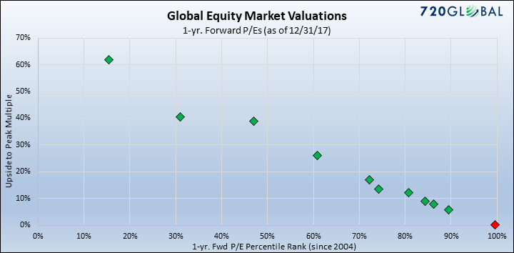
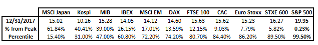
Although several countries are less than 15% away from the peak, as of December 31, 2017, the S&P 500 was sitting at peak levels. Despite the volatility of the past few weeks, these numbers have not changed very much and the U.S. remains the global valuation leader.
Reasons
It is difficult to attribute what we are observing to Donald Trump’s election as the 1-year forward PE on the S&P 500 has been the highest in the world since well before his surprise election victory. It is possible U.S. equity market leadership is due to expectations for comparatively stronger earnings growth. However, even that logic does not reconcile with the data. According to Robert Shiller, current S&P 500 real earnings per share (adjusted for inflation) are only 6.4% above their 2007 peak. Meanwhile, the value of the S&P 500 index (adjusted for inflation) is over 38.3% higher in the same time frame.
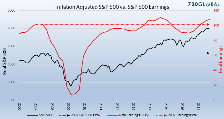
From that perspective, it should not surprise anyone that the U.S. equity market is leading the world as that accounts for an enormous amount of P/E multiple expansion and should offer pause for concern.
Other Points of Interest
Suffice it to say that U.S. stocks are rich on an absolute and relative basis. There are many other places in the world to invest where there is better value in equities. In addition, the Federal Reserve (Fed) is tightening monetary policy while other central banks appear content to see if their recoveries are sustainable. That means the central banks in most countries have not yet become a headwind to risky assets as the Fed has in the U.S. Although it would be impossible to pinpoint the precise reason U.S. stocks lead the world, a few of these points give us clues for consideration.
In order to gain additional perspective, we should also look at the recent correction and brief shakeout in stocks. In late January, volatility spiked and stocks dropped in what was the first 10% decline since January 2016 in the aftermath of the Chinese currency devaluation. Reasons for the recent sell-off ranged from debt ceiling limit concerns to rising interest rates. After two weeks of uncertainty and market losses, stocks finally stabilized and started to rebound on February 9th. That was the same day as the surprising agreement on the budget deal between Congress and the President which will further expand U.S. excessive deficits well into the future.
The chart below offers an illustration of the relationship between returns for each industry sector in the S&P 500 and their betas to the broader market. The green markers reflect a one-year history up to the prior market peak of January 26, 2018. The red markers denote the peak to trough time frame from January 26 to February 8, 2018. In classic fashion, as the market sold off and returns became negative, those stocks with the highest betas (Financials, Info Tech and Materials) generally lost the most and the more defensive sectors with lower betas lost the least. Other than being an interesting representation of those two periods to contrast the market move, there is nothing unusual about the performance and sensitivity relationship.
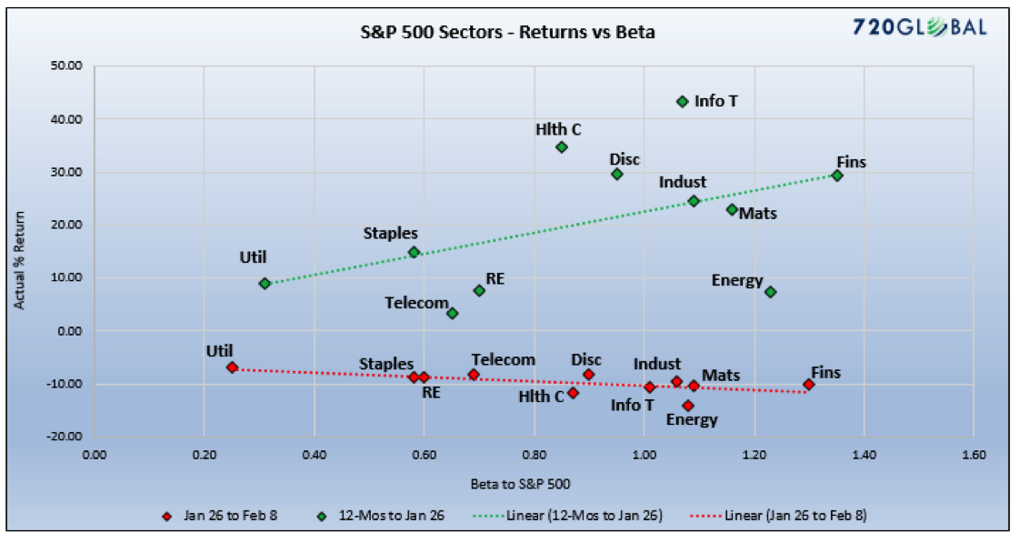
The importance of the chart above lies in the contrast between the green and red markers. Since the expansion is likely in its later stages at 105 months long, investors should be methodically de-risking by raising cash and shifting equity allocations from high beta sectors to low beta sectors.
Strange Behavior
There was something uniquely out of character about what we observed in other markets, especially U.S. Treasuries. The normal relationship for most of the past 35 years has been for the bond market to rally when stocks decline. Yet, for the first time in recent memory, we saw something different in January and early February.
The chart below illustrates market corrections for the S&P 500 in 2014 (-7.28% over 30 days), 2015 (-10.40% over two weeks) and early this year (-10.10% over two weeks). It also shows the concurrent performance of various high quality fixed income categories.
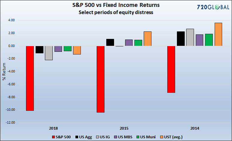
Expectations are that when stocks fall, bonds rally (prices rise and yields fall). As shown, in 2014 and 2015, Treasuries and other high-quality bonds did just that. But in January and February of this year, that was not the case. Uncharacteristically, the returns on high quality bonds actually fell and yields rose alongside a stock market under duress. There was no evidence of a “flight-to-quality” response from investors.
This is an important dynamic because many fund management strategies utilize U.S. Treasuries as a hedge against a correction in risky assets. If an astute but traditional investor is long 60% stocks and 40% high-quality bonds, then on past occasions when stocks dropped -10.0% their bond allocation gained an average of 3.0% and the portfolio was left with a minor -4.8% loss. To contrast, in the recent equity selloff, high quality bond performance dropped -1.3% so a portfolio using a 60/40 allocation would have been down -6.5%.
It is certainly possible that what we observed in recent weeks was an anomaly. Based on the past 30 years of stock-to-bond price performance, that would be a logical conclusion, but it also might be short-sighted. The market may be taking into account that accumulated debt and forecasted deficits portend much heavier supply of Treasuries in the future along with a looming question of who will buy them. Treasury supply and demand dynamics appear uniquely troubling as recently noted in Deficits Do Matter.
Summary
Despite the recent correction, the U.S. equity markets still easily lead all major global markets in terms of valuation. This is not cause for optimism, it is a sign of extended risk. The outlook for earnings has improved due to tax reform and other recent fiscal policy measures, but even with that boost, earnings do not support these valuations. There is also a clear tension between the Fed and their monetary measures and those of the Congress undertaking new fiscal stimulus. Those paths will overlap and it will be bumpy at best with tightening Fed policy opposed by the forces of fiscal stimulus buttressed by tariffs and the threat of retaliation from other countries.
The markets appear to have sent an early warning to equity holders with the spike in volatility, but with the sustained optimism of the market since, it does not appear as though many have taken heed. Since early February, volatility has dropped back to less elevated levels but it remains significantly higher than the single digit readings commonly seen in 2017. Even if VIX stabilized to average 15 for the next few weeks, that would still be 36% above the average level of 11 for all of 2017. If interest rates remain elevated, to say nothing of rising, it will create further portfolio deleveraging pressure especially on the $1 trillion in funds managed under risk parity strategies.
Despite the bounce from the lows seen on February 8, the market seems uncomfortable and edgy. At the same time, it appears unconvinced that anything could be wrong. Investors have enjoyed such a long period of extreme central bank accommodation and the easy returns that have gone along with it, they are reluctant to modify for the changes clearly taking place. Risks, both implied and explicit, are large and growing but investors seem mostly unaware despite the early warning signal.
A fair characterization would be that it’s like living next to the city dump, if you’re there long enough, you eventually stop noticing the smell.
Twitter: @michaellebowitz
Any opinions expressed herein are solely those of the author, and do not in any way represent the views or opinions of any other person or entity.
")


 Rolling Over At Key Fibonacci Level?")


