All you really need to know is whether or not there will be a recession in the next six months.
Ok, that is an exaggeration but bear with us.
Since about 1950, the average monthly return for the S&P 500 is about 0.7%. That works out to a decent 7.7% on an annualized compound basis and this does not include dividends (feel free to add 1.5-3.0%). Add a couple points for dividends and this demonstrates the power of compounding returns over the long term.
During this period there were 11 recessions of varying durations and magnitudes with the most recent ending in June of 2009. It is common knowledge that the stock market is not a fan of recessions. Lower economic activity, credit risk, multiple compression, the list of recession symptoms is long, and the vast majority are not good for equities. So much so, the vast majority of bear markets roughly line up with recessions. While there are some exceptions, this is a good and intuitive general rule.
The chart below is the S&P 500 (log) as the blue line, with recessions in red bars and bear markets in grey bars. The grey bars measure when the market starts falling and ends when the market has started a meaningful recovery. As you can see, most of these loosely line up. Sometimes the market begins falling before the recession, to varying degrees.
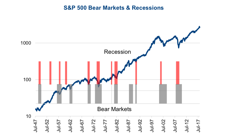
Markets & Recession
There have been eleven recessions since the late 1940s, coincidentally with an average duration of eleven months (table below). Interestingly, the average price return of the S&P 500 during these recessions was around 0%. Now much can be hidden in an average. The last recession (aka global financial crisis) had markets down 37% once the recession started until it ended. But during others, the market actually rose. In fact, in six of the eleven recession the S&P 500 rose.
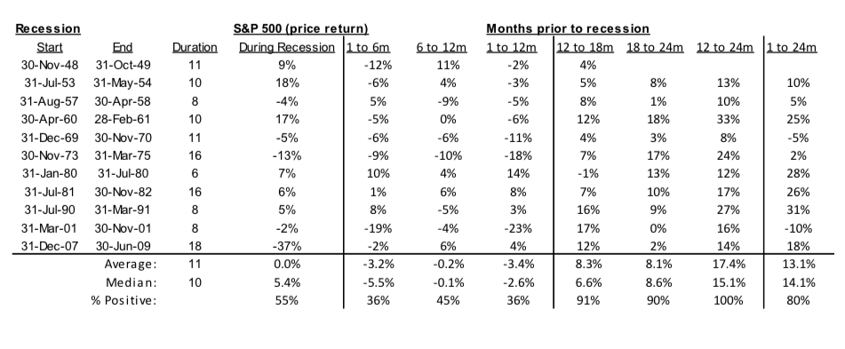
In many cases most of the pain is felt before the recession actually begins. We measured the S&P 500 price performance in various periods approaching recessions and found the six months just before to be a bad period for equities. This obviously supports the view that equity markets are a bit more forward looking especially compared to economic data which is often a bit backward looking.
The table has several important takeaways. Apart from the last six months before recession being painful, markets tend to be very strong. This is the late stages of a bull market, which can be very profitable. Especially the 12-24 months before the recession starts. Wonder if that was 2017…which was up +19%.
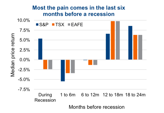
Results in Canada, for the TSX, were similar but had some interesting differences. Focusing on median price returns, Canada did even better during the 12-24 months ahead of the big R. Our market, with its more resource bent has greater exposure to what many investors term late cyclicals, including Energy and Materials. However, our market starts to lose momentum earlier, not doing well during the last six months and also the six months beforehand. Also, the TSX did not perform well during the recession which could be attributable to our market’s greater leverage to global economy growth. EAFE was similar.
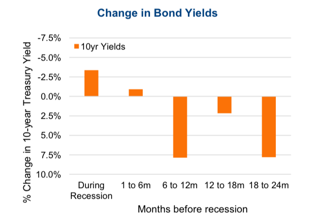
To demonstrate the power of diversification, we also applied the same framework to ten-year bond yields. We reversed the axis as falling yields means your bond price is rising. Clearly bonds do not do well in the last stages of a bull market, but start to perform their capital preservation function in the last six months and into the recession. Just in case you forgot why you own bonds (or should own bonds).
The Million Dollar Question: Could there be a recession in the next six months?
That is the big question, and it is why we developed the Market Cycle framework. This approach combines many indicators (over 30) from various disciplines including technical, economic, valuations, fundamentals and sentiment. All with the objective to gain some insight and get some early warning if the probability of a recession in the next six to twelve months is rising or likely. Currently 21 of the 30 indicators are bullish which is well above the Recession warning threshold of around 10. But it is worth noting the number of positive indicators was a healthier 26 at the end of 2017, so we have seen some deterioration.
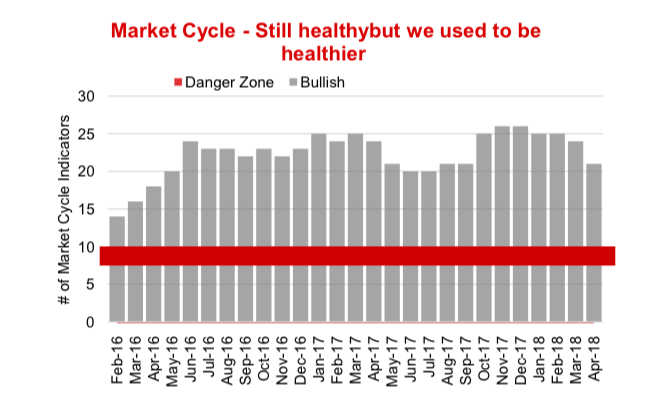
Our continued view is that while the global economic data is losing a bit of momentum, the positive still vastly outweigh the negatives. And given our indicators remaining bullish, we continue to view the recent weakness as a normal correction and not the beginning of a bear.
Data in charts sourced to Bloomberg unless otherwise noted.
Twitter: @sobata416 @ConnectedWealth
Any opinions expressed herein are solely those of the authors, and do not in any way represent the views or opinions of any other person or entity.


