For years, bonds had a single job in portfolios: provide a ballast during periods of equity market weakness. Ok, and maybe spin off a little income along the way. But most portfolios had been receiving as much or more of their income from equities, given yields were rather low. Then came 2022, and bonds didn’t just drop the ball – they fumbled, stumbled and kicked the ball out of bounds. The Canadian TSX fell -5.8%, the S&P 500 -18.1%, and Canadian bonds dropped by -11.8%.
For the past decade, looking at rolling monthly returns for the TSX & Canadian bonds, there is no denying bonds have provided a good stabilizer for portfolios. Slicing the data to only those periods when the TSX declined, and bonds, on average, were flat. Hence the stabilizer.
But if you look at 2022 till the end of February this year, not so much of a stabilizer. During this period, when the market was down, it was down an average of -3.9%, and bonds were down an average of -1.2%. We don’t want to jinx it because one month does not make a trend, but March saw equities down and bonds up.
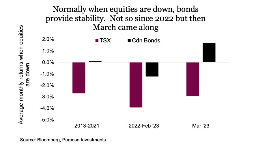
So, are bonds back to being bonds again? Maybe. March was an odd month with a bit of a market scare driven by fears over the impact of deposit flows on banks. Adding to this, the surprisingly strong economic data that had been the trend for the past few months has started to surprise a bit in the other direction. This was all good for bonds, while not great for equities.
Correlation relationships
Forecasting correlations is about as hard as trying to forecast markets. But there are a few factors that tend to influence the bond/equity correlation over time. Correlations tend to be higher during periods of higher economic growth, and lower when growth slows. Now if you are in the camp that believes the economy is slowing, as we are, then that favours lower correlations.
The bigger impact is short-term rates. When central banks cut or raise rates, the correlation tends to be higher. Now we are not jumping to believe this is necessarily a causal relationship. Often when central banks are cutting rates, there is trouble in the markets or economy, which is a risk-off environment that naturally enjoys a strong negative correlation between equities and bonds. But when they raise rates, it increases the discount rate for the valuation of equities and bonds – helping them move in tandem.
So, if we have seen peak rates (or if we are close), and if the economic temperature is cooling, bond/equity correlations should be lower than we have seen in the past year. The chart below captures the rolling 2-month correlation and slope between equities and bonds. Correlation gets most of the attention, but the size of the move matters too. Both have turned negative of late.
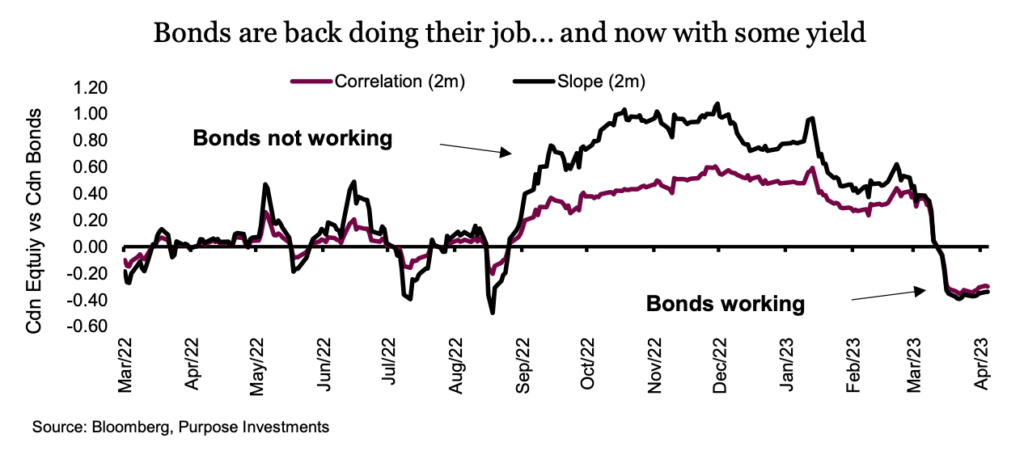
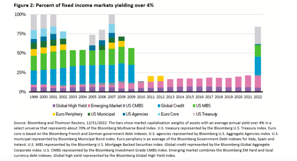
Now, this could reverse for any number of reasons. First, if inflation re-accelerates or economic growth picks up, that certainly wouldn’t help. There is another buffer that helps bonds; namely, they now have a more attractive yield than years’ past. Perhaps one of the best charts to illustrate this is from iShares. The chart below uses Bloomberg data to compile what percentage of the bond market is trading with a 4% or better yield. It really highlights that yields today are simply back to more normal times, which is very different from the yield drought of the 2010s.
Final thoughts
Inflation may not yet be over, and a recession is far from a certainty in the near term. However, the return of negative correlations between equities and bonds is a welcome change of events. The near-term sustainability of this relationship will depend on what lies ahead for the economy, risk appetite and, of course, the path of central banks. But with higher yields than years past and an increasing probability of a recession ahead, duration has quickly become a positive influence for portfolios.
Source: Charts are sourced to Bloomberg L.P., Purpose Investments Inc., and Richardson Wealth unless otherwise noted.
Twitter: @ConnectedWealth
Any opinions expressed herein are solely those of the authors, and do not in any way represent the views or opinions of any other person or entity.


