As you can probably guess from my career as a technical analyst, I am huge fan using data visualizations to tell the story.
Earlier today, I actually brought up Excel to tinker with a VBA module and my eyes immediately started to glaze over. So when I first read Edward Tufte’s Beautiful Evidence, I felt perfectly at home with the simplicity and clarity of visual representations.
In the words of the folks at Visual Capitalist in their primer on infographics (which is in infographic format, obviously), “People remember 10% of what they hear, 20% of what they read, and 80% of what they see and do.”
One of the most powerful ways to visualize data is through maps. For example, a table showing the size of Chinese cities relative to different countries would be mildly interesting. But seeing it on a map really drives home the size and scope of the Chinese economy.
“People remember 10% of what they hear, 20% of what they read, and 80% of what they see and do” — visualcapitalist.com
I have often heard people critique some technical analysis as being “too simplistic”, to which I usually answer, “Why thank you!” I agree with Perry Kaufman’s assessment at the 2017 IFTA Conference, where he said, “There are always opportunities to provide simple, better products for investors. You don’t need to be complicated.”
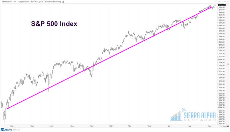
So why am I bullish on the equity markets? Well, I could write a detailed explanation for you. Or I could send you an Excel sheet with reams of data supporting a bullish thesis. Or I could just show you this:
Thanks for reading.
Twitter: @DKellerCMT
The author does not have a position in mentioned securities at the time of publication. Any opinions expressed herein are solely those of the author, and do not in any way represent the views or opinions of any other person or entity.


: Showing Some Signs of Emerging Strength")
