We all know about the so-called known risks in the market: valuation, slow growth, corporate earnings, Fed rate hike, China, presidential election, Brexit.
Lately, however, there has been some talk in the financial news media and blogosphere about the recent flattening of the U.S. yield curve, which is the flattest it has been since 2007 (articles from MarketWatch, CNBC, Wall Street Journal, and The Felder Report).
First, let’s define what exactly the yield curve is. Investopedia defines it as the following:
“A yield curve is a line that plots the interest rates, at a set point in time, of bonds having equal credit quality, but differing maturity dates. The most frequently reported yield curve compares the three-month, two-year, five-year and 30-year U.S. Treasury debt. This yield curve is used as a benchmark for other debt in the market, such as mortgage rates or bank lending rates. The curve is also used to predict changes in economic output and growth.”
Simple enough right? Now the shape of the actual yield curve is also analyzed by Wall Street economists. Turning again to Investopedia (emphasis mine): “The shape of the yield curve is closely scrutinized because it helps to give an idea of future interest rate change and economic activity. There are three main types of yield curve shapes: normal, inverted and flat (or humped). A normal yield curve (pictured here) is one in which longer maturity bonds have a higher yield compared to shorter-term bonds due to the risks associated with time. An inverted yield curve is one in which the shorter-term yields are higher than the longer-term yields, which can be a sign of upcoming recession. A flat (or humped) yield curve is one in which the shorter- and longer-term yields are very close to each other, which is also a predictor of an economic transition. The slope of the yield curve is also seen as important: the greater the slope, the greater the gap between short- and long-term rates.”
With the definition of a yield curve as well as the different types of yield curves out of the way, let’s now turn to what some financial pundits have been focusing on: the flattest U.S. Treasury yield curve since 2007; some pundits have even gone as far as to say the U.S. yield curve is “essentially inverted already” despite the fact it is far from being inverted. Now there isn’t just one yield curve, there are multiple yield curves depending on which maturities you choose to compare. However, the majority of the talk recently has been about the 10-year treasury and the 2-year treasury (specifically the spread between these two maturities, as the spread represents the steepness/flatness of the curve itself). Unless stated otherwise, when I am talking about the U.S. yield curve, I will be referring to the 10-year treasury and the 2-year treasury as well.
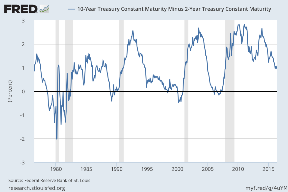
Above is a graph from the Federal Reserve Economic Data (FRED) showing the spread between the 10-year treasury and the 2-year treasury since June 1976, which is the maximum length that FRED provides. The shaded areas represent official economic recessions. Also note that the yield curve officially becomes “inverted” when the spread drops below zero.
You can see how the curve has changed over the last four decades from this chart. Zooming in on the action during the more recent years, you can see that the U.S. yield curve has flattened since the highs in 2010 and 2011 and is indeed trading at multi-year lows. But is this a signal of an impending stock market crash and economic recession?
Over the years, there have been many academic studies on the implications of an inverted yield curve. There is a great article by Charlie Bilello (@MktOutperform) over at Pension Partners that was written back in 2014 about the potential predictive power of an inverted yield curve. Charlie refers to his findings by saying:
“An inverted yield curve has indeed been an early warning sign of an oncoming recession. The past nine recessions in the U.S. were all preceded by yield curve inversion, with an average lead time of 14 months.”
Note, Charlie’s methodology differs from what I have been referring to thus far. Specifically, his study used the difference between the 10-year yield and the 1-year yield as the measurement of the yield curve. Charlie goes on to say that “In the past nine recessions, yield curve inversion has preceded the stock market peak six times with an average lead time of 7 months. Most recently, we saw the yield curve invert in January 2006, well in advance of the stock market peak in October 2007.”
Again, it is important to note that the U.S. yield curve is not inverted currently. It is also interesting to note that since June 1976, the U.S. yield curve (10-year minus 2-year) has been negative 15% of the time according to my analysis. Moreover, the average and median spread over the past four decades is 0.97 and 0.98, respectively. The spread is currently 0.96 (as of 5/16/16). Again, while the U.S. yield curve has become flatter, it isn’t close to becoming inverted at the moment. And some say that it most likely will not become inverted due to the historic actions taken by the Federal Reserve, namely the Fed’s zero interest rate policy (ZIRP) following the Great Recession. The Fed officially abandoned its ZIRP back in December 2015 after it announced it would raise its target rate to a range of 0.25% to 0.50% from a previous range of 0.00% to 0.25%.
Charlie Bilello – in the same article mentioned earlier – also tackles the potential problem with this abnormal monetary policy on the likelihood of seeing an inverted yield curve any time soon. As Charlie states, “The problem with this simple interpretation, though, is that current Federal Reserve policy is unlike any of the prior recoveries in which the yield curve eventually inverted.” He goes on to say that, “By holding short-term interest rates near 0%, the Fed has effectively made it impossible for the yield curve to invert. With the 1-year Treasury yield at 0.11%, for the curve to invert the 10-year Treasury yield would have to cross below this level, an unlikely event.” Charlie makes another important point in his article: “The stock market is not the economy and vice versa. While an inverted yield curve has tended to precede stock market weakness, you don’t need an inverted yield curve to have stock market weakness. There have been five bear markets without any yield curve inversion or recession, most recently in 2011.” He also notes that, “You can also have an inverted yield curve without a recession, as we saw in December 1965 through February 1967. There was, however, a bear market during that time, from February 1966 through October 1966 when the S&P 500 declined 23.7%.” All great info Charlie.
What I would like to do now is bring the conversation back to the market, specifically the S&P 500 Index.
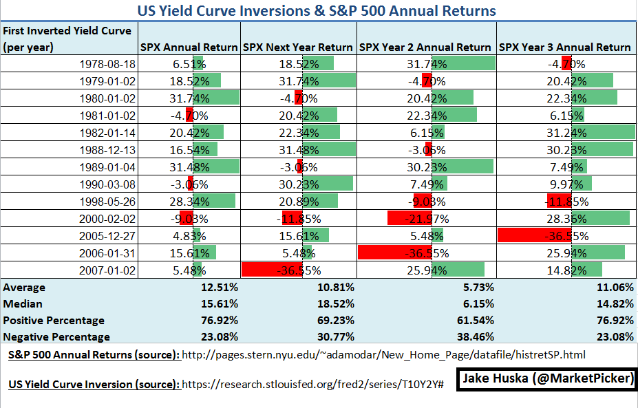
I created the table above to look at the annual performance of the S&P 500 in the years following an inverted yield curve. Going back four decades, I looked at the first time the U.S. yield curve became inverted (i.e., the spread between the 10-year treasury and the 2-year treasury becomes negative) for each year. I then looked at the annual returns for the S&P 500 for that year (see “Annual Returns” column in the table) as well as the following three year returns.
What I personally gleaned from this study is that during the past forty years, an inverted yield curve (defined as the spread between the 10-year treasury and the 2-year treasury being negative) does not automatically translate to poor market performance. Specifically, you can see that the average and median annual returns for the S&P 500 are positive double-digits the year during a yield curve inversion as well as the year following a yield curve inversion. Moreover, you can also see that the market is positive nearly 77% of the time at the end of a year that had an inverted yield curve; the market is still positive nearly 70% of the time at the end of the year following an inverted yield curve. Of course, these numbers drop noticeably after the second year following an inverted yield curve. This echoes back to what Charlie Bilello said in his article (emphasis mine): “The past nine recessions in the U.S. were all preceded by yield curve inversion, with an average lead time of 14 months.”
While the economy is not the stock market (and vice versa), an inverted yield curve does not appear to spell immediate danger to equity investors based on historical evidence. In fact, as the table above shows, there were several occasions where an inverted curve led to several back-to-back positive double-digit annual returns.
Of course, it would be wrong to not address the two elephants in the room: 2000-2002 and 2008. You can see the annual returns for the S&P 500 following the yield curve inversion in early 2000 led to significantly negative annual returns (-9.03%, -11.85%, and -21.97%). In addition, the year following the inversion at the beginning of 2007 preceded the market closing down -36.55% for the year in 2008. These aren’t minor drops in the market by any means.
So where does this leave us now? I wish I could give you a definitive answer as to the future direction of the market. Based on some anecdotal evidence, it does seem that the so-called “smart money” is leaning more bearish on the market, but this is hardly actionable. There appears to be a disconnect between the predictive power of an inverted yield curve signaling a soon-to-be economic recession and the actual returns in the stock market (at least in terms of the annual performance of the S&P 500). While it is impossible to ignore what occurred in 2000-2002 as well as in 2008, there is little evidence that the U.S. economy is headed for another recession any time soon, especially like those seen in the early and mid-2000s. This certainly isn’t to say that the market can’t have a price correction(s). But to pound your fist and practically yell that the U.S. stock market is about to crash based on a single data point is not only misleading but is irresponsible. And remember that for all this talk and analysis, the U.S. yield curve is not inverted! Forming narratives based on single data points is simply reckless.
As I wrote in a recent SeeItMarket post: “no matter who you are as a market participant – a long-term investor saving for retirement or the more active retail trader – always take bold calls and predictions with the smallest grain of salt. Recognize that ‘professional prognostication’ is Wall Street’s word for marketing. Do not focus on what is outside of your control. Instead, focus on what you can control: your actions.”
Thanks for reading. And please let me know if you have any questions or comments.
Twitter: @MarketPicker
Any opinions expressed herein are solely those of the author, and do not in any way represent the views or opinions of any other person or entity.

: Showing Some Signs of Emerging Strength")
