The past few weeks have flipped the script on the treasury bond market, as bond yields (interest rates) have soared higher. Are market participants leery of inflation. Will the Federal Reserve start a new rate hike cycle? Is it something else?
The charts have yet to confirm that a new interest rate bull market is upon us. BUT, the charts are also at critical junctures that may ultimately decide this question.
For obvious reasons, what happens at these key junctures (see charts below) will help determine portfolio positioning going forward.
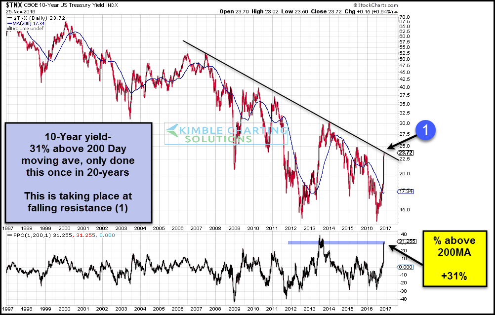
Let’s start by taking a look at the 10 Year Treasury Bond Yield (INDEXCBOE:TNX). It’s fair to say that we haven’t seen too many times that it’s been this far above its 200 day moving average. As you can see, it’s testing important downtrend resistance right now (chart through Friday).
10 Year Treasury Bond Yield Chart
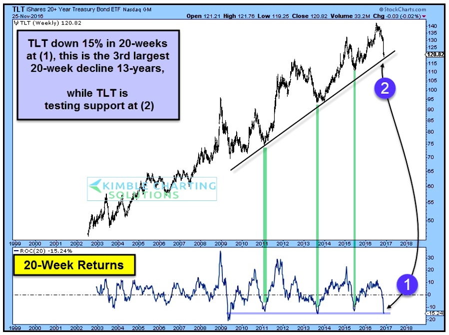
Turning to the popular 20+ Year Treasury Bond ETF (NASDAQ:TLT), we can see the steep decline. When bond prices fall it means yields are rising. We shorted bonds back in July and covered the trade recently – got lucky and caught one of the largest 20 week declines in the history of TLT. Interesting times in this complex. Chart below is through Friday.
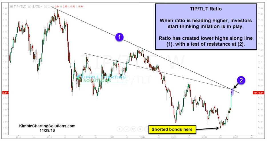
Lastly, let’s take a look at an important treasury bond “ratio” (inflation protected securities – $TIP (NYSEARCA:TIP) vs long-dated treasury bonds – $TLT). Concerns about inflation are rather quiet right now. But they won’t be if this breaks out!
Thanks for reading.
Twitter: @KimbleCharting
Any opinions expressed herein are solely those of the author, and do not in any way represent the views or opinions of any other person or entity.

: Showing Some Signs of Emerging Strength")

