It’s amazing to watch the stock market maintain a bid off throughout recession-like economic data. No matter how you read the economic data, track it, or concern about it, apparently it continues to be good news for stocks. Or, that is, until is isn’t. Check out @MishGEA’s take on the consumer after this week’s retail sales. I’m not a fundamentalist, but I respect Mish’s work and always take note when he speaks up. Also, check out @EddyElfenbien as he notes that industrial production fell for the fifth straight month.
But, as most traders are aware, the market is not the economy! So let’s check in on the price action.
Flows and Internals
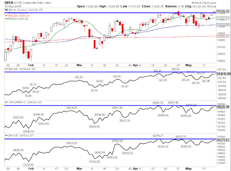
Checking in on the NYSE Composite Index and several related breadth indicators, we see a slight divergence in the A/D lines and volume. It’s a concern that may set up for a false breakout or moderate correction, but really it’s not a huge divergence like we saw during the 2007 market top.
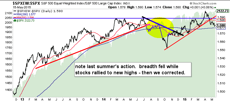
The S&P 500 Equal Weighted Index (SPXEW) continues to under-perform the S&P 500 (SPX). This is not a good look as we hit new all time highs.
The most recent example of the market advancing with lagging breadth was last September, which lead to the Fearbola pullback.
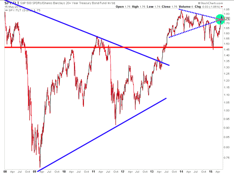
Now let’s take a look at the stocks to bonds ratio, which looks at the ratio of the S&P 500 ETF (SPY) to 20+ Year Treasury Bond ETF (TLT). This important ratio broke key resistance last week on a sharp run higher. It’s worth eyeing for the next couple of weeks to see if it follows through. Keep in mind this is just one of many measures that are testing key levels. Also a breakout doesn’t mean stocks have to go up, but it would provide a nice little tailwind. It could support a rally to new highs, but we also have to be mindful of breadth, which is thinning.
Sectors
What’s been evident across the market is that buyers and sellers have remained patient and crossed each other out in what appears to be a range-bound market.
I explained previously why i’m not a big fan of financials here. I need to see something other than JP Morgan hitting new highs. Sector breadth is also lacking (similar to the overall market).
Agribusiness continues to be a leader. I highlighted some of the better looking Ag names on Tuesday.
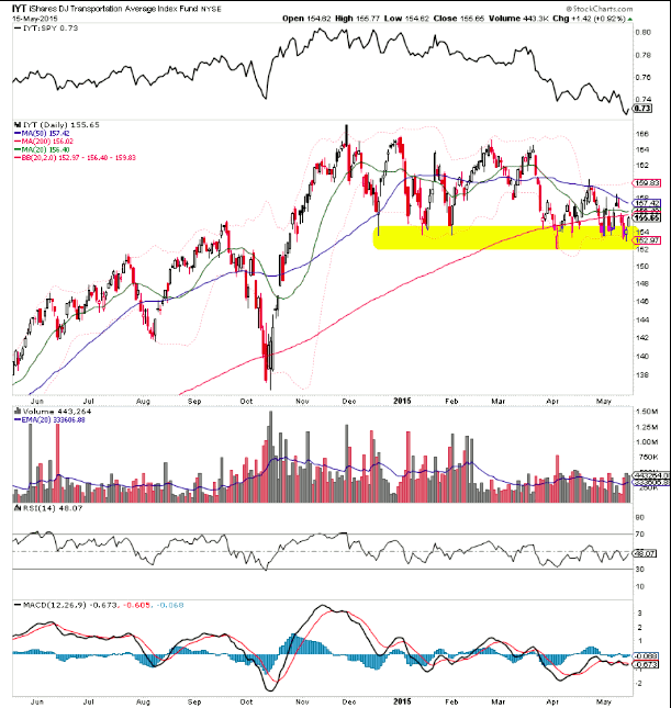
The Dow Jones Transportation ETF (IYT) caused a big scare mid-week, mainly because of the rails, which carry an unusually heavy weight within the index. It’s amazing how this thing keeps finding a way to bounce at support. But, at the same time, it’s causing a notable divergence with the Dow Industrials.
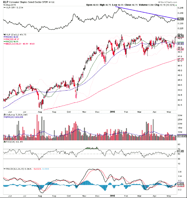
The Consumer Staples surged strongly at the end of the week and may set up a price and relative strength breakout.
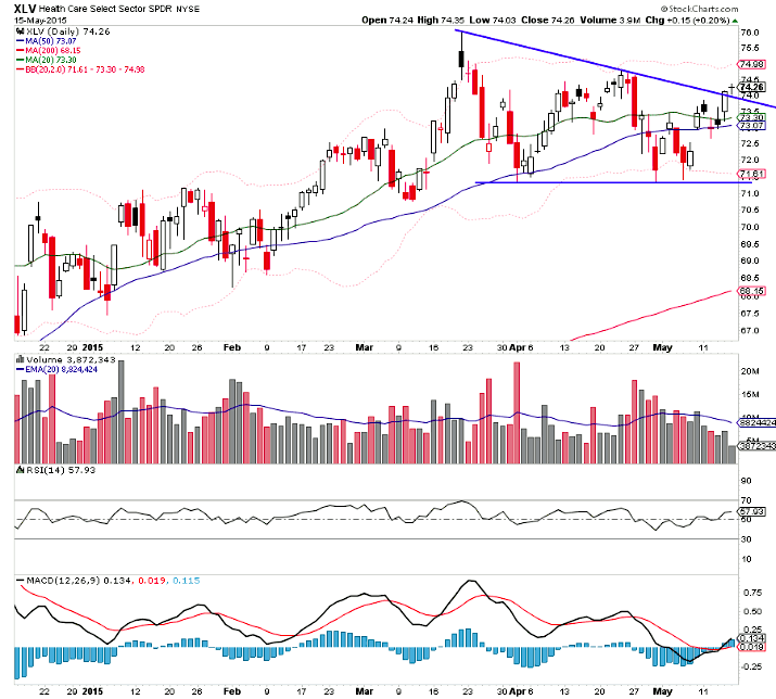
The Health care Sector ETF (XLV) and the Semiconductors ETF (SOX) broke two touch descending trend lines. That said, both are still working through horizontal resistance. XLV is shown below.
Bonds
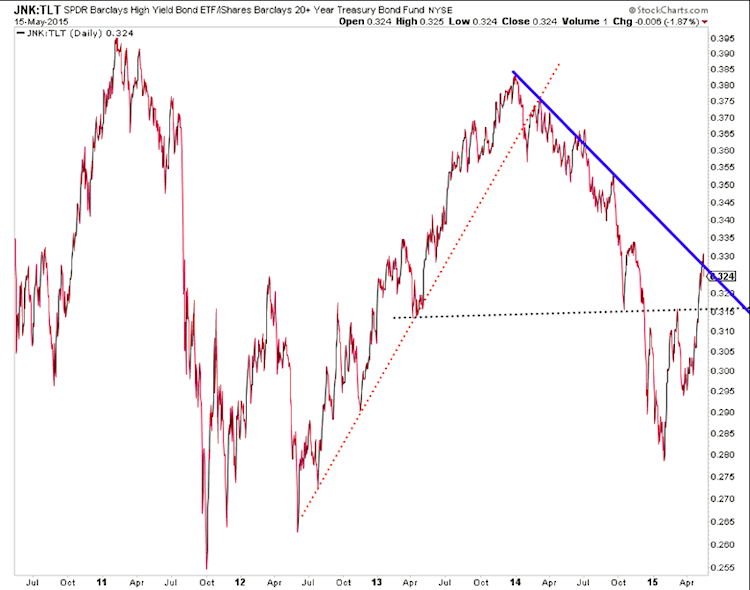
We’re in a yield hungry world filled with underfunded pensions. And this may be related to the recent out-performance of high yield bonds relative to treasuries, bunds, etc – See the ratio chart below of the Junk Bond ETF (JNK) to TLT. Perhaps when treasury yields are too low, money flows to the more acceptable yields. These ratios sure haven’t been a risk-on, risk-off indicator over the last year or so.
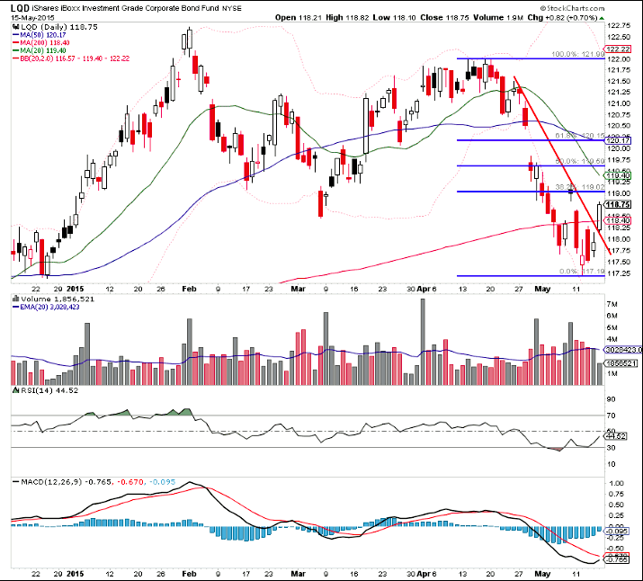
Bonds from TLT to LQD (Investment Grade) ended the week breaking short-term downtrends after flashing divergences at the lows. 120 on LQD could be an interesting area to get short. Check out @jbeckinvest’s post noting evidence of steepening yield curves.
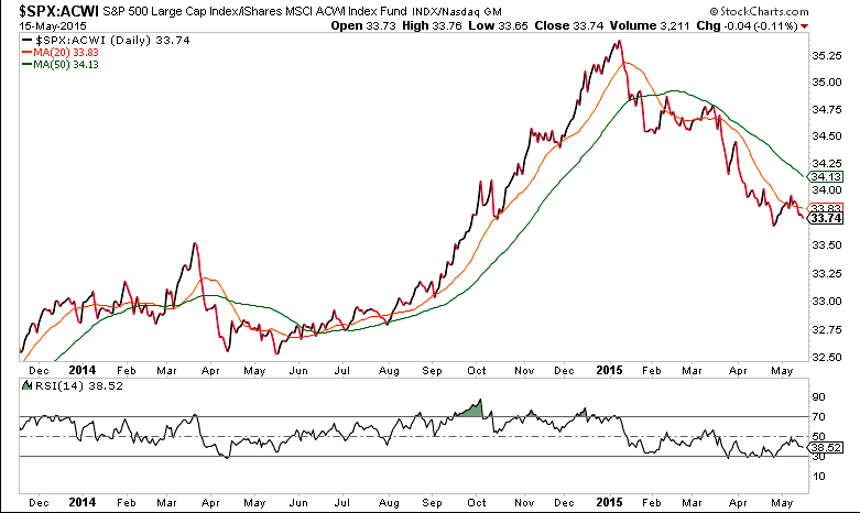
Overseas
Global Markets in 2015 are still not a U.S. based story as the S&P 500 reverses much of last years gains relative to the world (via the ACWI Global Index).
Thanks For Reading!
Follow Aaron on Twitter: @ATMcharts
Read more from Aaron on his blog.
No position in any of the mentioned securities at the time of publication. Any opinions expressed herein are solely those of the author, and do not in any way represent the views or opinions of any other person or entity.

 Rolling Over At Key Fibonacci Level?")

 Rolling Over At Key Fibonacci Level?")


