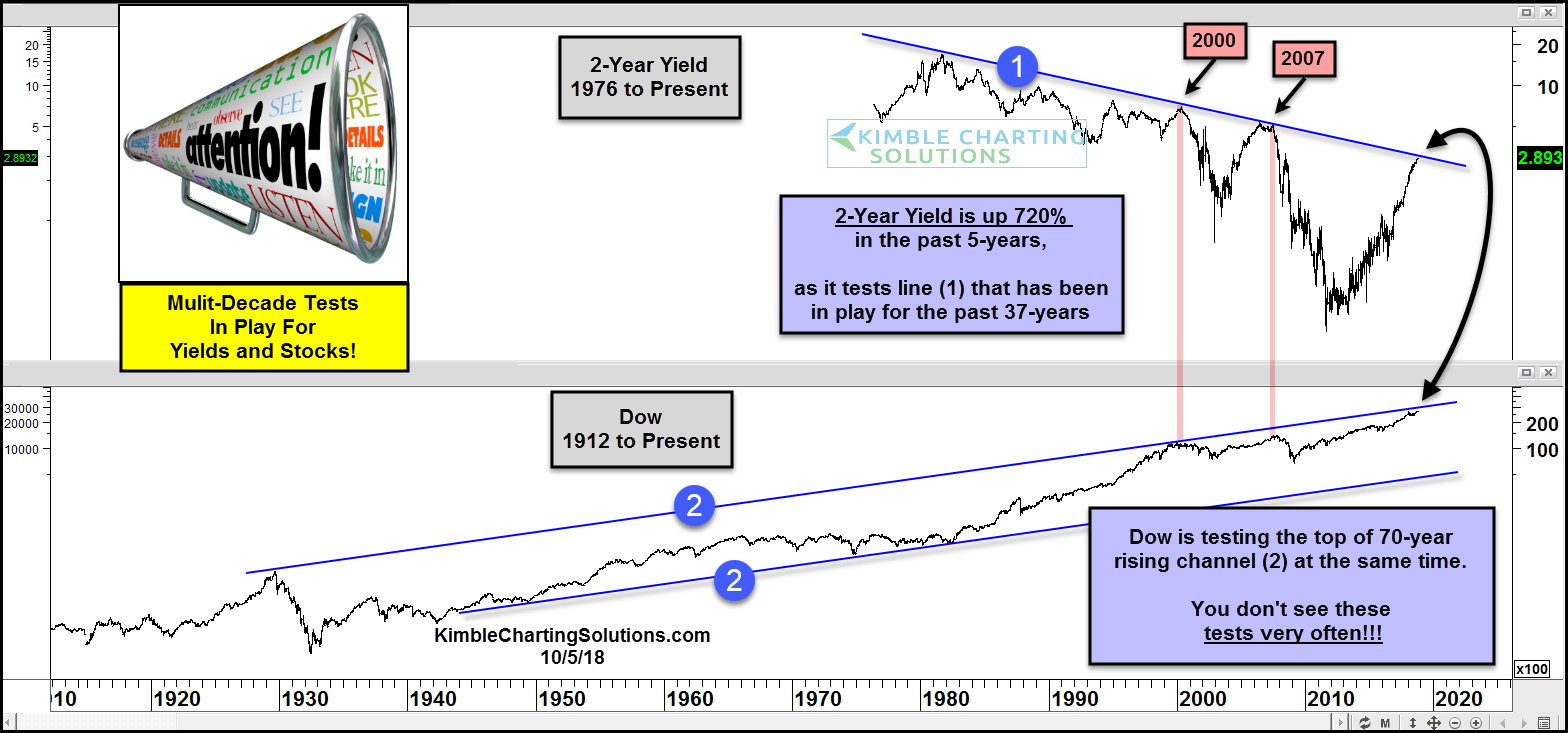
At what point does the rise in treasury yields (and interest rates) matter to the economy and stock market?
Today’s chart looks at the past 4 decades of the 2-year treasury note yield versus the stock market (the Dow Jones Industrial Average).
As you can see in the chart below, the 2 year treasury yield has been in a downtrend for quite some time (1).
A steep rally in 2-year rates has yields testing this down trend line right now.
The past 2 times the downtrend line was tested were in 2000 and 2007 – both resulted in bear markets!
It’s also notable that the Dow Jones Industrial Average is testing upside resistance within its long-term uptrend channel (2)… it did this in 2000 and 2007 as well.
You don’t see stocks and yields testing mult-decade lines at the same time very often!
2 Year Treasury Bond Yield vs Dow Jones Industrials Chart
Note that KimbleCharting is offering a 30 day Free trial to See It Market readers. Just send me an email to services@kimblechartingsolutions.com for details to get set up.
Twitter: @KimbleCharting
Any opinions expressed herein are solely those of the author, and do not in any way represent the views or opinions of any other person or entity.


