What is the S&P 500’s best single-day performance of 2014, year-to-date? +1.55% or + 28.7 points to 1873.91 on March 4, presumably sparked by Russian President Vladimir Putin’s conciliatory comments regarding Ukraine and a not-yet-annexed Crimea following signs of heightened belligerence and growing expectations of war the day prior.
And yesterday’s close, 10 weeks later? 1872.83, or -1.08 points.
Maybe more than any other, that stat is the best, simplest expression of the congestion the Large Cap equities (Small Caps, not so much) have been aimlessly churning through.
Working toward the end of a May in which any “market” seems to have already gone away (without selling) and just ahead of the Summer doldrums, the S&P 500’s (SPX) stagnation begs the question: when will stock market volatility return; and what will it look like when it does?
As these environments do, the gnawing uncertainty of this period of price congestion has prompted a lot of new and newly dusted-off volatility analysis, mostly of the VIX and it’s volatility term structure. Out of this body of commentary, a couple of noteworthy themes have emerged:
- The VIX’s can’t stop reverting to its 12 handle (or producing the brief, violent pops that keep appearing in between visits to that level); and,
- As a function of the broad divergence between Small Cap and Large Cap performance, a record disparity has developed between short-term Russell 2000 (RVX) and S&P 500 (VIX) implied volatility:
$IWM Small Cap v. Large Cap S/T Implied Volatility: Widest Gap Ever? $SPY $RVX $VIX https://stks.co/q0K0D
— Andrew Kassen (@andrewunknown) May. 14 at 11:04 AM
That said, here’s a study that steps away from dedicated volatility products to answer the volatility question befuddling the market.
Below is a 10-year chart of the S&P 500 (2004-2014) overlaid with Bollinger Bands (BB). Just in case you’re unfamiliar, BBs are designed to track the running standard deviation (usually 2, as in the case below) from a simple moving average of price (usually 20 periods). In other words, they’re a simple trailing measure of recent volatility. Where the bands are closer together, the standard deviation has trended lower, and vice versa. To measure this easily, underneath the price chart you’ll find Bollinger Bandwidth (BBW), an indicator that is like a gestalt of the BBs, designed to the distance between the bands.
The vertical lines denote 12 occasions over the last 10 years where the BBW has troughed below a reading of 0.1. Over this lookback period, these are the points where historical volatility has been at it’s absolute lowest. At 0.06, the current (and 13th) trough is the lowest and most persistent since mid-2006.
Volatility Ahead: S&P 500 (SPX) Bollinger Bands Tapered to Historic Low (click image to zoom)
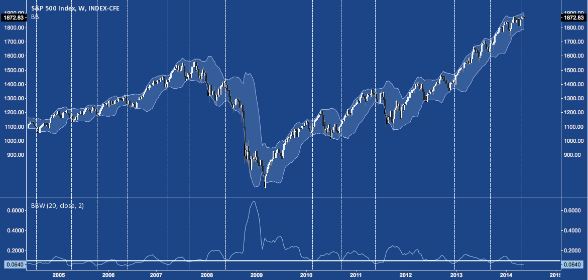
In general, volatility is a mean-reverting function: it captures the tension Sisyphean struggle markets go through as they constantly seek stasis but are consigned (by the humans that create them) to endlessly careen through periods of disequilbrium. The flip side of this is that periods of volatility generally following periods of equilibrium. Here, a BBW reading below 0.1 (read: the S&P’s current congestion zone) is relative equilibrium.
To quantify this in light of the chart above, in the table below I’ve broken down the 12 historic “BBW <0.1” occurrences noted. Here, you’ll find the closing price at each trough, the net change over the previous 5, 10, and 20 weeks prior to the trough; and the net change in the 5, 10, and 20 week periods that followed, expressed both in points and in the % range covered, as measured close-to-close (click image to zoom).
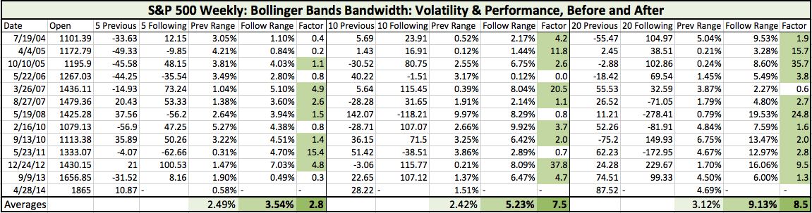
Here are the main takeaways:
- The range the S&P puts in following the BBW trough is usually a multiple of the range preceding it. SPX get’s much more volatile.
- How much more? The “Factor” column measures the multiple:
- In the 5 weeks following these troughs, the S&P is 2.8x more volatile.
- In the 10 weeks following these troughs, 7.5x more volatile.
- In the next 20 weeks, 8.5x more volatile.
- Going out further in time, the likelihood the “following” period will be more volatile than the “previous” period increases. By the 20 week mark, 11 of 12 troughs have produced a (in some cases, much) more volatile period. The only exception is March 2007, with all the “deep breath before the plunge” connotations that date carries.
Volatility will return. With a glance at how long the S&P’s BBW persists below 0.1, it will happen quite soon (expect a delay of the Summer doldrums: at least in price, if not in volume); and it’s highly likely to happen from this historically low level.
Twitter: @andrewunknown and @seeitmarket
Author holds no exposure to securities mentioned at the time of publication. Commentary provided is for educational purposes only and in no way constitutes trading or investment advice.
Any opinions expressed herein are solely those of the author, and do not in any way represent the views or opinions of any other person or entity.


")


