In recent weeks we’ve discussed the market’s very bearish intermarket posture.
Nothing has changed there, but there are a few things worth noting.
The Sentiment Inflection
First of all, the news from Wednesday night into Thursday was an inflection point in investor sentiment with the NBA halting its season and Tom Hanks sharing that he has coronavirus.
Interestingly, now famous options trader ‘50 cent’ sold his long volatility position from Mid February. Note that there was also continual short covering around S&P 500 Index price level 2500 on Thursday and Friday.
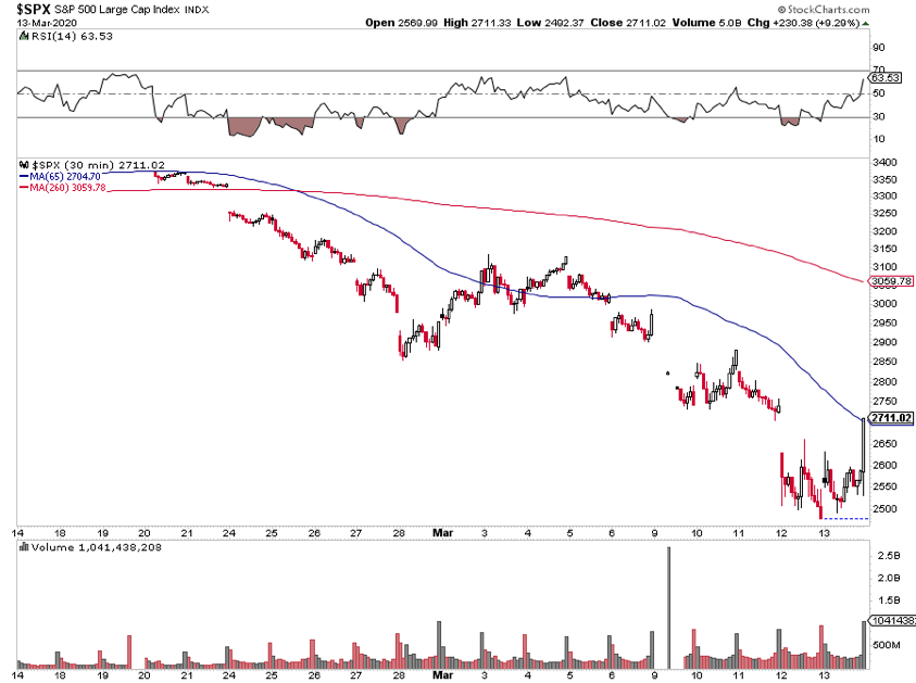
For the S&P 500 Index, 2500 is a clear line in the sand for now. It could just be a case of a sentiment inflection point being a reasonable place for professionals to get out of shorts.
As we all know, the best rallies happen in bear markets and risk management is job #1.
The leaders and the best?
Over the past year, stock prices of the very best companies were pushed to incredible heights. If you look back just one year
$AAPL +53% YoY
$MSFT +40% YoY
$SHOP +87% YoY
$AMD +88% YoY
Sure these stocks are down sharply, but it’s not like these are incredible relative prices either.
That said, these leaders are all testing and bouncing from their 200 day moving averages. Last week’s lows are now key reference points with the technology sector’s relative strength hitting new highs.
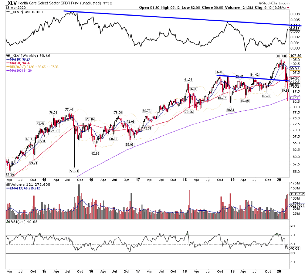
Other pockets of relative strength are emerging as well. It doesn’t take a CFA charter or CMT designation to figure out a ton of money is flowing into healthcare. Healthcare ETF XLV is just now bouncing at the 200 week moving average while relative strength is ripping higher.
A paradigm shift in energy
After last weekend’s Russia oil news, something remarkable happened in energy. All of a sudden, Marcellus Shale names became where you want to be in Energy. You can see things like COG, EQT, SWN and CNX are immediately turning up in the relative rotation graph.
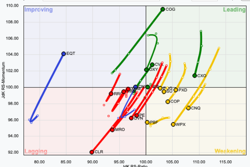
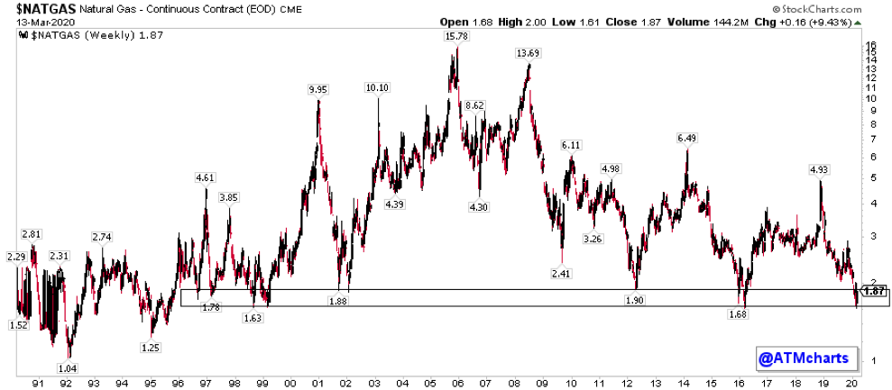
Why is this? The Marcellus produces much more gas than oil so these companies are less levered to gas. When other places that are levered to oil cut production, that reduces supply of natural gas as well. A huge balance shift is happening before our eyes. The chart of natural gas shows prices are at THE floor from the mid 1990s. This is one of the best risk-reward longs in the book.
Downside risk is still very high
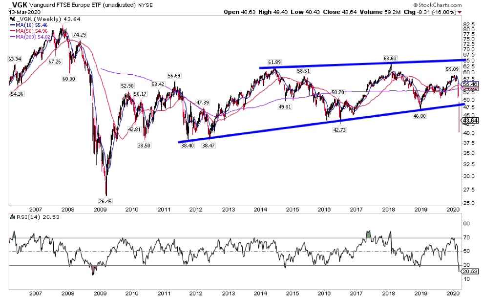
While the US has many short term lines in the sand to position against, many broad based Europe ETFs look like VGK. Decade long gradual rising channels have broken lower after unimpressive bounces from the 2018 low. Unless this recent move completely reverses and then some, the risk is so high no reward is really worth it.
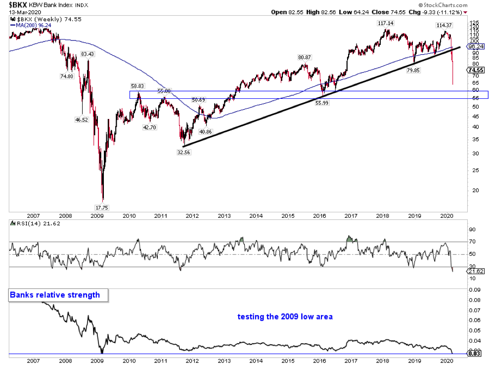
Banks relative strength is testing the Financial Crisis lows after Banks confirmed a double top, broke the uptrend from 2011 and have fallen into a downtrend.
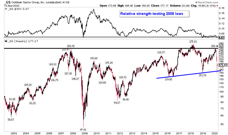
Goldman Sachs is the financial to watch. Is this a massive top from 2014 at the top of a range?
In times like these, it doesn’t matter what your timeframe or strategy is. What matters is how you execute and adapt. It’s helpful to write up and rehearse entry and exit plans ahead of time so you’re ready to take action when the time comes.
Thanks for reading. Trade ‘em well.
Twitter: @ATMcharts
Any opinions expressed herein are solely those of the author and do not in any way represent the views or opinions of any other person or entity.


