Intermarket analysis is simple.
We measure two assets against each other. We want to see the riskier asset trending higher in bull markets.
When we look through many intermarket charts today; they are not.
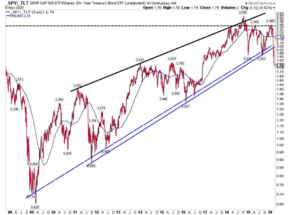
Stocks vs long term treasuries continued their move lower and are further breaking the bull market uptrend. This was prime for some reversion and we just didn’t get it.
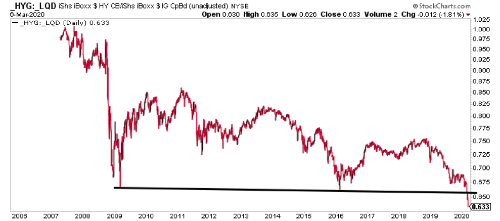
High Yield relative to Corporate bonds also broke down further below the 2009 low this week.
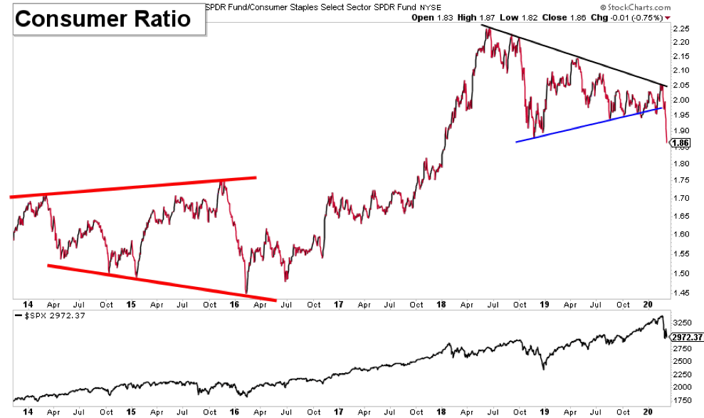
The consumer ratio failed to confirm the entire 2019 rally. It’s been a long lasting divergence and just recently it broke down.
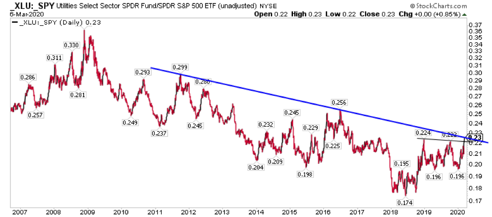
Utilities relative to the S&P 500 has trended lower for a decade. Now it’s broken a 1 year range higher and is testing the broadest the trend into Monday’s open (at the time of writing futures are limit down (5%) and this appears to be set to break out.
Obviously, these tools aren’t timing tools. Say what you will about that, but the broad strokes message is bearish and has gotten substantially more negative in recent weeks.
These are big picture signals. So if you’re tactical and think the market is going to hold the recent low area, consider shortening your time frame. If you’re an investor, you may want to consider saving some of that dry powder and/or figure out a plan for raising cash into rallies.
Thanks for reading. Trade ‘em well.
Twitter: @ATMcharts
Any opinions expressed herein are solely those of the author and do not in any way represent the views or opinions of any other person or entity.
: Cup (and Maybe Handle) Watch")
 Trading Near Top Of Price Range")
 Reaches Important Price Support")