It’s a stock picker’s market. Or markets (3 or 4 of them), if relative strength across capitalizations has anything to say.
Though yesterday’s trade ended solidly in the red, the Dow Industrials (DJIA) and S&P 500 (SPX) maintain a sanguine outlook, holding just off their respective all-time highs. Staking some middle ground, the S&P Midcap 400 (MID) and the NASDAQ 100 (NDX) find themselves in a more somber mood with MID -3.38% off April’s all-time highs, and NDX -4.85% of March’s 14-year high. Meanwhile, small caps increasingly occupy a world unto themselves, with the Russell 2000 (RUT) taking last place, nearly doubling NDX’s decline at -8.9% off March’s all-time high. To really complete the composite picture, the Russell Microcap Index (IWC) finished yesterday -12.31% off March’s all-time highs and on April’s lows – under-performing both the Dow and S&P by more than -10%.
All told, the massive performance disparity across broad stock index continues, with a top-down relative strength regime firmly in place. The outsized deterioration in small-capitalized (and more US Macro-sensitive) companies is an remergent theme over the last couple months that may be signaling a secular shift away from them; or at least has significant cyclical implications as a canary in the coal mine, chirping rumors of broader risk aversion to come.
If so, expect an affirmative answer to the question on everyone’s lips: yes, the small cap selloff contagion will make the jump to its larger peers.
But what signs are there that large caps may succumb here? After all, isn’t price itself suggesting just the opposite? Less superficially obvious but equally important is the defensive position Large Caps have taken up under the surface. This becomes evident with a glance at the S&P’s current sector orientation (as we described more fully last month over here), where Energy and Defensive components are well out in front:
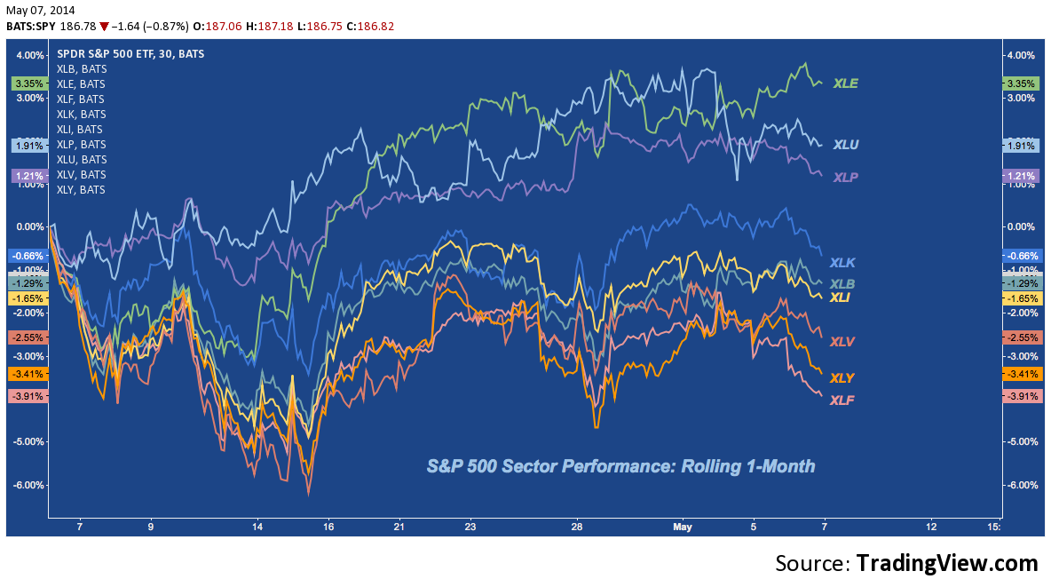
For all the speculation and stupefaction over the S&P’s resilience and whether the risk-off contagion evinced by small caps and tech will become a market cap pandemic, it’s essential to grasp a single underappreciated fact: Peak-Cyclicals (XLE, and to some extent XLB) and Defensives (XLU, XLP) are the components holding the S&P up. Large caps may be levitating above high beta; but they’re hardly oblivious or content, whatever the numbers at the closing bell each day may say.
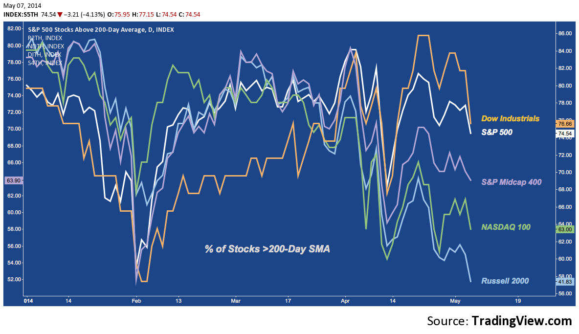
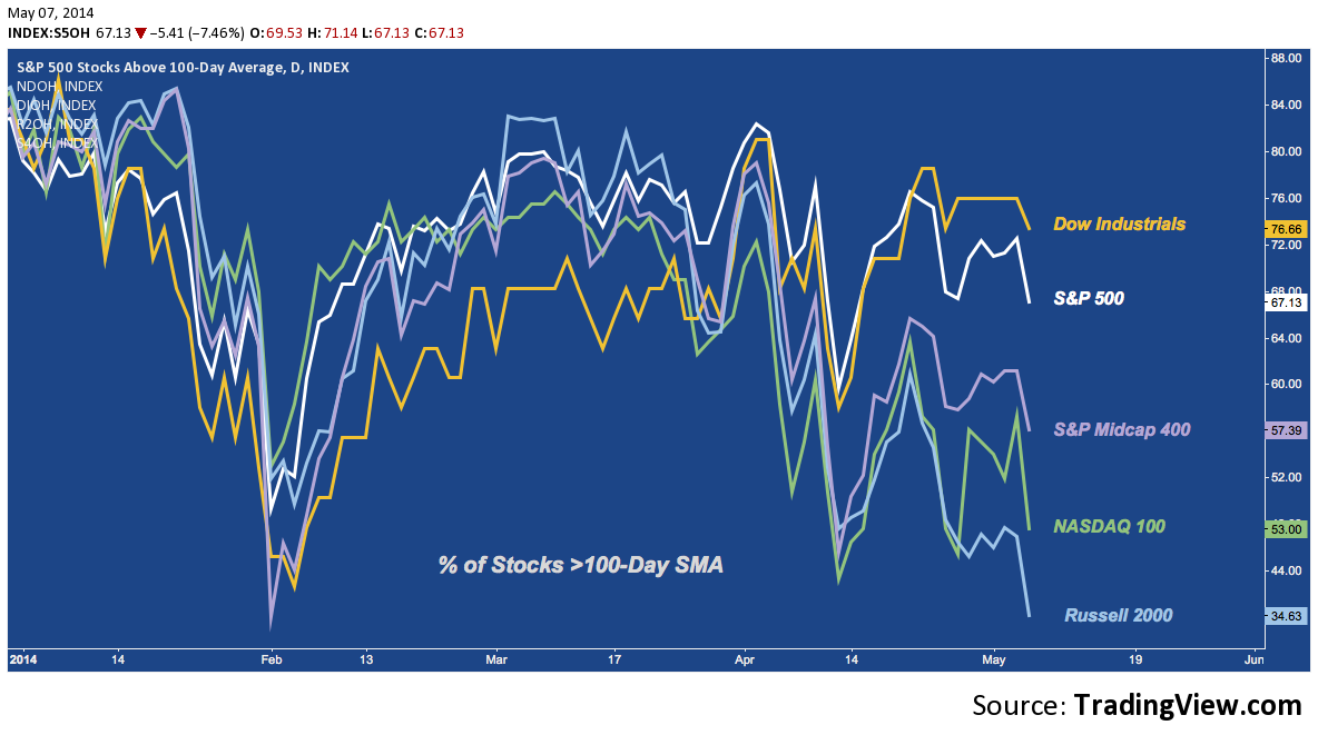
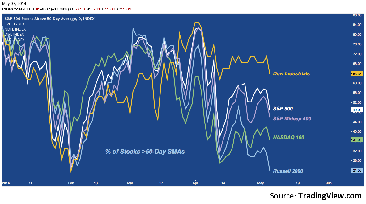
If yesterday is indicative (remains to be seen), large caps could be ready to wake up from their oblivion. One effective way to test for this is to measure trend participation by looking across markets caps at what percentage of stocks are above their benchmark moving averages. Here’s a run-through beginning with the 200-Day Simple Moving Average (SMA). Amidst the established top-down RS theme, the single factor that really jumps out here is abrupt deterioration in the Dow and S&P:
Percentage of Stocks Above Their 200-Day Simple Moving Average (SMA)
Percentage of Stocks Above Their 100-Day Simple Moving Average (SMA)
Percentage of Stocks Above Their 50-Day Simple Moving Average (SMA)
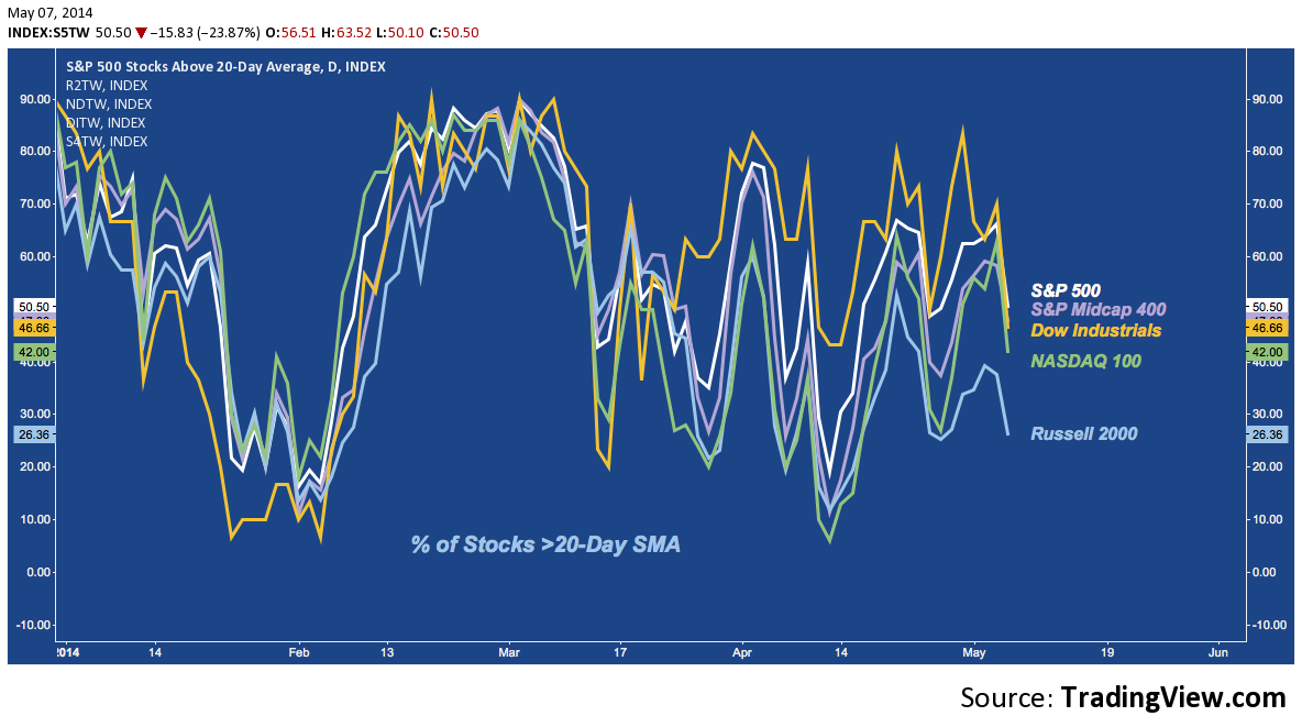
Percentage of Stocks Above Their 20-Day Simple Moving Average (SMA)
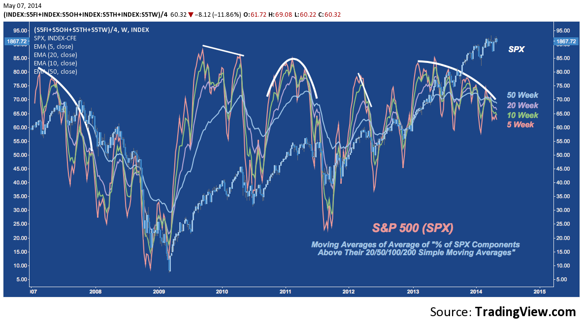
Pulling these “Percentage of stocks above their 20/50/100/200-Day SMA” stats on the S&P 500 together into an average and then smoothing that with moving average lookbacks over different time frames yields the chart below. With the exception of the volatile 5-week average, each is are back to where it began 2013. That could set the stage for an impressive rally, if the S&P weren’t +30% over the same timeframe. These divergences typically end poorly, with price eventually folding as ground gives way beneath:
Jumping back to looking across market caps, here’s another composite: this time simply averaging DJIA, SPX, MID, NDX and RUT and overlaying it with Bollinger Bands. As the Bollinger Band Bandwidth (lower panel) shows, taking the entire market cap spectrum into consideration (from the subdued to the volatile), US equity volatility more compressed now than at any other time going back to Q2 2007. 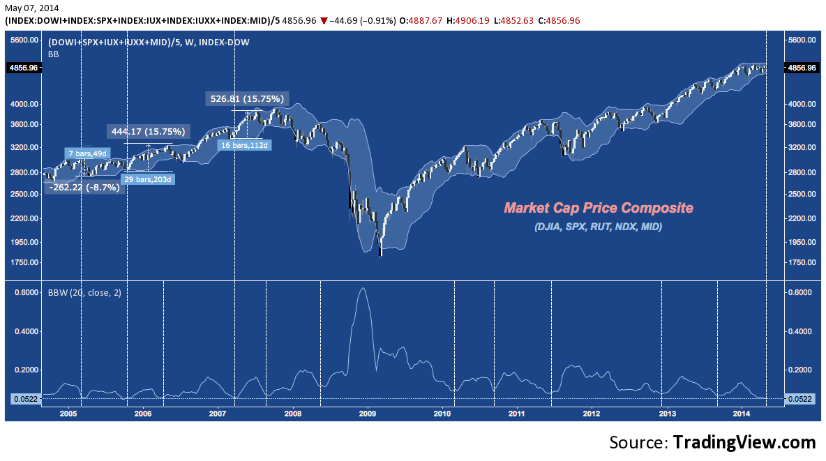
This is in line with the current low-volatility regime on the VIX that echoes the 2005-2007 period. But note that even in that period, when composite volatility was cinched this tight, significant directional moves unfolded over the next 2-6 months (to say nothing of the much larger moves that built from compression troughs at higher levels). Another such period is close at-hand, and this time it looks as if Large Caps won’t be immune.
Twitter: @andrewunknown and @seeitmarket
Author is net short exposure to the Russell 2000 index at the time of publication. Commentary provided is for educational purposes only and in no way constitutes trading or investment advice.
Biohazard image courtesy of commons.wikimedia.com
Any opinions expressed herein are solely those of the author, and do not in any way represent the views or opinions of any other person or entity.


