When I’m interviewing people I love to ask them what their ‘One Chart’ is.
Their One Chart is the chart that gives them the best overall read on the overall market environment, other than the S&P 500 Index.
Today my One Chart is the S&P 500 Index. However, this particular chart shows overall breadth indicators at the bottom.
Note that you can watch my in-depth video on “One Chart” on my YouTube channel.
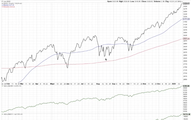
On this chart you can see the closing basis with the 50 and 200 day moving averages.
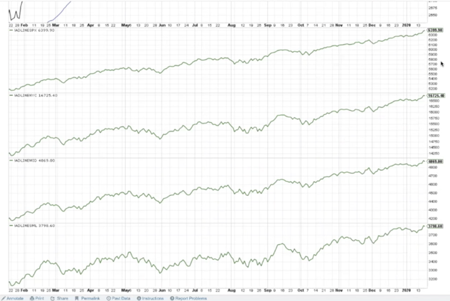
Below there, I am looking at breadth in the form of the cumulative advanced decline line for the S&P 500 at the top, then the NYSE (New York Stock Exchange), followed by the large-cop index and the small-cap index.
Part of my normal weekly review process is to look at these cumulative advanced decline lines and what I’m noticing is that all four of them have made new highs again this week. What has happened a number of times and again in the most recent couple of weeks is you have had higher-highs in the S&P 500, the NYSE a little more flat, then a few weeks ago you had the mid-cap and small-cap index sloping downward.
That meant that while the cumulative advanced decline line, the overall breadth measurement, in the broad or large and mid-cap space was getting stronger, the breadth in the mid-caps and small-caps was actually not confirming that uptrend. There was a bit of potential divergence there, which didn’t feel great.
What has happened though is that in the last week is that they have all resolved to the upside. So the S&P 500 advanced decline line has continued higher but also the S&P mid-cap index and small-cap index – all of their breadth lines have also confirmed that up line.
These lines are all color-coded green because that trend is positive.
The reason why this is my One Chart is because at some point you will start to see a weakness in breadth. If you look back in September of last year, you tend to get weaker breadth, a weaker advanced decline line, in the small and mid-cap space because that is a little more speculative of when people begin to take the foot off the accelerator of their positions and you start to see it in the small and mid-caps before you’ll see it in large-caps.
This is a key chart to watch because I’m waiting to see when those lines turn downward.
Twitter: @DKellerCMT
The author does not have a position in mentioned securities at the time of publication. Any opinions expressed herein are solely those of the author, and do not in any way represent the views or opinions of any other person or entity.


