For this week’s One Chart, I’m examining a 10-Year chart of the S&P 500, however, at the bottom of this chart we have two key breadth measures.
The first is the percent of stocks in the S&P 500 above their 200-day moving averages, and at the bottom are the S&P 500 names above their 50-day moving averages.
I feel this is an important chart because if you look back at the last 10 years, overall we have been in a secular bull market – and for the most part – a cyclical bull market as well.
A few notable exceptions have been in 2015-2016, and 2018 (arguably cyclical bear markets within these periods), but overall the trend has gone up and to the right.
If you look at the second panel, which is the percent of stocks above their 200-day moving average, you’ll notice that in this overall bull market phase, when the market sells off, one of two things tends to happen:
1. You tend to find support at the 50% level, meaning we drop to about 50% of S&P stocks above their 200-day. And that’s about it. You might see it go a little bit below 50%, but then comes right back up. So the pullbacks in 2012, 2014, 2016, 2018, and 2019 – these all fit this characteristic. When the market overall is trending higher, these end up being relatively buyable pullbacks when it gets down to 50% and it doesn’t go much below that.
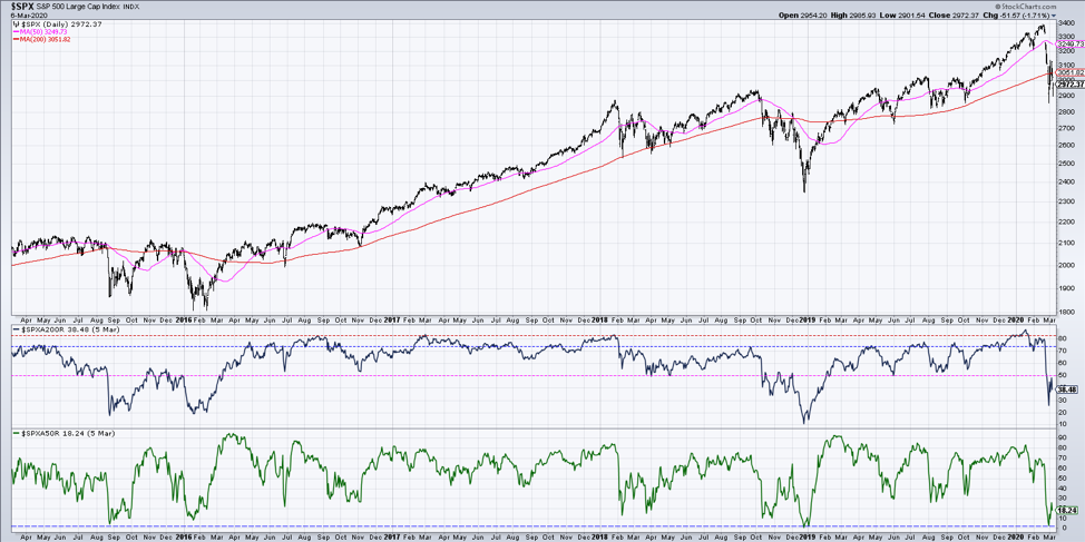
2. If you look at the other times, when it went right through that 50% level and kept going, this tells you it is a deeper time and/or price correction. This happened in 2011 when we broke right through the 50% level. The S&P 500 rallied after that first low but ended up finding a lower low before the trend reversed and went back up. We also saw this again in 2015 where it went down below 50%, had a lower low, then resolved higher.
Maybe the one difference was in 2018, but not really. We broke down below 50% in October for the first initial pullback, then found a lower low toward the end of 2018 (market low Christmas Eve) as the breadth measure bottomed out around 10%. Coincidentally, this is right about where it bottomed out in 2011 as well.
That brings us to where we’re at today. One of the issues I have for those who believe this is simply a shallow pullback, or more of a V-bottom or a great opportunity to buy on weakness, is that I am seeing us blow right through this 50% level (which we have done in the last week). This tends to signal a deeper correction in both time and price.
In each one of those cases over the last ten years the market has seen a lower low before eventually recovering. Therefore at this point, I’m feeling the market has more time and price to go on the downside before we can say this downtrend/pullback/corrective period is anywhere near over.
To watch this in video format, just head over to my YouTube channel!
Twitter: @DKellerCMT
The author does not have a position in mentioned securities at the time of publication. Any opinions expressed herein are solely those of the author, and do not in any way represent the views or opinions of any other person or entity.

: Showing Some Signs of Emerging Strength")
