Call it one part quarter-end window dressing, one part compulsory and indomitable Fed-fueled optimism; and one part “taper” fatigue: the Great S&P 500 Pullback underway since May 22’s all-time high at 1687 is almost 50% retraced.
The S&P 500 (Symbol: SPX) remains over 4% off its highs, but after 4 up days in a news cycle awash with Fed officials walking back Ben Bernanke’s uncommonly hawkish commentary on June 19, one can’t help but ask: “Was that it?” for the Summer Swoon of 2013?
To put the last several weeks in perspective, take a look left at the full scope of the S&P’s recovery off its March 2009 low. Since the market bottomed then, 7 up-legs have been installed by SPX, with 7 mediating corrective legs down.
Surprisingly (maybe some recency bias at work), the latest leg up (measuring from the mid-November 2012 trough to May 22, 2013) was smaller than average.
More surprising: despite the quasi cross-asset class mini-panic of late last week, the current S&P 500 pullback is the smallest of the entire recovery (in terms of percentage; and third only to early 2009 and early 2010 by points).
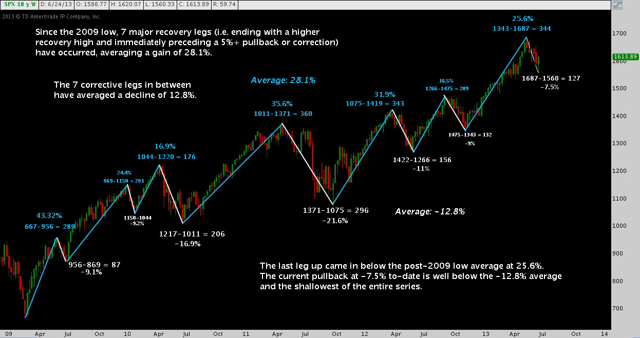
This chart is a call to stay flexible, with capital and market expectations. The bull market may be long in the tooth; or it may be in the first days of another double-digit run up. Either way, this S&P 500 pullback – barely half of the historical average presented here – may not be over.
Twitter: @andrewunknown and @seeitmarket
Author holds no position in the securities or instruments mentioned at the time of publication.
Any opinions expressed herein are solely those of the author, and do not in any way represent the views or opinions of any other person or entity.


