On Wednesday I had a conversation with Urban Carmel and Jesse Felder about measuring market breadth. If you are unfamiliar with Urban and Jesse, they are both great follows on Twitter and write must-read blogs. Urban recently wrote a post on breadth divergences being noise. He highlighted a couple of charts showing market breadth through an indicator showing the percent of stocks over the 50-day and 200-day moving averages. While this is one way of measuring market breadth, I agree with Urban that it can often create noise in our analysis.
However, in my opinion not all measures of breadth are created equal. In this post, I’d like to share my preferred method of measuring market breadth.
A couple times a month, I write a post titled Weekly Market Technical Outlook in which I analyze many of the same charts with updated analysis and market commentary. One of those charts measures market breadth, specifically through the Advance-Decline Line and the Percentage of Stocks Above Their 200-day Moving Average. As Urban pointed out, there can be quite a bit of back and forth in the breadth measure involving the Moving Averages. However, my preferred way of looking at breadth is through the Advance-Decline Line (A-D Line).
The Advance-Decline Line is a cumulative number of the daily net number of stocks rising or falling. If more securities on a specified index aere up one day then the A-D Line rises, and the opposite occurs when a majority of securities decline. Now there are different versions of the Advance-Decline Line, the most commonly used looking at all traded securities on the New York Stock Exchange (NYSE). The issue with using this version is it includes non-equity securities. This is why I prefer to look at just the Common Stock Only Advance-Decline Line for the NYSE as well as the S&P 500 A-D Line.
Below is a chart including both of these breadth indicators, along with the S&P 500 Index (SPX) by itself in the top panel. Since 2006 we have had just one negative divergence in the S&P 500 Advance-Decline Line and two negative divergences in the Common Stock Only version. A negative divergence occurs when an Index like the S&P 500 makes a higher high in price but this price action does not get confirmed by the indicator, as it makes a lower high. We saw this happen in 2007 in both of these measures of breadth and recently, if momentarily, in just the Common Stock Only A-D Line.
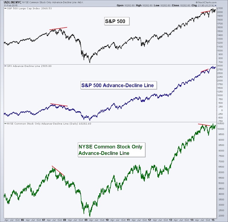
Market peaks in an index are often led by the degradation of the underlying securities of the index itself. Many stocks are likely to already be in a bear market before the S&P 500 puts in its final peak. Is it possible to still have periods of increased volatility without a bearish divergence in breadth? Of course. We saw examples of that in 2010, 2011, and 2012. But none of these led to bear markets or protracted down turns.
In my opinion, no indicator or set of data is perfect and nothing acts as a crystal ball for the market. However, by understanding and using tools that measure breadth, we are able to have a better understanding of the ‘health’ of a market. Currently, we have both versions of the Advance-Decline Line tracking higher with the S&P 500. Furthermore, neither measure of market breadth is showing warning signs of a protracted market decline. The bulls appear to still be in control.
The information contained in this article should not be construed as investment advice, research, or an offer to buy or sell securities. Everything written here is meant for educational and entertainment purposes only. I or my affiliates may hold positions in securities mentioned.
Follow Andrew on Twitter: @AndrewThrasher
You can also read more on Andrew’s Blog.
Any opinions expressed herein are solely those of the author, and do not in any way represent the views or opinions of any other person or entity.

: Creating Bullish Divergence?")


: Creating Bullish Divergence?")

