The past two years have seen headlines dogged by inflation and the Federal Reserve’s fight to end inflation.
That fight has seen the Federal Reserve raise interest rates over and over again… and 10-year treasury bond yields have followed suit and risen sharply.
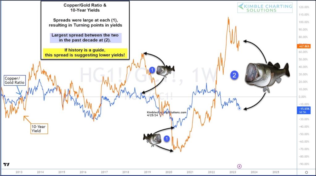
One ratio that we follow alongside the 10-year yield is the Copper/Gold ratio. It often hangs around the 10-year yields trajectory… until the spread gets too out of alignment and bond yields then come back to earth.
Today’s chart shows the last time we saw a “fish mouth” spread at (1) along with the current (and largest in a decade!) fish mouth spread at (2).
So the question is: Will one of the largest fish mouth spreads in the past decade resolve itself in lower bond yields (interest rates)? History suggests so. Stay tuned!
Copper / Gold Price Ratio versus 10-Year Treasury Yields Chart
Note that KimbleCharting is offering a 2 week Free trial to See It Market readers. Just send me an email to services@kimblechartingsolutions.com for details to get set up.
Twitter: @KimbleCharting
Any opinions expressed herein are solely those of the author, and do not in any way represent the views or opinions of any other person or entity.


 and Semiconductors (SMH): Concerning Price Pattern?")


