Charts Help Us With Fundamental Perceptions
A properly conducted poll can help us better understand the net aggregate opinion of a general population. Using similar logic, stock market charts can help us monitor the net aggregate opinion of all market participants.
When the interpretation of all the relevant factors (earnings, valuations, Fed policy, future expectations, etc.) produces a net bullish opinion, stocks tend to perform well. When the net opinion is mixed, the stock market tends to move sideways. During the early stages of a new bear market, the net aggregate opinion shifts from mixed to net bearish and it opens the door for a stock market decline.
What Are The Stock Market Polls Telling Us Now? Is a stock market decline nearing?
2015 has, for the most part, been a sideways year for stocks, which tells us the present day net aggregate opinion of all market participants is mixed. From a mixed profile, eventually one of two things can happen to break the stalemate:
- The net aggregate opinion continues to roll over and stocks eventually drop with a stock market decline.
- The net aggregate opinion improves and the market’s resolution is to the upside (and stock follow)
This week’s stock market video uses a historical perspective to demonstrate why the stock market may be near a major inflection point. The general concepts outlined in the video are captured in the three stock market charts covered in the remainder of this article (below the video player).
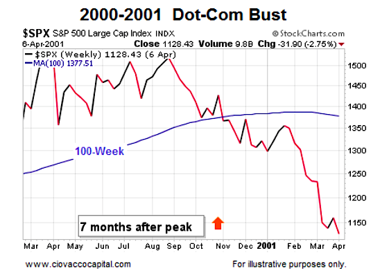
Net Aggregate Opinion Rolls Over In 2000-2001
Our market model looks at a wide array of market data using multiple timeframes. The 100-week moving average does a good job summarizing the present state of the observable facts. On the left side of the S&P 500 chart below, the net aggregate opinion still had a bullish bias (see slope of 100-week moving average in blue). The net aggregate opinion flipped to a mixed state as the slope of the 100-week moving average flattened out. Early in 2001, the market poll started returning bearish results and the stock market decline was underway.
Orange Arrows and Apples-to-Apples
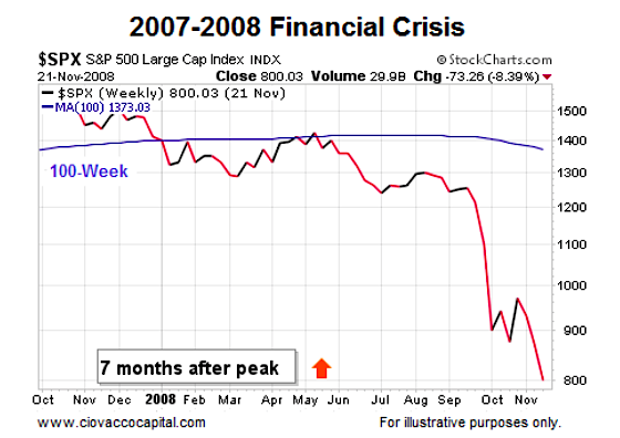
In 2015, the S&P 500 peaked in May, or seven months ago. Therefore, the most relevant point in the 2000-2001 chart above and 2007-2008 chart below is denoted by the orange arrows (seven months after the S&P 500 peaked).
2007-2008: Net Aggregate Opinion Turns Bearish
Is there anything magical about the 100-week moving average? No; remember we are using the 100-week moving average as an illustrative proxy for numerous other forms of hard evidence that are painting a similar picture as the stock market calendar prepares to flip into 2016. A similar “the net aggregate opinion rolled over” look was evident as stocks flipped from a bull market to a bear market in 2007-2008 (see below). These signals raise the probability of a stock market decline and help us manage risk accordingly.
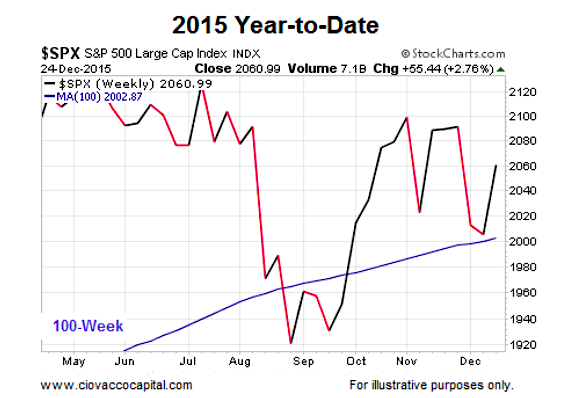
2015: Looks A Bit Better, But Still Vulnerable
This video clip compares the three charts (2000, 2007, & 2015) head-to-head. The key takeaway is the bulls have not thrown in the towel yet (price is still above the 100-week and the slope is still bullish in the 2015 chart below), but the margin of bullish error is getting very thin (price could easily drop below the 100-week and the slope could flatten out and roll over as it did in 2001 and 2008).
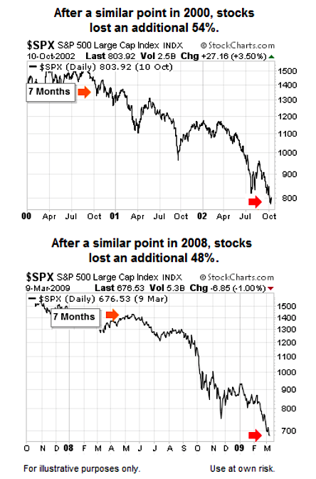
How Much Additional Damage Was Done in 2001 and 2008?
Since the S&P 500 peaked seven months ago, our analysis above focuses on seven months after the peak in 2000 and 2007. How much pain was inflicted on retirement plans and stock portfolios from seven months after the peaks in the S&P 500 to the end of the bear markets? The answers are not pretty. In 2001, stocks lost an additional 54%. In 2008, stocks lost an additional 48%, meaning it makes sense from a probability perspective to respect that big moves (here, stock market declines) can follow possible inflection points in investor perceptions.
Flexibility Key Near Possible Inflection Points
As noted in the video, big moves following possible inflection points can be bearish (2000 & 2007) or bullish (1987, 1994, 2011). Therefore, it is prudent to have both bullish and bearish contingency plans in place as we prepare for 2016.
Thanks for reading.
Twitter: @CiovaccoCapital
Read more from Chris on the CCM blog.
Author or his funds have long positions in related securities. Any opinions expressed herein are solely those of the author, and do not in any way represent the views or opinions of any other person or entity.


