SIMILARITIES TO 2018
In a recent well-researched article, Michael Santoli highlights numerous relevant and concerning data points:
“Get used to the phrase ‘since January 2018,’ because plenty of behavioral indictors have reached levels last seen then.
The four-week total of global inflows into equity funds? Highest since January 2018.
Likewise, the ratio of upward to downward profit-estimate revisions for S&P 500 companies.
Fund managers in Bank of America’s latest monthly client survey had their highest portfolio allocation to equities since January 2018.
And the week before last, the American Association of Individual Investors survey showed 55% were bullish, the most since….well, just guess.”
Skeptical sentiment was a tailwind for markets in the earlier stages of the advance off the March low. It is probably fair to say sentiment has moved into the neutral-to-headwind category in recent weeks.
WEIGHT OF THE EVIDENCE
Markets move on the weight of the evidence, which includes the “keep an open mind about pullbacks, failed breakouts, and volatility” data points above. The weight of the evidence also includes price action, which provides additional insight into the market’s longer-term outlook.
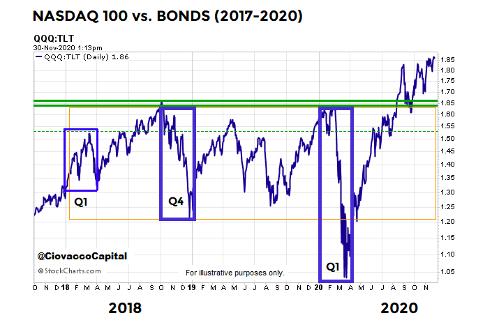
Q1 2018 TO Q4 2020
The S&P 500 peaked on January 26, 2018, which kicked off a period of wild swings and consolidation that lasted into 2020. The three biggest bearish episodes began in Q1 2018, Q4 2018, and Q1 2020.
A MORE CONFIDENT LOOK IN 2020
The chart below shows the performance of the NASDAQ 100 relative to long-term Treasury bonds. The three bearish periods are shown via the blue boxes. After the January 2018 “harder market” kickoff, the QQQ:TLT ratio pushed higher and reversed sharply in Q4 2018. The ratio failed in the same general area in Q1 2020. We know bad things happened in risk assets during these three periods. Therefore, it is notable the conviction to own growth-oriented QQQ relative to the conviction to own defensive-oriented TLT was strong enough in recent weeks for the ratio to break out above the areas that acted as resistance in 2018 and 2020.
SHARP INTRA-YEAR REVERSAL
If the QQQ:TLT ratio can hold the breakout discussed above into year end, it would represent a rare reversal. In calendar year 2020, the ratio exceeded the lowest lows from both 2018 and 2019, then sharply reversed and exceeded the highest highs from both 2018 and 2019. The chart below is a weekly version of the QQQ:TLT ratio. Notice how the ratio broke above the 2018 and 2019 highs in the week ending August 15. The ratio has held the breakout for fifteen weeks, which is significantly different from price action in Q1 2018, Q4 2018, and Q1 2020.
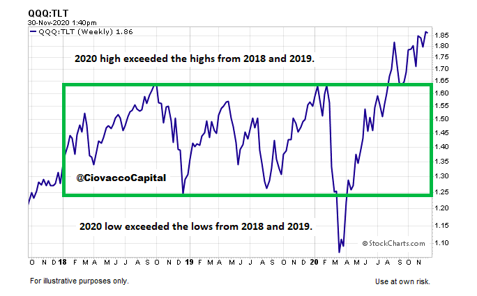
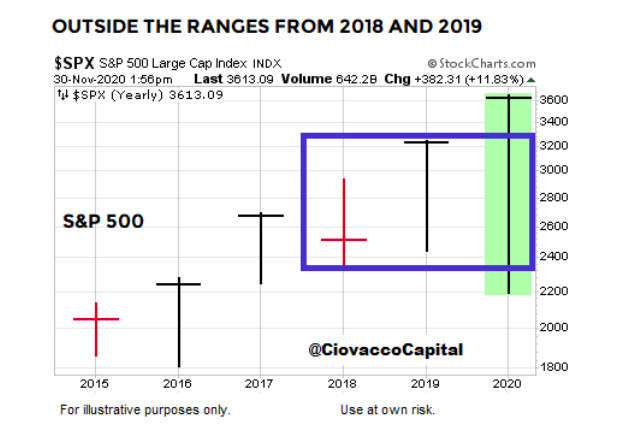
The S&P 500 has also exceeded both the intra-year lows and highs from both 2018 and 2019. Given the month of December is still ahead of us, it remains to be seen if the S&P 500 and QQQ:TLT can close above the highest closes from 2018 and 2019.
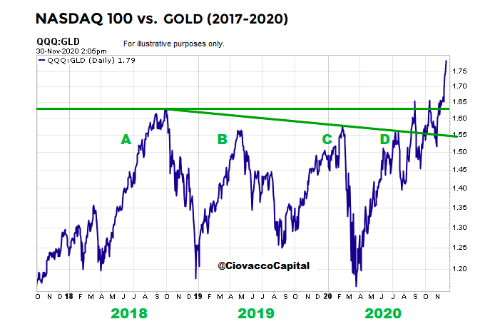
NASDAQ 100 VS. GOLD
Price action, which helps market participants monitor bullish conviction relative to bearish conviction, also provides some “keep an open mind about better than expected long-term outcomes” data points when reviewing the performance of the NASDAQ 100 relative to defensive-oriented physical gold. In Q4 2018 (point A in the chart below) investors began to favor defensive gold over growth-oriented QQQ. Something similar happened during the early stages of risk-off periods in Q2 2019 (point B), Q1 2020 (point C), and Q2 2020 (point D). It is noteworthy the present-day conviction to own growth-oriented QQQ relative to defensive-oriented GLD has pushed the ratio well above all four of those levels. Notice how a risk-on vs. risk-off battle was waged in recent months above points A, B, C, and D; the resolution thus far has been convincingly to the upside. In Monday afternoon’s session, when the S&P 500 was down, QQQ:GLD was up.
SIMILARITIES AND DIFFERENCES
In a weight of the evidence approach, the concerning similarities to 2018 are relevant and the notable differences between 2018 and 2020 are also relevant, helping us keep an open mind about a wide range of outcomes. If another bearish plunge in stocks occurs in late 2020 or early 2021, the ratio charts above will be helpful in terms of assessing the severity of the damage.
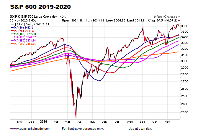
If the chart of the S&P 500 below begins to morph into a Q1 2020 look, concerns would increase. That may happen soon, but it has not happened yet. We will continue to take it day by day respecting a wide range of outcomes.
SENTIMENT STUDIES
A sentiment study based on survey data from the American Association of Individual Investors (AAII) can be found in this video segment. A study based on NDR data can be found in this video segment.
Twitter: @CiovaccoCapital
The author or his clients may hold positions in mentioned securities at the time of publication. Any opinions expressed herein are solely those of the author, and do not in any way represent the views or opinions of any other person or entity.

: Showing Some Signs of Emerging Strength")
