By Andrew Nyquist Well, that’s a pretty big title. And there are a lot of ways and angles to look at the correlation between the US Dollar and US Equities. That said, we’ve covered this theme before; see my recent piece here, and Andrew Kassen’s here. But this is a part of a much longer conversation meant to be parced in pieces. So I’ll continue the conversation with a couple more historical US Dollar charts and some thoughts. Please feel free to post comments below.
Considering that the market recycles the secular “bull” and “bear” every 16 to 18 years, I thought it would be good to look at a chart of the past 30 years, so I could see if the often talked about equities to US Dollar correlation holds true. And considering that 1982 was roughly the start of the last secular bull market, with 2000 roughly marking the top and the start of a new bear market, this time frame offers a lot of data points to consider.
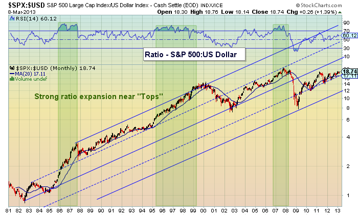
From a macro secular point of view, the correlation has been decent over the past 30 plus years: when the US Dollar Index peaked near 160 in 1985, the S&P 500 was less than 200. And when the S&P 500 hit new highs over 1500 in 2007, the US Dollar Index was cut in half at 80. However, looking at the various cycles and fractals of time, it is much less reliable. From 1981-1985 and 1995-2000, the dollar rallied along side equities. But even so, the ratio of equities pricing (S&P 500) to the dollar index was expanding (see the second chart below). That said, the attacks of 9/11, coupled with the housing and sovereign debt crises (all during a surge in globalization) brought about the current era of low rates and easy Fed Policy. And this has exploited the correlation further. So, again, on a macro basis, the correlation holds water over the past 30 years.
But, and this is big but, there are many countries involved in the ongoing sovereign debt crisis, and this could spur currency wars and additional volatility – both of which may blur the correlation going forward. Interesting times, my friends. As always, thank you for reading.
Historical US Dollar Chart (vs. S&P 500) 1981-2013
 S&P 500:US Dollar Correlation Ratio Chart
Twitter: @andrewnyquist and @seeitmarket
No position in any of the mentioned securities at the time of publication.


