By Andrew Kassen A month ago, with the S&P 500 a mere 3% below new all-time highs and creeping, we conducted a kind of stock market rally deconstruction by way of harmonic patterns here on See It Market.
Like the task of taking apart and rebuilding an engine to best learn how it works, our analytical discipline of “looking left” views disassembling past price moves as vital to a coherent technical understanding. Both processes compel a deliberate and thoughtful consideration of how each piece functions independently, the systems they create in concert with one another, what – if anything – may be wrong with their current condition, and what is likely to come next based on the unique past and present that is uncovered along the way.
In short, we tear apart charts to develop an “Archaeology of Price” which predicated not only on the generic notion that “past is prologue,” but that the act of analyzing the past is prologue, also.
Before I get too deep for a stock market rally chart update, let’s turn to how the thesis in our month-old analysis is holding up. You’ll recall (well, probably not; but I’ll remind you) our approach hinges on a couple questions:
1. “Where has price been, and where is it now?
2. “What, if anything, is a plausible objection to the thesis set forth in (1)?”
And what was the general conclusion drawn?
“Our assessment is there is no definitive objection to, but instead a mounting counterargument against the prevailing trend here that will play out around the SPX’s historic high.”
That was at $SPX 1519; yesterday’s (03/20/2013) close was 1558. The “historic high”? 1565 (closing), or 1576 (absolute high print).
However the counterargument plays out, the time is upon us.
The force of our thesis from February still holds, so my comments (ready your sigh of relief) here are relatively brief. If you didn’t catch that article (link above), I recommend checking it out as a complement to the charts that follow.
First, the broad sweep. For all intents and purposes, the S&P has now made a full roundtrip or 100% retracement of the crisis in nominal terms. Fascinatingly, the entire 4.5 year still-underway recovery (stock market rally) is harmonically structured for a major inflection precisely around 1540-1580. Call that pareidolia if you like, but with a well-founded quantitative basis there is little room for subjective ambiguity. Click to enlarge.
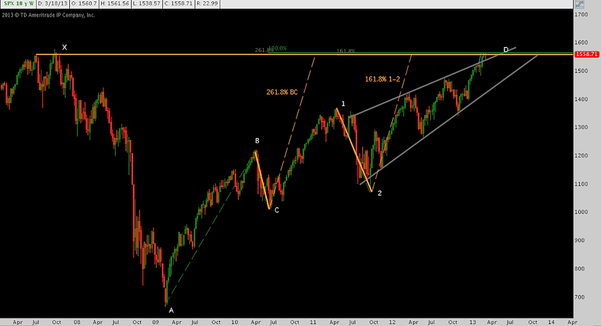
Also, though slight at this distance, note that SPX has snapped its rising wedge to the upside. We mentioned this as the “potential blowoff” scenario last time around. Broad volume metrics don’t support this “extreme” interpretation in a classical sense; instead, the break – given its as-yet unenthusiastic followthrough – is better characterized as a pattern overthrow that threatens diminution into a false break (which would mean a re-entry into the wedge). Either this break is pushing this rally leg to its culmination faster; or is ready to push higher after checking back in at wedge resistance.
If the last chart got you thinking about the up trend and whether the prevailing harmonic structure is superimposed or genuinely articulates it geometrically, check this out:
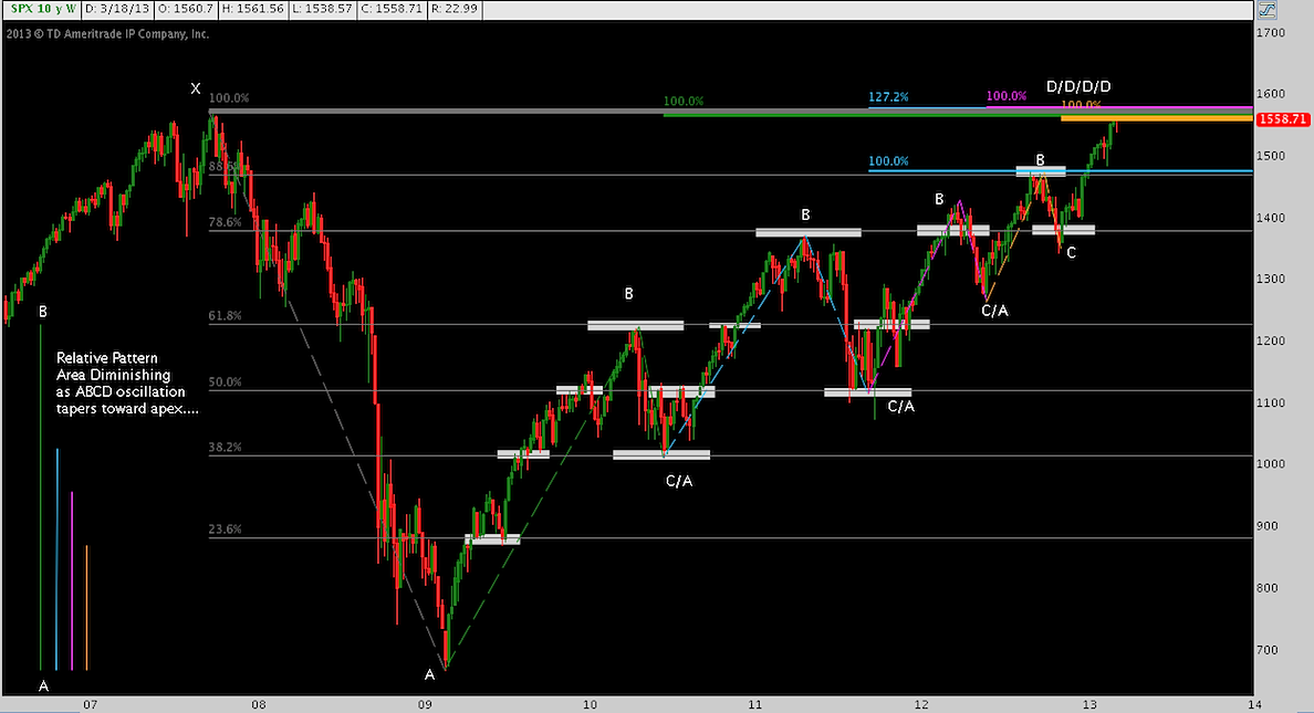
Simply put: 4 ABCDs, each featuring an initial leg that reaches but a fraction of the previous iteration. All of these ABCDs have key projections overlapping between here (1558) and ~1580. Though there’s no wedge drawn here, I find this chart gives an even better feel for the point the S&P is narrowing toward.
Next, we’ll zoom in to that gray-colored wedge displayed in the first chart above.
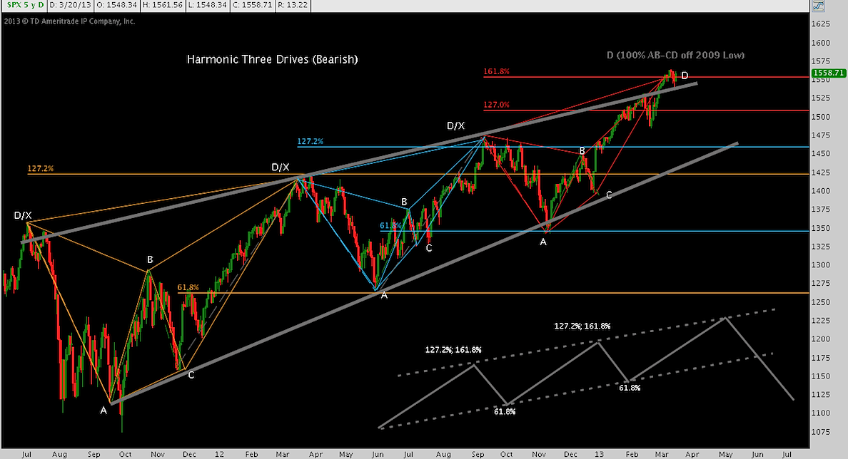
Many tools can be employed here to try to explicate “where price is now.” In the context of harmonic analysis, the best description of the last 20 months remains the Three Drives Pattern (a generic representation of which you’ll see here, in the lower-right). Though it isn’t necessary to the pattern construction, in this case each “drive” is an instance of a harmonic butterfly. Here, the third butterfly’s culmination coincides with the terminal swing high suggested by the Three Drives.
On its own, the Butterfly has bearish implications, if of relatively modest corrective scope. As the end of the end of the Three Drives, it takes on greater significance.
Let’s pause for a moment here. Remember: as I (very intentionally) explained in the original article, this does not build out as a forecast of a major correction. Or a minor one. As I often say, I struggle to forecast the next 5 minutes. In a system of effectively unlimited variables, to forecast much of anything is pure hubris (think about this for a moment: you’ll find it explains a lot of the hot water financial markets have endured in the past). Here, we are doing something far less impressive: considering the upstream channel of a river to see if we can plausibly argue it will change direction at the site we’re standing on (what we call the “Stream Geology of Price”….just kidding!). Put another way: At this specific moment with all its characteristics: is there an alternative possible future that can compete and perhaps overwhelm what currently prevails?
Here are the more dire implications of this potential setup to the stock market rally: that final butterfly is the top of the top (okay, not quite: there’s a Gartley pattern buried in there that ‘s another fractal dimension deeper) of the Three Drives, a pattern which activates with a break below $SPX 1450-1460. Where it goes is difficult to contemplate, considering that the bottom of the pattern (point A of the first Butterfly) is 1100-1125. Is that absurd? Maybe. But maybe the inculcation of the last 13 years suggesting another crisis is around the corner is giving way to a different bias, created by the almost-relentless bid of last 4.5, suggesting a cyclical bear market is so very unlikely.
If that Butterfly may be fixing the locus of “the top of the top”, it’s worth a second look:
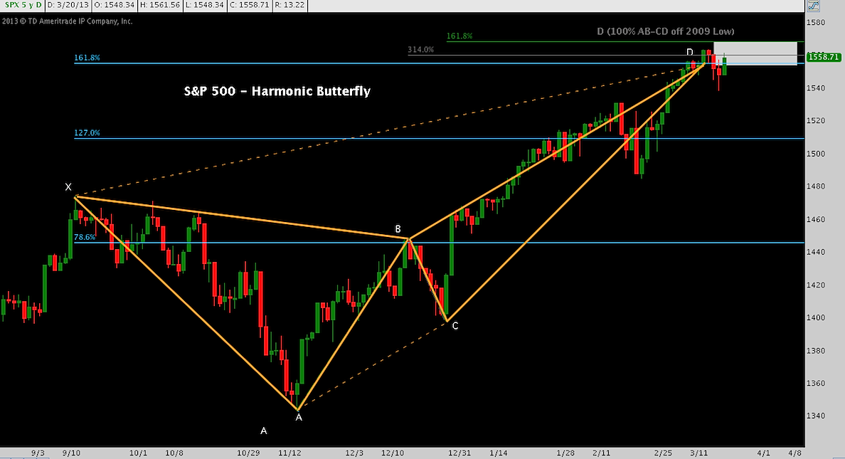
Here you’ll note the fibonacci field (white rectangle) bounding 1550-1570. Ratcheting down, this is the range within the 1540-1580 range we saw above.
More recently, I’ve discussed that a pop to 1600 might be in the cards. It’s a big round number; and besides, equity markets want a new S&P all-time high so it will happen and a big round number is a great place to throw in the towel; ha, milestone met!
Something like a blowoff could occur into that handle, but more on base sentimental than technical grounds, except for its proximity to 1580. As a result we have minimal conviction about this. If the S&P 500 does move to 1600 unless full capitulation markers are present, it will probably move substantially higher: the next major cluster of resistance over S&P 1580 lies around 1700.
Twitter: @andrewunknown and @seeitmarket
No position in any of the mentioned securities at the time of publication.
Any opinions expressed herein are solely those of the author, and do not in any way represent the views or opinions of any other person or entity.

: Showing Some Signs of Emerging Strength")
