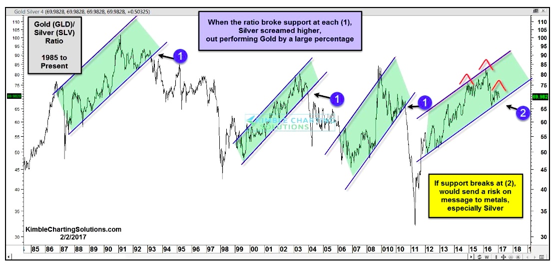
One chart that provides a good indicator for precious metals followers is the Gold to Silver ratio.
Below is a chart looking at the ratio over the past 3 decades. It uses the ratio of Gold prices via GLD (NYSEARCA:GLD) and Silver prices via SLV (NYSEARCA:SLV).
Note that when the ratio is moving higher, it reflects that Gold is stronger than Silver (and Silver is weaker than Gold). And when the ratio moves lower, gold is weaker than Silver (and Silver stronger…). Precious metals bulls like to see the ratio head lower, as it tends to be bullish when Silver leads.
Over the past 30 years, there have been 3 different times that the gold to silver ratio has formed a rising price channel and broken lower support (see each point 1 on the chart below). These breakdowns highlight points where a new trend of Silver “strength” began.
As you can see, the gold to silver ratio has formed another rising price channel over the past several years. As well, an ominous head and shoulders reversal pattern has formed. Will this lead to yet another breakdown (suggesting that Silver is about to outperform gold). Stay tuned as this would be a bullish development for Silver… and precious metals investors.
GOLD TO SILVER RATIO CHART
Thanks for reading.
Twitter: @KimbleCharting
Any opinions expressed herein are solely those of the author, and do not in any way represent the views or opinions of any other person or entity.

: Showing Some Signs of Emerging Strength")

