With the needle buried at 100 since the Fed’s began the Era of Accommodation in late 2008-early 2009 with ZIRP and QE1, Fed Funds Futures have been a worthless point of reference. But that may be about to change, in more ways than one.
Tom McClellan (of the widely-followed McClellan Oscillator and Summation Index) posted a brief analysis (here) on Thursday evaluating the leading relationship between the COT positioning of Commercial (Hedging) Speculators in 30-Day Fed Funds Futures (ZQ) and the S&P 500 (SPX).
McClellan: Commercial Speculators in Fed Funds Generally Lead Stocks Higher
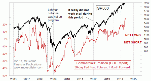
As Tom notes – along with a couple very noteworthy periods where the relationship broke down – these futures traders “have been ramping up their net long position as a group in a big way”. In fact, Comm Spec net long positioning just eclipsed the previous all-time high set in 2007. Tom points out the ambivalent signal Commercials are sending – about policy tightening expectations, as well as stocks – observing that the last time Comm Specs were this bullish it came “just ahead of the final price top” on the S&P; but that “history shows that [their net long position] is a bullish message for the stock market. ”
Like NYSE Margin Debt, Consumer Confidence/Sentiment and many other leading-coincident metrics, in bullish periods this one points aggressively higher, providing affirmation. Higher: right up to the cliff (or steeply graded hilltop) where the market takes a significant turn for the worse. For reference, just look at McClellan’s chart: each time net long ZQ positioning moved up steeply – except for the QE3 anomaly as noted – stocks followed suit; and then corrected viciously.
That’s something of a tautological observation, though; all I’ve really said about trends is that they bend. McClellan’s piece illustrates a relationship that signals a “continuation” in trend – but that just begs the question: what about where they end?
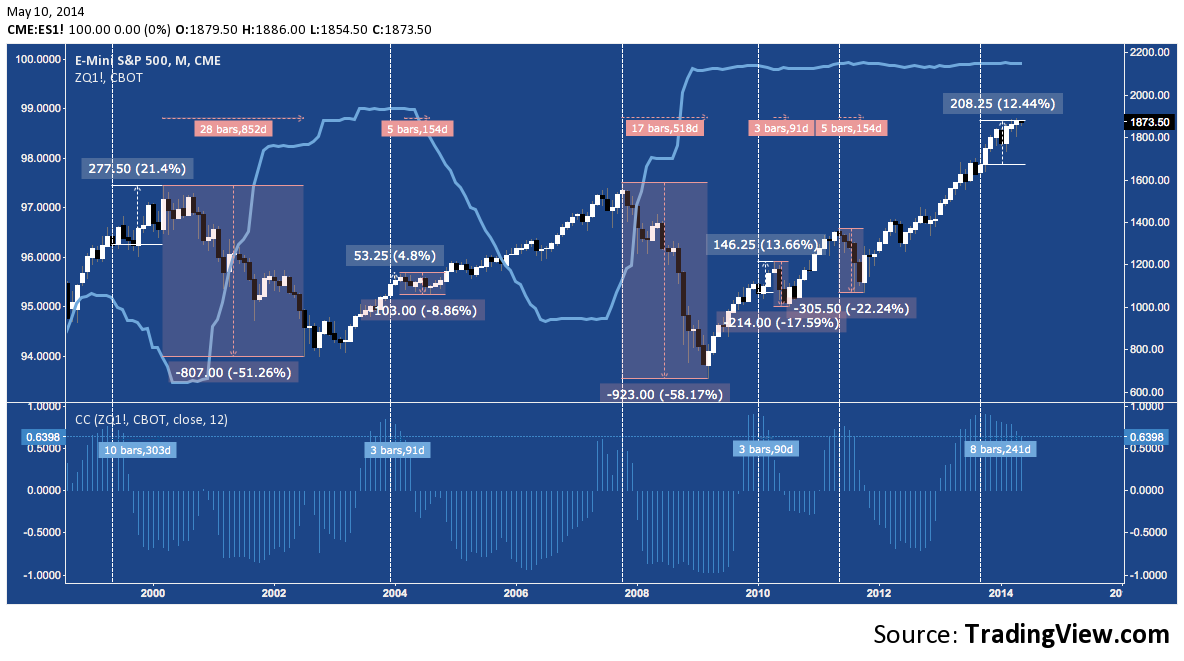
As the aggressive COT positioning might suggest, the 30-Day Fed Funds Futures contract (ZQ) itself has done a great job marking the beginning of bear markets and corrections. In the following two charts, I compare swings in the correlation between the continuous ZQ (blue line) and S&P 500 E-mini Futures (ES) contracts over the last 15 years (since 1999). The first is a monthly chart with a rolling 1-year lookback, while the second is a weekly chart with a 50-week lookback (effectively the same chart, offering more detail). The rolling correlation between these contracts is found in the lower panel of each chart.
30-Day Fed Funds Futures (ZQ) v. S&P 500 (ES): Monthly
30-Day Fed Funds Futures (ZQ) v. S&P 500 (ES): Weekly
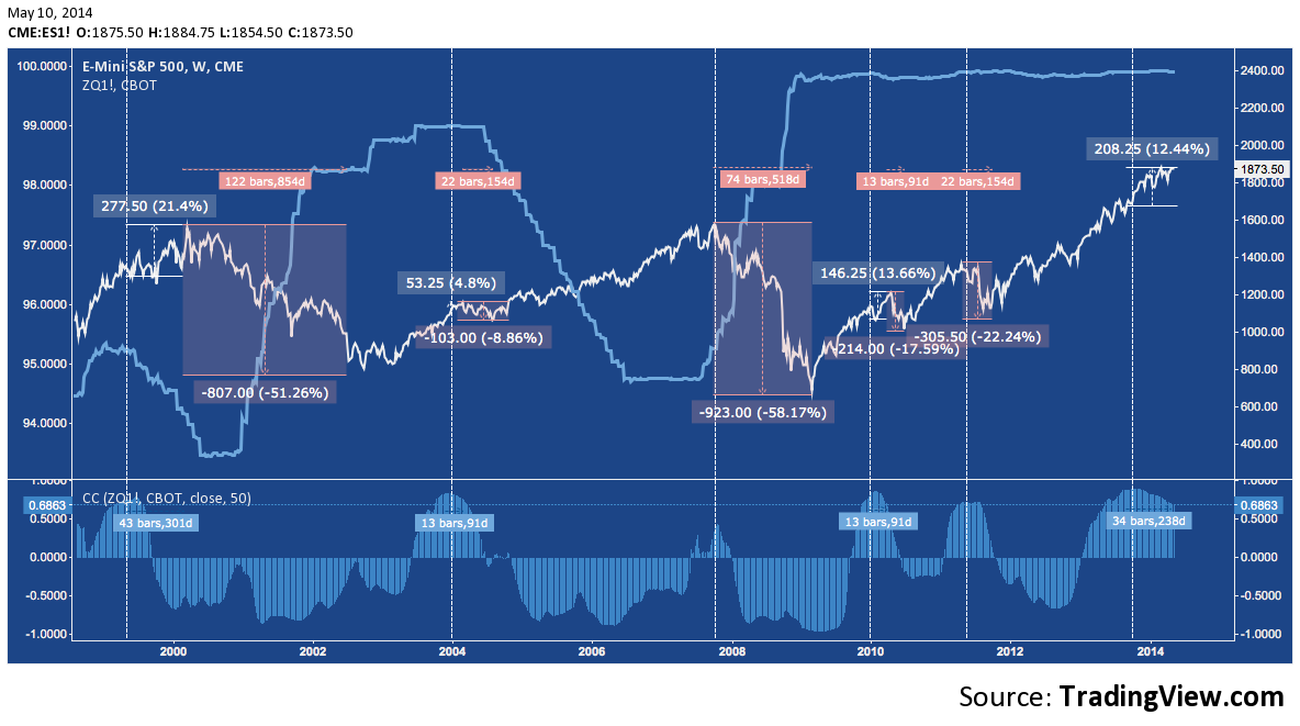
As you’ll note, the positive correlation between ZQ and ES becomes tightest just before or at stock market tops. The benefit of this view is that we can not only corroborate what McClellan shows in his chart; but also measure how strong the correlation becomes, how long it takes to grow and what – if anything -happens of note once it peaks.
Above, I’ve noted 5 historic peaks: 1999, 2004, 2007, 2010 and 2011. Here are a few observations on them:
- In 3 of 5 (1999, 2004, 2010), the positive correlation built to 0.9 or higher, while the other two were lower but noteworthy for how strongly they broke above 0.
- In 2 of 5 occurrences (2007, 2011), the S&P topped with the correlation and correction >20%
- In same 3 of 5 as above, the S&P continued higher for a multi-month month period – an “adverse incursion” against any short position put on at the correlation peak – and then corrected. 2 of these periods (2004, 2010) were short-lived; while the third (1999) preceded a decline with which we’re all familiar.
- Except for late 2007, each peak is a single rounded top. 2007’s two small peaks mark out the double top there.
Based on the charts above, assume a short is opened at each historic correlation peak. Here are some a few resulting stats:
What was the average drawdown (if any)? How long did it last?
- Average adverse incursion: 7.97%
- Average incursion duration: 96.8 days
What was average sell off? How long did it last?
- Average decline: -31.6% (Mean: -22.24%)
- Average decline duration: 354 days (Mean: 336)
The most recent correlation peak (>0.9) occurred in mid-2013. ES is in its second-longest adverse incursion behind 1999, and third biggest, nearly equal with 2010’s 13.66%:
- Current adverse incursion: 12.44%
- Current incursion duration: 220 days.
Since the current correlation peak is followed by an adverse incursion, what’s the average decline after the incursion ends?
- Average decline following adverse incursion: -25.9% (Mean: -17.59%)
Like so many other market variables, since ZIRP began the ZQ/ES relationship is majorly altered, and can seem as though it is now playing with a different set of rules entirely. Perhaps it has been, but as anticipation of the end of QE grows into the summer and the slowly materializing prospect of Fed tightening takes shape I anticipate the old relationship will reassert itself, creating a much harder road for stocks ahead.
Twitter: @andrewunknown and @seeitmarket
Author holds no position in securities mentioned at the time of publication. Commentary provided is for educational purposes only and in no way constitutes trading or investment advice.
Aging Bull pic courtesy of https://blog.wildlife-pictures-online.com/
Any opinions expressed herein are solely those of the author, and do not in any way represent the views or opinions of any other person or entity.


: Showing Some Signs of Emerging Strength")
