 As a primary trend trader with a focused strategy of looking for higher probability setups, I often find myself sharing my two sense on charts and market trends. Today I will focus on the S&P 500 and its current trend.
Earlier on StockTwits, I viewed a 20 year monthly chart of the S&P 500 posted by a fellow member of the community. I couldn’t help but appreciate the technical presence of what appears to be a repeating pattern of both price and market internals.
The question that all investors have now is whether the stock market is set to push higher or is it at the end of another bull market drive higher and ready to pull back? And perhaps more importantly, how can I identify the beginning of new trends and profit from the timing?
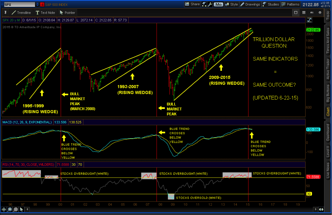
Chart source: StockTwits
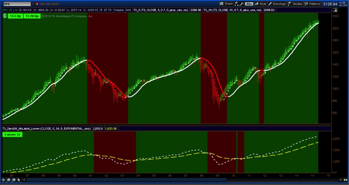
In an attempt to answer questions around where we are at in the trend, let’s take a look at the same time frame and apply my strategy. We’ll use the same exact same scenario but with less indicators. No MACD. NO RSI. Just two moving averages. Each portion of the S&P 500 chart below colored in GREEN identifies a market in a long TREND. And vice versa each portion in red identifies periods of heavy selling. The green color coded area also correlates to the rising wedge seen above. As soon as the market broke the wedge formation, as seen below, it turned the cloud RED. Market timing on a moving average crossover combined with a color cloud and Heikin Ashi bars allows traders to follow the trend until the trend ends.
As you can see in the chart below, we are still in an uptrend (see green background). No turnaround is set in motion until the background turns red, indicating that my T3 moving averages have crossed. Until that point, what market levels am I watching on the upside?
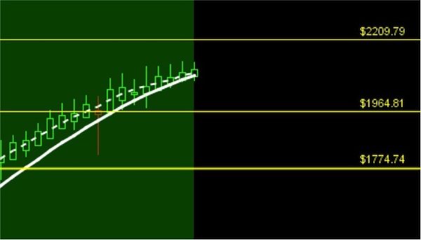
Since we have just ended the first half of 2015, let’s look at a monthly zoom chart of the S&P 500. As you can see, the moving averages are in proximity of one another may give me reason to tighten up any stops I may have in related equity markets. Does this mean that they will trigger? I have no clue. That’s when we simply rely on good trade risk management.
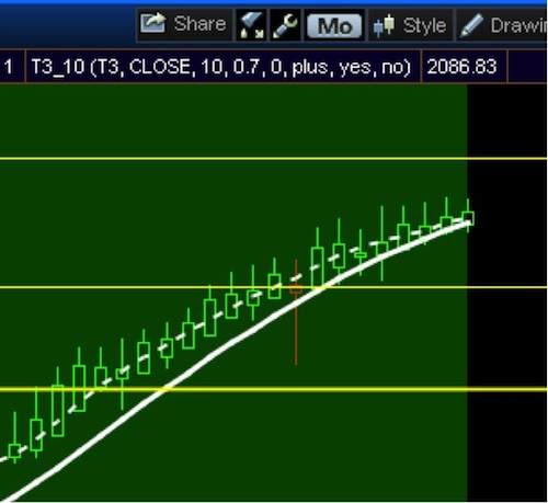
This allows me to set some prospective targets using Fibonacci extension lines. This simply helps identify prospective price targets.
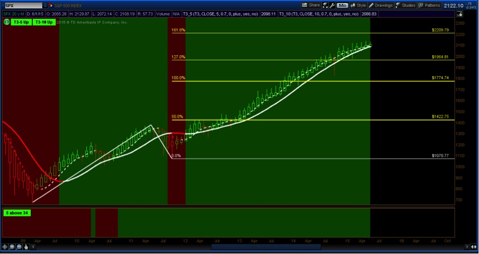
There are never any guarantees in this business, but as long as price action, combined with moving averages are in TREND, the S&P 500 may be targeting 2209. Any level below will now become a level of support if/when we do turn south.
It is the use of simple indicators that can put you in a technical setup from the start and keep you in for longer. The more you add to your charts, the more you hesitate from entering. Keep it simple Jedi traders. Identify the start of a trend and learn what it takes to remain in it, with the simplest of tools. Thanks for reading.
Twitter: @TradingFibz
The author has no positions in any of the mentioned securities at the time of publication. Any opinions expressed herein are solely those of the author, and do not in any way represent the views or opinions of any other person or entity.


