My One Chart for today is a ratio of the Nasdaq Composite versus the Dow Jones Industrial Average.
On Twitter recently I was asked this question: Does it concern you that the Nasdaq has been underperforming the Dow over the last couple of weeks?
Let’s explore the chart (see image below).
In the top panel, you have a ratio of the QQQ vs the DIA, or the Nasdaq 100 ETF vs the Dow Jones Industrials ETF.
You’ll notice that these actually moved relatively flat to one another through the middle of 2019.
However, in the 4th quarter this ratio started to appreciate and the outperformance really started to emerge.
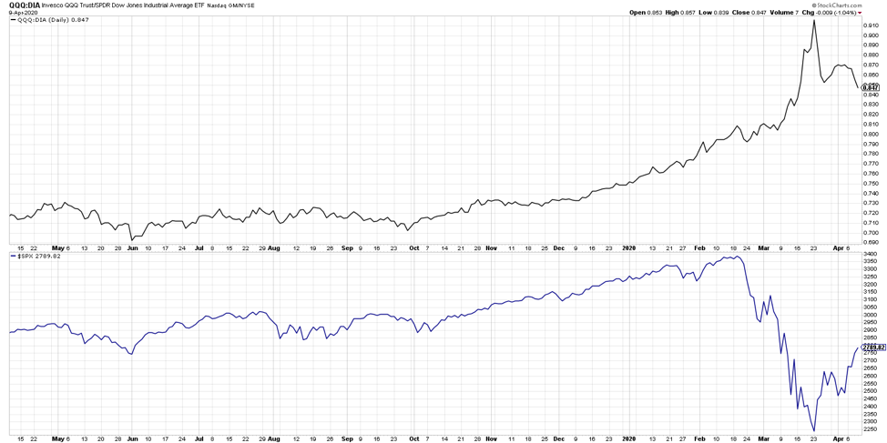
This pattern is very similar to another chart to keep in mind- the ratio of the XLK (technology ETF) vs the S&P 500.
But what’s interesting about this ratio is that it continued to accelerate higher as the QQQ outperformed the DIA through the market peaks. In the bottom panel we have a chart of the S&P 500. The market peaked the 3rd week in February, and since that time the market has sold off pretty aggressively into the 3rd week in March. Over that four-week period this ratio in the top section didn’t roll over, it actually accelerated to the upside.
During this market sell off, people were flowing over to technology as a safe haven of sorts, buying into the generally stable and consistent big mega-cap tech names. Then the market recovered and rallied, and you would expect people to be getting back into the juice, that is, the more speculative beta names in technology. But what’s intriguing is that the ratios rolled over. The Nasdaq has actually underperformed the Dow Industrials since the market bottomed out a couple weeks ago.
In regard to the earlier question, does it bother me that the Nasdaq is outperforming the Dow? No, I’m not concerned because I don’t think it illustrates an overall sentiment about stocks.
What I do think it represents is a potential sector rotation and actually a leadership rotation. People are rotating away from those big stable tech names and that overall “technology safe haven” theme we’ve seen the last couple years. We’re seeing this ratio roll over with people flowing into other more defensive areas like utilities, real estate, consumer staples, and even financials which have rallied pretty well in the last week or so.
Which of those emerges as the new strength? I’m not sure, but generally, I don’t think this ratio tells you much about the overall market direction. What I do think it tells you is that that this theme of potential consistent tech leadership may be starting to weaken off a little bit. If we get the end of a bear market rally and we rotate lower, I wouldn’t be surprised if that ratio continues to go down as people look for safe havens elsewhere.
To watch this in video format, just head over to my YouTube channel!
Twitter: @DKellerCMT
The author does not have a position in mentioned securities at the time of publication. Any opinions expressed herein are solely those of the author, and do not in any way represent the views or opinions of any other person or entity.

: Showing Some Signs of Emerging Strength")
