This post was written with Craig Basinger.
Markets calmed down last week after seeing a brief return of volatility that certainly raised some eyebrows. One aspect that has provided stability despite higher geopolitical risks has been the underlying company fundamentals. We are coming off one of the better Earnings Seasons for the S&P 500 (NYSEARCA:SPY) that we have seen in some time. While equity market valuations do remain elevated, solid earnings growth can go a long way to sooth valuation concerns.
In this week’s market commentary, we are going to dive into earnings and equity valuations, from a few different perspectives. The idea is to see if investors are justified in their concerns about an overvalued equity market…
Q2 2017 Earnings Season Was A Hit
With 98% of the S&P 500 (INDEXSP:.INX) members having reported 2nd quarter results, this one is pretty much in the books. Compared to the same quarter a year ago, earnings expanded by 9.4% and sales grew by 5.3%. And this growth was relatively broad based. 79% of companies grew sales and 73% grew earnings. All 11 sectors, except for Utilities, enjoyed positive earnings growth with the biggest gainers being Energy and Information Technology.
Earnings and Sales growth are certainly good things for an equity market. Chart 1 below covers the past twelve years of quarterly Earnings Season and there is a relationship between company fundamental growth and overall market return (orange line). The vertical axis is the S&P 500 return while the horizontal axis is the average of earnings and sales growth. While clearly there are some outliers, there is a relationship between positive company growth and positive market returns. We also found a stronger relationship for earnings compared to sales growth, when charted in isolation.
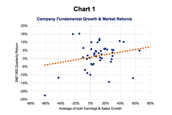
The good news takeaway from this relationship is earnings and sales appear to be set to grow for the next few quarters at least. Economic data has been good, profit margins are healthy, energy prices are lower and somewhat stable plus the weaker U.S. dollar is a boost for many members of the S&P 500. When they account for overseas profits, a weaker dollar results in better translation back to their income statement. So we certainly have a healthy fundamental growth environment.
Valuations – The Grey Lining To Our Silver Cloud
Despite growing earnings and top line sales, the S&P 500 is not cheap and, depending on how you look at it, may be rather expensive. Chart 2 below is the S&P 500 (thick orange line) along with various earnings multiple ghost lines. The thinner ghost lines are calculated using a constant price-to-earnings ratio (PE) over time and changing earnings. As you can see, the S&P 500 is almost touching the 18x line, or 18x earnings, which is the most expensive we have seen since the tech bust in 2001/2002.
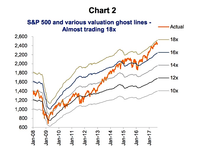
It may actually be worse than the aggregate price-to-earnings multiple for the S&P 500 implies. One might think that the current 17.6 is a bit rich but nothing compared to the valuations we saw in the late 1990s. True, the aggregate PE ratio reached over 25x in 1999 (Man, those were fun times!), and at 25x from today’s earnings would equate to an S&P 500 of 3,500!!! That isn’t going to happen this cycle. In the late 1990s tech bubble, a large portion of the market had no earnings, which based on the aggregate calculation inflates the overall PE level for the index. Today’s market leaders, while dominated by Technology again, at least make money for the most part.
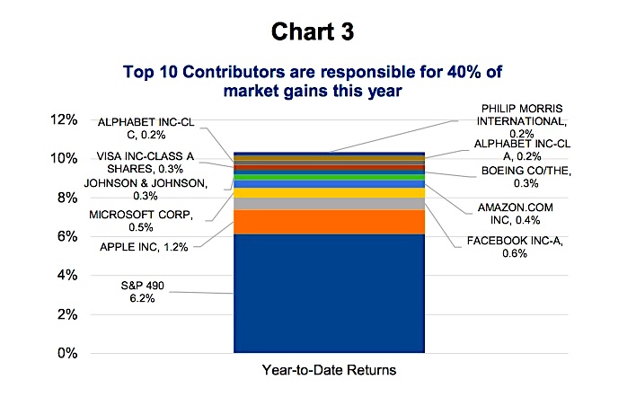
The next chart (3) includes the top 10 contributors to the S&P 500 year-to-date rise of 10.4%. The top 10 make up about 40% of this gain so far this year with the remaining 490 members of the S&P 500 responsible for the rest. This narrow market leadership is a common characteristic of the late stages of a bull market cycle.
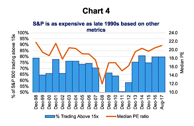
In Chart 4, we slice up valuations from a few different perspectives. The blue bars are the percentage of companies trading above a 15x earnings multiple. At 80%, this is the most expensive we have seen in the past twenty years. Alternatively, the orange line is the median PE for the S&P 500. Median is the middle company, aka the 250th ranked in order of PE. Again, this is just about as expensive as the late 1990s in the tech bubble.
Conclusion
The U.S. equity market is expensive and it isn’t just a few companies making the index look rich. It is rather pervasive which means finding companies trading at a low multiple much harder. On the positive, earnings are growing and this does help alleviate valuation concerns. But should growth falter or bond yields rise, which would put downward pressure on the earnings multiples, this could cause a market decline.
One other positive is other markets are not nearly as expensive. Europe and Asia are both trading below 14x and close to home Canada is 16x (see chart 5 below). If you are a value oriented investor, reducing U.S. and allocating to other developed markets may be prudent.

Charts are sourced to Bloomberg unless otherwise noted.
Twitter: @sobata416 @ConnectedWealth
Any opinions expressed herein are solely those of the authors, and do not in any way represent the views or opinions of any other person or entity.


: Showing Some Signs of Emerging Strength")
