The current market cycle started back in early 2009 and has been chugging along for over 8 years.
While it has not been smooth sailing as both Europe and Japan briefly dipped back into recessions earlier in the recovery, the recovery has nonetheless plodded along, healing the wounds from the global financial crisis.
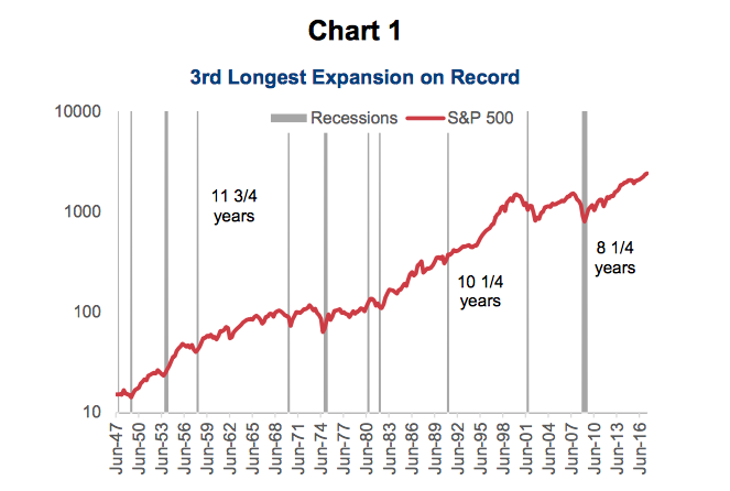
At 8 years and 3 months, the current market cycle is the 3rd longest on record. This is measured either by market returns, such as the TSX’s or S&P 500’s (INDEXSP:.INX), or by the distance between bear markets. The cycle is also the 3rd longest on record if measured in terms of the length of the U.S. economic expansion.
Chart 1 below shows the S&P 500 back to the 1940s, with shaded bars representing recessions. The current run was only bested by the 10 year 3 month run in the 1990s and the 11 year 9 months run in the 1960s.
Note that this post was written with Craig Basinger and Derek Benedet.
It is important to note that bull markets don’t die of old age. Given how gradual the economic recovery was in the initial years of 2010-2016, it could easily be argued that few excesses have accumulated during the bull cycle, opening the door for a much more elongated run. Given the extended duration of the bull market, the annualized return has ‘only’ been 17% a year, ranking it fourth weakest out of the past 13 cycles. Clearly, the pace of recovery has been slower and from a lower level, compared to cycles in the past. Slow and low is great for smoking some brisket, but not necessarily for market returns.
That being said, at the moment, we may be in a sweet spot for the markets.
Over the past year, the global economy has moved into a period of synchronized global economic growth. This has not been the norm since the market cycle started back in 2009. Sure, there was a period of global growth coming out of the recession, but this came from a very depressed level of economic activity. After this initial spurt of synchronized global growth, Japan slipped back into recession in 2011. Once they started to recover, Europe dropped into recession with the Euro crisis. This game of musical chairs with one major economy contracting seemed to keep rotating between Japan, Europe, and the U.S. over much of the recovery from 2010 to 2016. Chart 2 below shows these three major economies, with the shaded areas denoting periods of synchronized economic growth.
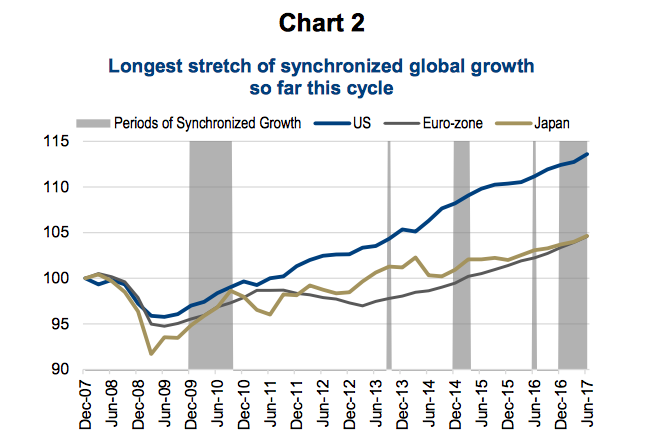
The good news is that we are now in the longest stretch of global synchronized growth since 20
This goes beyond the three biggest economies included in the graph. In fact, every OECD economy is currently expanding. That does not happen very often and it is clear evidence of global synchronized economic growth. We are referring to this period as the sweet spot because economic growth is occurring at a period of benign or tepid inflationary pressures. Chart 3 shows the core Consumer Price Indices for the U.S., Eurozone, Japan, and Canada. As you can clearly see, the rate of inflation remains very low.
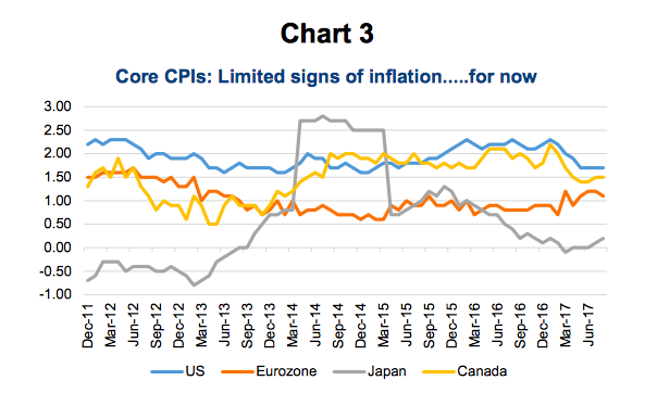
Based on September’s U.S. inflation data, which was released on Friday, U.S. inflation has remained almost stubbornly low, having now missed six of the past seven months vs. expectations. It’s not only missing expectations but also failing to reach the FOMC’s targets. This should temper the Fed from hitting the gas pedal too hard and is another positive for equity markets. For now, financial conditions remain very constructive, with the Goldman Sachs Financial Conditions Index at its lowest level since late 2014.
Market cycles typically end as a direct result of central bank tightening. It isn’t really the central bank’s fault, but when they are reacting to strong growth that is starting to cause inflation, the end is usually near. That is why the CPI data is important.
The Fed has been paving the way, hiking rates now four times. Canada has quickly caught up with two hikes so far this year. Europe and Japan are not tightening yet; but, with most economic slack now out of the system and growth beginning to take off, it’s hard to argue for them to continue with their extreme monetary stimulus. Both are expected to venture down the ‘tapering’ pathway trail blazed by the U.S. back in 2013. As long as inflation remains low, and central banks continue to take the slow and easy approach even while economic growth accelerates, markets will really enjoy this environment. Hence why we have seen so many new market highs of late.
This is the sweet spot, so enjoy it. What may be a precursor to an end of the sweet spot could be higher inflationary data. That is likely in the pipeline, given improving growth, tighter labor markets and an economy that has less and less excess capacity. We still have not seen many signs, but inflationary data does tend to lag, so best to expect it sometime in the coming quarters.
Finally, this market cycle may be older but it certainly remains healthy. Chart 4 is our Market Cycle indicators. We track 30 indicators that have historically had some predictive capabilities in signaling a change in direction of the market cycle. Some of these indicators are based on interest rates, others on company fundamentals, economic indicators, valuation based measures, market technicals and commodity prices. We would call this multi-disciplined as our belief is that no one model or indicator can predict the market but we have a better chance of identifying when a change in direction is more likely by using a basket.
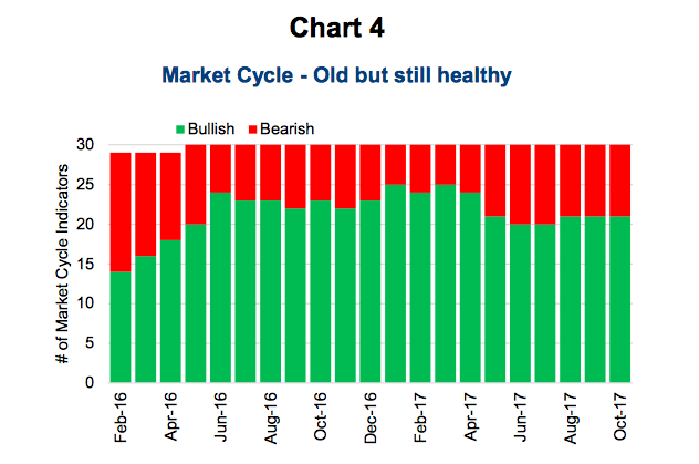
Today, 21 of 30 are still bullish on the continuation of the current cycle. That is a healthy score as we tend to become more concerned if the bullish readings get down to 8-12. So 21 is good enough for us to believe the likelihood of an end to this cycle remains very remote for the coming quarters. The cycle is old, but healthy.
Charts are sourced to Bloomberg unless otherwise sourced.
Twitter: @sobata416 @ConnectedWealth
Any opinions expressed herein are solely those of the authors, and do not in any way represent the views or opinions of any other person or entity.


