 The warning signs coming from the bond market are getting louder and louder as investors received a fresh red flag signal last week.
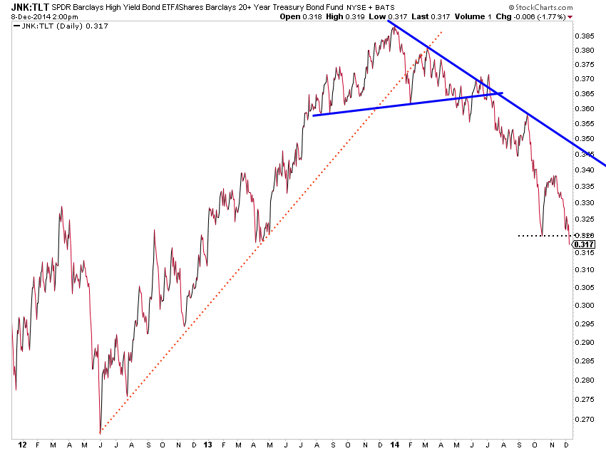
Let me explain. Throughout the first half of 2014, the ratio of High Yield Bonds (JNK) relative to 20 year+ US Treasuries (TLT) finished the formation of a monster top before breaking down again late in the summer.
Well, it may be breaking lower again.
And though it’s not a great signal to trade off of (short-term) per say, it’s still an important piece of evidence from a macro perspective. And for weeks we’ve seen this ratio continue to lag and finally it’s starting to break below the October low.
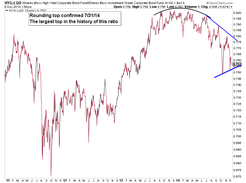
We’ve also seen similar action in the corporate bond market via the ratio of high yield (HYG) relative to investment grade corporate bonds.
Now we’re seeing further signs of a global phenomenon as the Emerging Markets Debt (EDD) relative to US bonds (represented by iShares Barclays Aggregate Bond Fund – AGG) is breaking down.
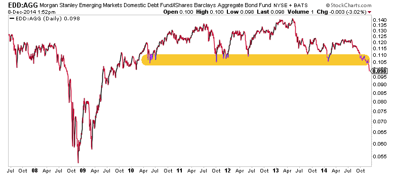
This isn’t just any breakdown; this is a loss of 4 years of support! Who knows if this timing is any more helpful than the other bond market ratios, but the signs are building that we should be prepared for a de-risking in equities and the possibility of some type of credit event.
If we combine this information with last week’s note on the stocks to bonds ratio, it appears that the markets are sending a defensive message to investors.
Thanks for reading!
Follow Aaron on Twitter: @ATMcharts
No position in any of the mentioned securities at the time of publication. Any opinions expressed herein are solely those of the author, and do not in any way represent the views or opinions of any other person or entity.


