 Every now and then it’s helpful to check in on the stocks to bonds ratio and see how it’s acting. This has been particularly true in the last 10 years or so. Normally, there’s not much to write about it, however, the stocks to bonds ratio is at an interesting long-term juncture across the major indices right now.
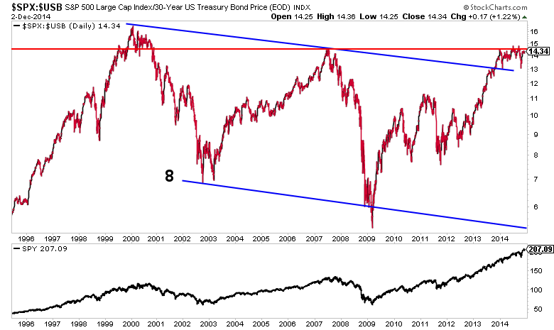
The S&P 500 (SPX – Quote) relative to 30 Year US Treasuries have reached a strong resistance level. After dancing around this area for most of 2014, price is starting to curl under the resistance. Is this some sort of large topping pattern?
We just don’t know yet. So watching the price action going forward will be key.
Looking back to the Y2K tech bubble top, we see that the stocks to bonds ratio traded in a slightly falling channel for 13 years. Unsurprisingly, this suggests stocks will outperform over the longer-term. It also emphasizes the significance of the 2007 highs as confirmation of the channel break going forward. In my opinion, this area is very important to watch heading into 2015.
S&P 500 to 30 Year US Treasury Bond Price Ratio (20 Years)
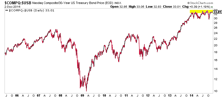
Shifting our attention to the Nasdaq Composite (COMPQ) relative to the long bond, we see that it is also trading sideways at the top of a year-long range. The direction the range breaks will be telling. Also note this ratio has broken substantially above the 2007 high.
NASDAQ Composite to 30-Year US Treasury Bond Price Ratio (10 Years)
Looking at the Russell 2000 (RUT) relative to the long bond, we see the ratio is already starting to trend somewhat lower on most timeframes. It’s not a clear downtrend, but perhaps one is emerging. Worth watching for sure. Interestingly, we’re currently at a pivot level that marked the 2007 high.
Russell 2000 to 30-Year US Treasury Bond Price Ratio (10 Years)

So what does that slight ‘Russell 2000 stocks to bonds’ downtrend look like from a performance perspective? It’s MAJOR underperformance.
30 Year Bond Price Performance vs Stock Market Indices – 2014
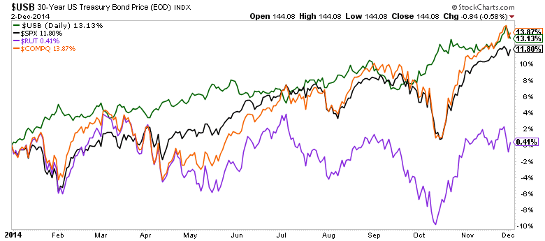
Into the end of the year, it’ll be interesting to see how people view the performance of treasuries. Do many folks even realize the long bond has outperformed the S&P 500 thus far in 2014?
Is there practical information we can derive directly from these charts? I think so. I believe the charts are offering us important information about the market’s posture heading into 2015.
If these ratios continue to top out and turn lower, it may favor bond like equities such as REITS, utilities and consumer staples in 2015. On the other hand, if these ratios break higher, it could spark further interest in risk-on groups like tech and financials. Keep an eye on those stocks to bonds ratios.
Thanks for reading!
Follow Aaron on Twitter: @ATMcharts
No position in any of the mentioned securities at the time of publication. Any opinions expressed herein are solely those of the author, and do not in any way represent the views or opinions of any other person or entity.


