What’s next for Bitcoin? That is a question being asked by many traders and crypto investors.
Well, it depends on your investment horizon. Savvy investors use multiple time frames to outline the long-term, medium-term and short-term pictures, with a focus on how those different time frames are interrelated.
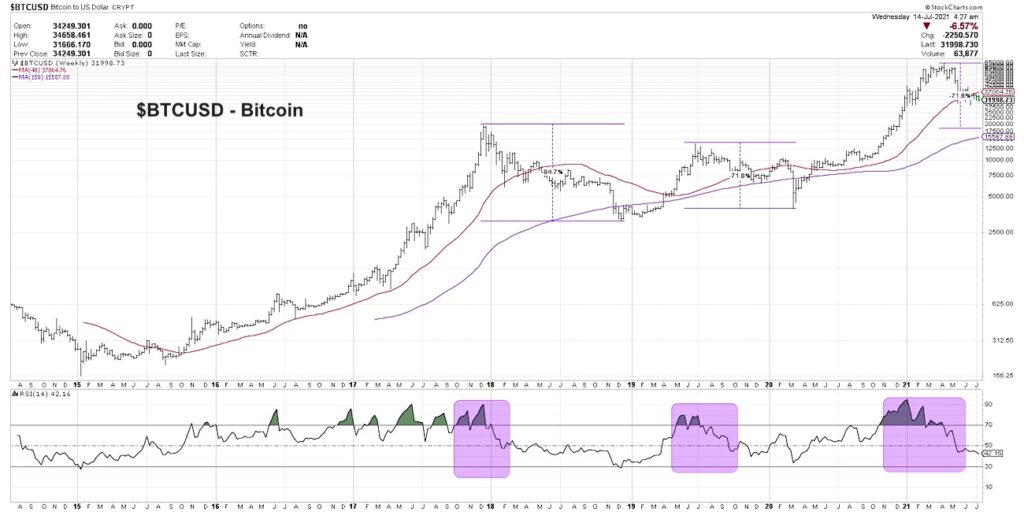
The long-term history, back to the inception of Bitcoin, shows how the initial rally in this relatively new asset class experienced an exponential rise to around 20,000. Then came two significant drawdowns as the cryptocurrency lost over 70% of its value in each correction. Now as Bitcoin is once again showing patterns of distribution, how does this long-term drawdown scenario relate to the daily and hourly charts?
In today’s video, we’ll review three charts of Bitcoin using three different time frames to identify long-term and short-term trends and potential inflection points. We’ll also try to answer the following 3 questions:
How does the current drawdown in Bitcoin relate to previous pullbacks, and how can we determine whether to expect further downside?
How did the daily chart rotate from accumulation phase to distribution phase, and what would indicate that the current downtrend may be exhausted?
What does the hourly chart tell us about short-term volatility and cycles of fear and greed?
For deeper dives into market awareness, investor psychology and routines, check out my YouTube channel!
[VIDEO] One Chart: $BTC Bitcoin On Multiple Time Frames
Bitcoin $BTC Chart
Twitter: @DKellerCMT
The author may have positions in mentioned securities at the time of publication. Any opinions expressed herein are solely those of the author, and do not in any way represent the views or opinions of any other person or entity.

 and Semiconductors (SMH): Concerning Price Pattern?")

 and Semiconductors (SMH): Concerning Price Pattern?")


