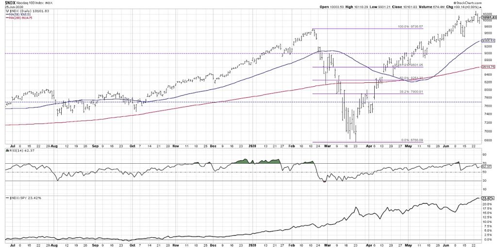
Today’s chart is the Nasdaq 100 index, and the focus is on bearish divergences.
The Nasdaq 100 chart doesn’t just show the Nasdaq 100, it actually reflects patterns that I’m seeing in plenty of Technology, Communication Services, and Consumer Discretionary stocks.
All of these different stocks in all of these different sectors are establishing what I would consider a bearish divergence.
A bearish divergence is when you have higher highs in price and lower peaks in momentum, in this case in the form of RSI. If you look at January to February 2020, a number of stocks, as well as the Nasdaq 100 index, saw a similar pattern.
We saw higher highs with a January peak, followed by a February high that went even higher. If you look at the RSI, you’ll see lower peaks that coincide with the second peak in price. So higher highs in price, lower highs in the RSI.
There are a number of ways to use this technique. The most aggressive strategy is to see the divergence and take action on it, but the more conservative approach is to wait for some sort of breakdown. By waiting for a breakdown of the swing low between the two peaks, so in this case the January low around 8900, you received a confirmation of downside potential in late February.
What I’m seeing right now is a very similar pattern of higher highs in price and lower peaks in RSI, although a little shorter timeframe by about a week. And it’s not just the Nasdaq 100 index and the QQQ where we see this distribution pattern. There’s an almost identical pattern in names like Microsoft, Apple, semiconductor stocks, and mega cap names in the consumer sectors.
One problem a lot of people get into is they start to identify divergences before they occur, and I would say the end of December into the beginning of January last year is one of those traps. If you look at the last two weeks of December going into January, you saw price continuing higher and the RSI beginning to go down.
If the price keeps making higher highs and higher lows, the divergence will eventually work itself out and the indicator actually continues higher. As the NDX remained in its uptrend, the RSI actually continued to go up and eliminated that divergence because there were no longer lower peaks in the RSI.
In this case, the RSI became extremely overbought, or an RSI reading above 80, which usually means a brief pullback and then at least one more final push higher. The lesson is to wait until you see some sort of confirmation before taking action on a potential bearish divergence.
The way I would read the current market (as I note all of these bearish divergences) is to expect at the very best limited upside, and at the worst a material downside move from here. For something like the Nasdaq 100 to really validate the bearish divergence, it would need to breakdown through that swing low which is around 9500.
This would represent another 5% drop below current levels with the Nasdaq 100 fighting that key 10,000 level, so there would need to be a bit of a selloff to validate in this particular index. With other individual stocks it would take a little less to get back down to that swing low, but that’s the general idea.
You’ll also notice that the 50-day moving average would line up pretty well with that 9500 level. If we do get a follow through to the downside, that’s certainly where I’d be looking (at the very least) for short term support for the Nasdaq 100. A break below the 50-day moving average would take this key index below the 9500 level and would increase the likelihood of much further downside.
It’s interesting to note that the S&P 500 itself does not have a bearish divergence at the moment. With the S&P, we’ve actually seen lower highs in June, with the early June top around 3240 and then last week finding consistent resistance right at 3150. The Nasdaq 100, in comparison, has been trending higher, along with leadership names in tech and consumer sectors making new highs in mid-June.
My One Chart for today is the Nasdaq 100 index, which I think represents the plethora of bearish divergences in the equity space. If and when the NDX confirms a break below the recent swing low around 9500, this could certainly suggest much further downside from current levels.
To watch this in video format, just head over to my YouTube Channel!
Twitter: @DKellerCMT
The author does not have a position in mentioned securities at the time of publication. Any opinions expressed herein are solely those of the author, and do not in any way represent the views or opinions of any other person or entity.


