What Does Fear Look Like?
Typically, when markets move into a long-term risk-off phase, the conviction to own defensive-oriented bonds begins to increase relative to the conviction to own growth-oriented stocks.
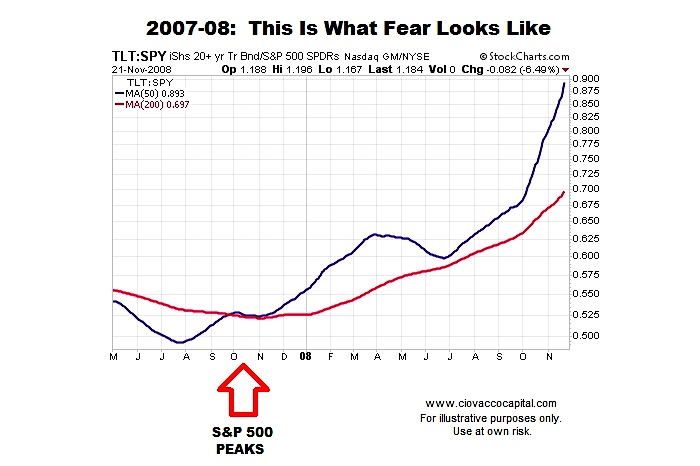
Since a picture is worth a thousand words, the chart below shows trends in bonds (20+ Year Treasury Bond ETF – NASDAQ:TLT) relative to stocks (S&P 500 ETF – NYSEARCA:SPY) during the stock market’s turn and subsequent drop in late 2007/early 2008. The ratio’s 50-day moving average is shown in blue and the 200-day is shown in red.
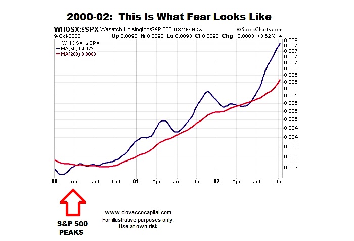
Human fear also dominated the markets during the stock market peak and subsequent dot-com bear market (2000-02). In a similar manner to the 2008 financial crisis, the conviction to own defensive assets ramped up and stayed elevated as the S&P 500 dropped over 50%. Since ETFs were not prominent in 2000, we have used WHOSX as a proxy for TLT and the S&P 500 in place of SPY.
The Same Ratio In 2017
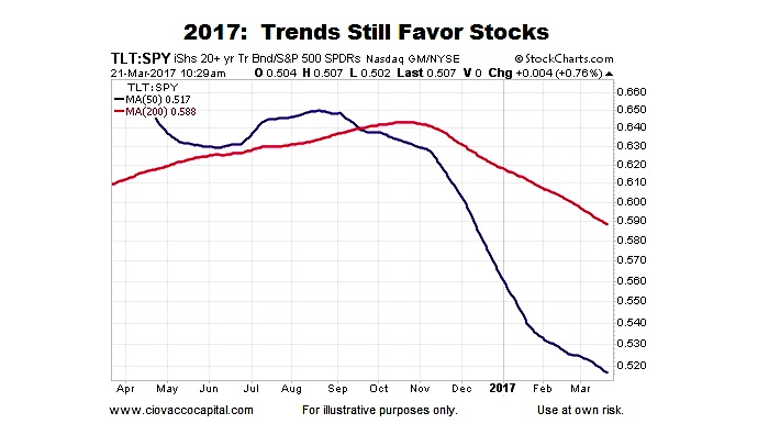
As of March 21, 2017, the trends in the same bond/stock ratio look nothing like the periods of elevated fear during the dot-com bear market and financial crisis.
A Gentle Reminder About Risk
Buy and hold works until it doesn’t. Even in the context of strong long-term trends in risk assets, it is always good to have an exit strategy when the next inevitable bear market comes.
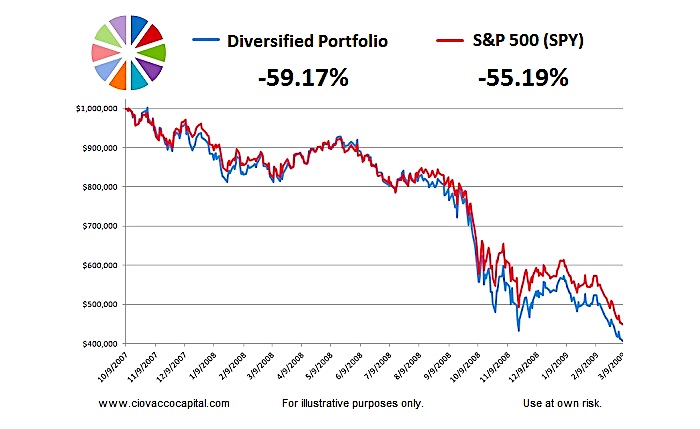
Did Diversification Help (2007-2009)?
A diversified growth portfolio can often give a false sense of security when a crisis hits. For example, the growth portfolio below appears to be diversified to an extreme.
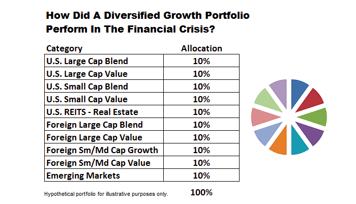
The pie chart approach was not particularly helpful during the financial crisis. In fact, the pie chart portfolio shown above lost more than the S&P 500 (SPY).
Are Interest Rates A Showstopper For Stocks?
This week’s video (see below) looks at the relationship between stock prices and interest rates, allowing us to address the following questions:
- How concerned should we be about rising interest rates?
- How helpful are interest rates in terms of monitoring the stock market’s health?
- Is it possible for stocks to rise during a period of multiple Fed rate hikes?
- Does the 2017 stock market look vulnerable?
Common Theme In Financial Press
On February 27th, The Wall Street Journal hypothesized rising bond prices may signal a shift back toward a risk-off trend in the markets:
Some money managers and traders believe that a rising Treasury bond market, often seen as a haven for investors, is a warning that valuations of riskier assets—such as stocks, corporate bonds and emerging-market assets—may be stretched.
In February, rising bond prices were a concern for stocks. Less than a month later, The Wall Street Journal (WSJ) hypothesized that falling bond prices could kill the stock rally (the exact opposite of the February hypothesis):
U.S. bond yields are topping a key measure of the dividends that large U.S. companies pay—a shift that has broad implications for investors who have viewed higher stock yields as underpinning an eight-year-long bull market.
As noted in WSJ, there are sound arguments for both cases, meaning the relationship between stocks and interest rates is a complex animal. Unless we know the future path of earnings, inflation, fiscal policy, monetary policy, etc., it is very difficult to discern what rising interest rates, taken in isolation, tell us about stocks.
Thanks for reading.
Twitter: @CiovaccoCapital
The author or his clients may hold positions in mentioned securities at the time of publication. Any opinions expressed herein are solely those of the author, and do not in any way represent the views or opinions of any other person or entity.

: Showing Some Signs of Emerging Strength")
