My macro process involves three key layers, in order of priority: price, breadth and sentiment.
While price has been in an unrelenting uptrend (until this week!), breadth conditions have not been confirming the recent upswing.
This has both descriptive value, explaining the narrowness of leadership, but also predictive value in terms of comparing the current readings to previous bull market cycles.
One of the ways I consider breadth is by reviewing the performance of the equal-weighted S&P 500 ETF (RSP) versus the normal market cap-weighted S&P 500 ETF (SPY).
First, let’s review the main difference between these two weighting systems.
Most equity indexes are cap-weighted, meaning the larger the market capitalization (price multiplied by shares outstanding), the greater the weight in the index. While this accurately reflects the strength or weakness of the index members, it tends to exaggerate the effect of the largest stocks on the list.
Some indexes, such as the Dow Jones Industrial Average, are price-weighted. This means that you weight each member by its stock price. While this simplifies index calculation, it arguably does not reflect your investment performance if you owned the individual names in the index.
For example, Apple’s recent 4-for-1 stock split meant that the stock went from being the highest weighted name in the Dow 30 to the middle of the list, just because its price was artificially cut in half!
Now we get to equal-weighted indexes, where each stock is given an equal weighting in the calculation. This means that the largest stock and smallest stock by market cap will be given an equal weight. This also means that it removes the overweight in the megacap stocks and better reflects what the “average stock” in the index is experiencing at any given time.
Today’s chart is a ratio of the equal-weighted S&P 500 to the cap-weighted S&P 500, represented by the ratio of the $RSP to $SPY.
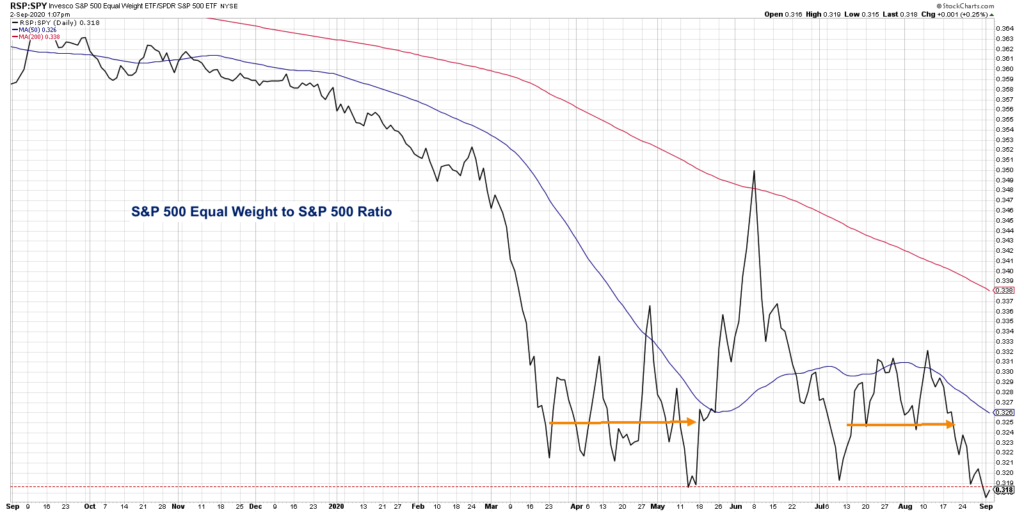
If this ratio is going up, the equal-weighted index is outperforming the cap-weighted index, and the smaller names are outperforming the larger stocks. If the ratio turns lower, this indicates the largest stocks are dominating the smaller names.
Going into the February 2020 market high, the ratio was already in decline, suggesting that the largest stocks in the index were leading the market higher. Once the market topped out and moved lower to its March 23rdlow, the ratio accelerated to the downside as investors flocked to the relative safety of larger blue-chip names.
For six weeks after the market low, the ratio remained relatively sideways as pretty much everything made a V-shaped bottom off the lows. The ratio spiked in late May and topped out again in June as the S&P 500 reached a peak around 3250, and many investors debated whether there was a “leadership rotation” in play as some of the beaten down sectors began to emerge in positions of strength.
Fast forward to this week, and you’ll notice that the ratio has once again made a new low. This shows how since the June pullback and subsequent rally to current levels, the largest stocks in the index have been providing a lion’s share of the gains.
This lack of confirmation, with the market achieving new highs but this ratio making new lows, is actually characteristic of bull market tops. In the later innings of a bull market phase, the market tends to move higher while breadth measures like this one start to deteriorate.
This speaks to a lack of conviction in small and mid-cap stocks, as investors flock to the strength and security of mega-cap names. In late 2007, I will never forget Pepsico (PEP) making new highs while the Russell 2000 index was making a lower high. That was just before much lower prices were achieved across the board.
I would bucket this equal-weighted to cap-weighted ratio along with other breadth indicators such as cumulative advance-decline lines. Most breadth measures have not confirmed recent highs and suggest that upside from here is limited with increased risk of downside moves.
To see this article in video format, check out my YouTube channel!
Twitter: @DKellerCMT
The author may have a position in mentioned securities at the time of publication. Any opinions expressed herein are solely those of the author, and do not in any way represent the views or opinions of any other person or entity.
")


")
