There’s a window for Twitter to follow in the footsteps of the Telegraph and the Telephone as the next major step forward in communications. It can be the end-all-be-all of real-time communications on a global scale.
But, Twitter (TWTR) also faces existential risk if that opportunity is not realized. Let’s look at five breathtaking images, each of which is ground breaking and reminds us, Twitter isn’t dead.
CHARTS
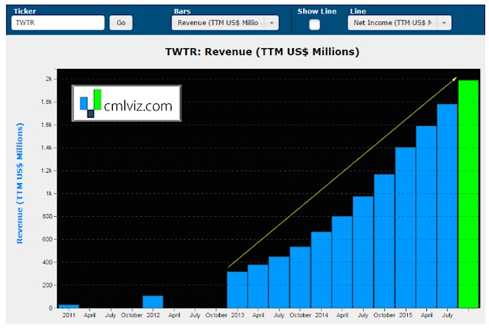
First, let’s isolate Twitter and just look at the company’s revenue revenue rolled up into trailing-twelve-month (TTM) periods. As you can see, the Twitter growth story based on revenue growth is still alive. But user growth is another story…
Note that while user growth at Twitter has all but stopped, the monetization of its user base is exploding. Next, let’s plot revenue growth in the last year on the y-axis and rank Twitter, Facebook (FB) and LinkedIn (LNKD) on the x-axis.
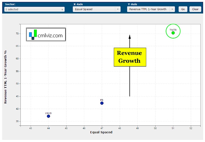
Yep, even in the context of its two closest competitors, revenue growth is booming and keeping Twitter growth prospects alive.
The main stream media doesn’t have the vocabulary to understand breaking technology. Get free news alerts from CMLviz and you will be the expert in the room.
If we compare Twitter to Facebook and LinkedIn in terms of price to sales, we’ll find something else stunning. Even though Twitter is growing revenue faster than its social media peers, it has the lowest valuation a measured by price to sales. In English, the stock market is giving Twitter less value per dollar of revenue than FB and LNKD, even though its growth is superior.
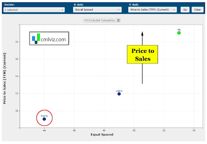
If you’re looking for a reflection of the stock market’s confidence in Twitter to turn its business around in terms of user growth, this is it, and the market is saying, “no, not really.”
Now, let’s expand this peer group and make it all technology companies with market caps between $15B and $30B. This time we will equal space the x-axis (rank) and plot gross profit on-year growth on the y-axis.
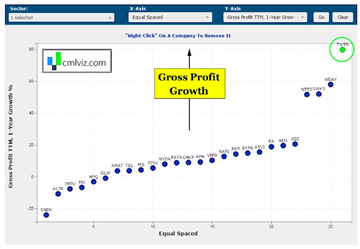
Twitter is in fact growing its gross profit faster than every technology company in this peer group.
Again, let us understand the difference between user growth and revenue growth. The former is booming the latter is dead (for now). And this is where bulls and bears clash on the Twitter growth story.
PROFITABLITY
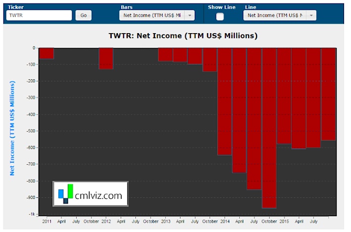
The sobering truth not reflected in all of these charts, of course, is profitability, or lack thereof. In our final chart, we plot Twitter’s net income (TTM) in the bars.
continue reading on the next page…


