Non-Correlated Market Musings – An Introduction
When Andy Nyquist first approached me to write for SIM I was both flattered and hesitant. My reluctance was not that I didn’t think I had anything to say (I can talk about anything – with or without any real expertise – for a tediously long time) but I wondered if I could add anything that was at all interesting to both you, dear reader, and me. And I’m convinced that both criteria must be met.
After some discussion, Andy agreed to offer me (at least for now) a blank page to scribble random extemporaneous thoughts and observations on anything markets/economics related. His only stipulations are that I don’t A) debase SIM with my native vulgarity and B) subject him to a libel suit. The former, I’m sure, will be much more difficult than the latter.
So, within the confines of such draconian rules, you can expect to be left with many more questions than answers in these pages. I am much more interested in finding questions since doing so leads to knowledge – and more questions. And regardless of my contempt for self-seriousness, I do hope (seriously) that you will find what I write valuable – if not in profit at least for entertainment.
Now that you’ve been warned, let’s get on with it: The inaugural issue of Non-Correlated Musings and Market Thoughts.
Modern Portfolio Theory In A Bond Bear
In Modern Portfolio Theory (MPT), used by most investment advisors in a simple form, it’s religion that portfolios are structured with some form of equity/debt allocation that is to be periodically rebalanced to the “appropriate” ratio as the two asset classes move in what ever direction they will. I’ll spare you the arcane academics of the wisdom of negatively correlated asset (and I know I can’t convert the religious) but I see a problem, Houston.
MPT, although around since the late 1950s, didn’t become widely used until Gene Fama’s work on the Efficient Markets Hypothesis became mainstream in the 1970s. It didn’t become common industry practice for financial planners/advisors until the early 1980s. Coincidentally, the early ’80s was the beginning of the greatest bull bond market in history. Besides a few stalls and hiccups, it seems that the end of that bull run is at least in sight. Thus, for 30 plus years, re-balancing hasn’t suffered much interest rate risk.
Assume, for the sake of discussion, that we enter a multi-decade secular bear bond market. Re-balancing, then, will cause a continuous averaging down into the bond portion of an MPT portfolio (this could be mitigated by well designed bond laddering but that’s probably beyond the skill set of most retail investors). A plausible outcome would be to constantly shift equity gains into assets that will continue to decrease in value (maybe there’s a laddered mutual fund but I’m not aware of any). If it happens, how will the burgeoning MPT based robo-advisor industry fare? I think we’ll know in a couple of years. (Note: I know there’s other solutions to this – just not ones that the average retail advisor or investor can pull off).
Just so you know, I think Modern Portfolio Theory is deeply flawed regardless of shifts in the yield curve. But I’ll leave that for future posts. After that, I invite the MPT purist zealots to challenge me to a dual. It’s worth dying for.
Chart Review
No, I won’t punish you with any lame attempt at my technical analysis skills. But this chart showed up in my Twitter stream.
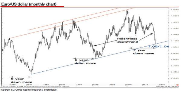
I respect the importance of the trend line at $1.05 (although I think it will break). But I have no choice but to nick-name this “The Relentless 5-6-7 Omen”. With all due respect to SG Cross Asset Research, may I ask why the need for such liberal use of a superlative? Secondly, does the 5-6-7 pattern represent anything – at all – other than, what, time? Just curious.
In the 100s of charts that cross my stream daily many of them try to imply something that I just don’t get. My default position with any data is to ask first: what isn’t this telling me? My second question is: what’s there that gets in the way of understanding what’s there?
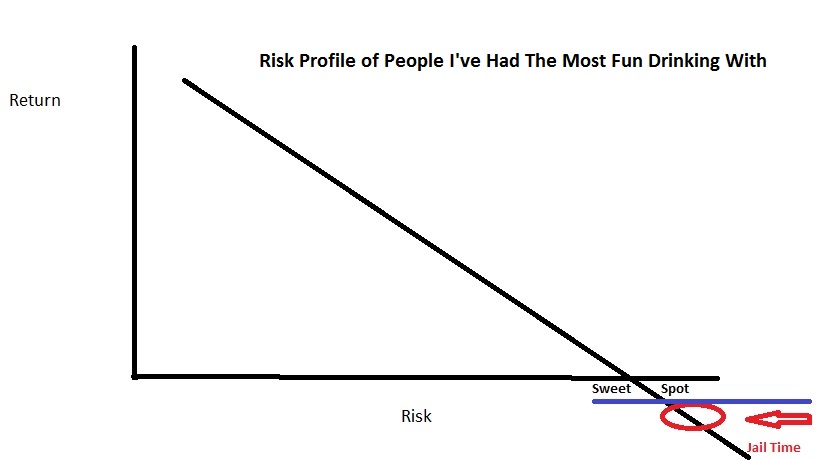
My #1 Favorite Chart of All Time
Well, excuse the hyperbole. I may have overstated the “of All Time” thing. I came up with this while sitting with a colleague about 2/3rds into a bottle of Herradura tequilla. It’s the closest thing I’ll ever have to an Art Laffer bar napkin moment.
(click on chart to enlarge)
That’s it. Enough nonsense for now. Trade ’em well and remember, if you’re not humble going in, you might be coming out.
– db
Follow Dave on Twitter: @davebudge
Any opinions expressed herein are solely those of the author, and do not in any way represent the views or opinions of any other person or entity.

: Worrisome to Broader Market?")


