Spot gold prices are approaching support at $1200. And I believe this will be an important test.
In this “chart” post, I want to share 5 gold charts that highlight how Gold has been weakened near-term. But, at the same time, I also want to show how the longer-term case for higher gold prices is still intact… at least for now.
Okay, on to the gold charts…
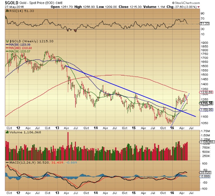
$GOLD Weekly Chart – Watch That MACD
The MACD indicator is signaling a bearish crossover on the weekly chart. This comes after a bearish flag pattern resolved to the downside. The next levels to watch below are the 50-day moving average at $1160, then the three year down trend line from May 2013 which currently sits at around $1130.
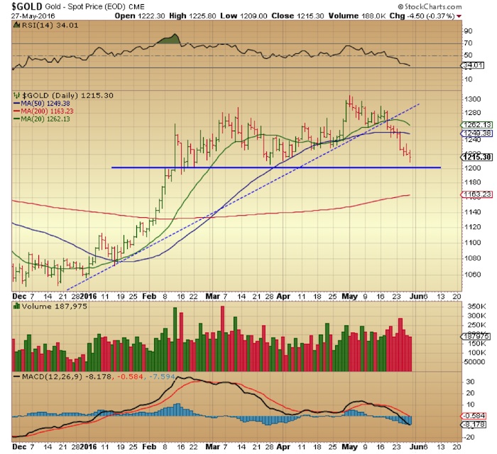
$GOLD – Daily Chart
The daily chart has $1200 as an important support level and its test will tell us if the current weakness is set to continue in the short-term. We are approaching oversold readings on the daily but, as we’ve mentioned in previous posts, oversold and overbought levels should never be taken as immediate action signals; they are merely something to raise your awareness of price action in the short-term.
$GOLD – Monthly Chart
The monthly chart for Gold is still holding up for now, signaling that the uptrend may continue on a longer term time frame. It is also telling us that some consolidation of that uptrend may be in the cards short term. The test of the support band between 1170 and 1200 will tell us if things are changing on a longer term timeframe as well.

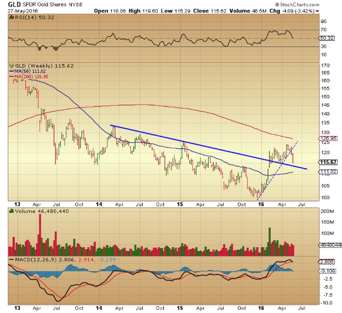
$GLD – Gold ETF Weekly Chart
The popular Gold ETF (GLD) has a similar situation to spot gold prices on the weekly chart with a broken uptrend line from December 2015 and now quickly approaching the 3 year downtrend line.
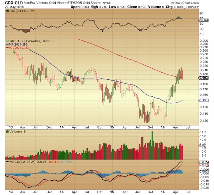
Also, a quick note on the gold miners which have been underperforming gold as of late. When the gold miners ($GDX) underperform gold it is usually a bearish signal. The weekly chart of $GDX relative to $GLD shows weakness in miners over the past 4 weeks as it works off overbought levels. There is also a potential bearish MACD cross over in the works which would obviously not bode well for a recovery in the short term. Miners’ underperformance is likely to continue and to accelerate if $GOLD were to make new 3 month lows (from Feb. 8th) which is not far below at 1164.
Conclusion: The uptrend in gold that began last December is still intact for now. Whether recent weakness is a mere consolidation of that run or something deeper is yet to be established. There are, however, signals that the weakness will continue in the short term but whether it deepens enough to break the charts technically is something we should know soon enough. A test of the support band between 1160 and 1200, which seems likely, should clear up any doubts.
Thanks for reading.
Twitter: @DDCapitalFund
The author does not have a position in mentioned securities at the time of publication. Any opinions expressed herein are solely those of the author, and do not in any way represent the views or opinions of any other person or entity.

: Showing Some Signs of Emerging Strength")
