All eyes are on the 200-day moving average as the S&P 500, along with many individual stocks, begins to test this key long-term barometer.
Why is the 200-day moving average so widely followed? And why is it important?
The short answers are, “Because everyone else follows it,” and, “Because everyone else follows it.”
Let me be a bit more specific.
Any charting platform I’ve ever used shows daily price charts with the 50- and 200-day moving averages automatically populated. Most importantly, the professional level platforms that money managers and institutional traders use have the 200-day moving average as a default setting.
So this means anyone looking at a chart of a stock will see the 200-day moving average and its relationship to the price. Even less-enlightened investors who do not regularly use technical analysis as part of their toolkit will see the 200-day moving average.
I’ve spent most of my career working with institutional investors and advisers to help them incorporate technical and behavioral tools into their investment process. As daily price movements can be very noisy, especially in periods of heightened volatility, one of the first tools we discuss to dampen the noise and focus on long term trends is the moving average.
In fact, I will often walk clients through a series of charts where price is removed and only moving averages remain. This basically removes the noise of short-term movements and allows them to focus on long-term trends and inflection points.
Here are three questions that you should ask of any chart using the 200-day moving average.
1) Is the 200-day moving average sloping up or down?
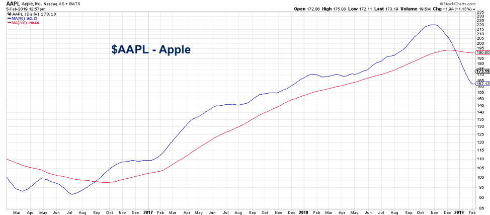
The chart of Apple (NASDAQ: AAPL) above illustrates this point. Here is a stock that has rotated from a bearish phase in fall 2016 to a bullish phase into late 2018, and has now returned to a bearish phase.
Even though in the short-term AAPL has recovered quite well, a downward-sloping 200-day moving average tells you that the long-term trend remains negative.
2) Where is the price relative to the 200-day moving average?
Stocks tend to find support at the 200-day moving average when testing from above, and they tend to find resistance when testing from below. Simple as that.

Similar to support and resistance levels, I tend to think of the 200-day moving average and the price range just around the moving average as a “congestion area” instead of as a specific price level.
Pre-decimalization, I think you could set a price level and expect a stock to hit that exact level and reverse. This is because when stocks trade on 1/8’s, there are only eight potential levels between each full dollar.
Now with stocks trading at sub-pennies, you have to assume that support and resistance levels are more of a process and less of an exact turning point.
The S&P 500 (NYSEARCA: SPY) tested its 200-day moving average from below three times in late 2018. Each time, the markets moved a bit higher before trading back down through this long-term smoothing mechanism.
With the S&P once again testing its 200-day moving average from below, I’d expect limited upside and plenty of downside as investors process gains from the December lows.
3) How many stocks are above their 200-day moving averages?
This is one of my favorite breadth measures as it captures where stocks are in relation to their long-term trends. Most people follow the NYSE stocks, but I tend to favor the S&P 500 as it’s a limited universe of stocks that I know fairly well.
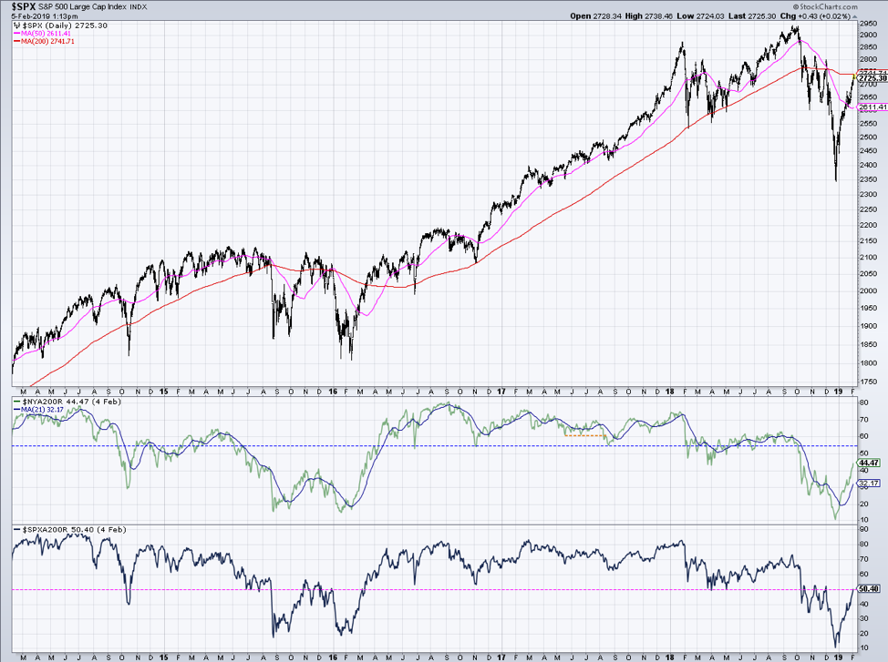
Here we see the S&P 500 index with the 50- and 200-day moving averages, the percent of NYSE stocks above their 200-day moving averages, and the percent of S&P 500 stocks above their 200-day moving averages.
As of yesterday’s close, just over 50% of the S&P 500 names are above this long-term price barometer. That’s up from a low of 10% at the end of last year.
While that is quite impressive, and it shows you how many names have had meaningful rallies off their December lows, two things concern me.
First, this means that 50% of the S&P 500 remains below their 200-day moving averages. Even with all the short-term bullishness and euphoria, half of the stocks in the S&P 500 have yet to eclipse this long-term measure.
Granted, many stocks are nearing their 200-day moving average from below (similar to the S&P 500 index), but they still have not eclipsed this key level of resistance.
Second, this breadth measure is back to where it was at the three peaks in late 2018 when the SPX failed in the 2800-2820 range. We’ve now roundtripped back to almost this same price level, and the long-term trend assessment is identical.
When I talk about moving averages, I’m often asked, “Does this work because people look at it, or do people look at it because it works?”
My short answer is, “Yes and yes.” I’ve worked with enough money managers that base decisions off of this level that I am very interested in following something that may affect their decisions. Also, if enough of us react to a certain technical pattern, there is no doubt that we could create the resistance that we’re all expecting.
Self-fulling prophecy or not, the fact remains that the S&P 500, along with many individual stocks, is testing its 200-day moving average from below. And based on my experience with this type of event, I’d expect a correction from current levels.
Learn more about my research over at Sierra Alpha.
Twitter: @DKellerCMT
Any opinions expressed herein are solely those of the author, and do not in any way represent the views or opinions of any other person or entity.


 and Semiconductors (SMH): Concerning Price Pattern?")


