A candidate for my favorite chart entering 2018 is the Energy Sector’s (XLE) performance relative to the S&P 500.
I believe we are working on a false breakdown below 2001 and 2003 resistance. This could be a big deal in 2018 and beyond.
Just imagine if the sector that has been a major laggard starts ripping higher within an already up trending market.
Energy Sector (XLE) / S&P 500 (SPY) Ratio Chart
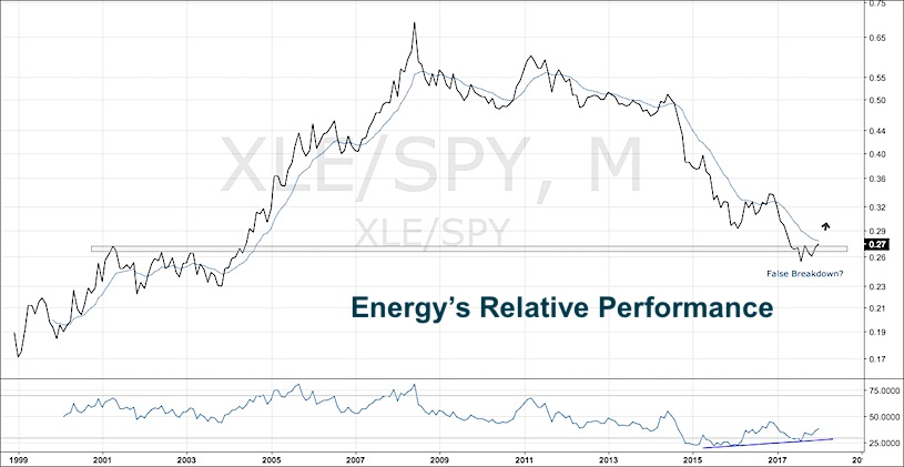
I have confidence in this chart due to the theme we are seeing elsewhere in the markets – the strength in basic material stocks, aluminum, copper and steel miners along with the individual commodities. It is quite hard to ignore at this point.
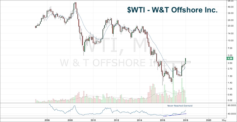
After running through just about every energy chart I could find, this post could include at least 20+ charts. There are plenty of stocks near ATH’s and many near ATL’s. My attention is drawn to two names: W&T Offshore (WTI) and Noble Drilling (NE).
These stocks have mean reversion written all over them, which remind me of Gold Miner sector in early 2016 with similar setups.
Now those who read my work know this isn’t usually how I pick my charts, but the price action to me is screaming bottom formed. I like the alpha opportunity that may be arising.
W&T Offshore Inc.
WTI has the look of big accumulation down here and it also never reached oversold conditions after its big fall. I wouldn’t want to be long WTI anymore if it is below 3.70.
Noble Corporation (NE)
Noble (NE), which looks very similar to the XLE/SPY chart, is working on a breakout above early 1990s resistance and late 1990s support. If price is above this level, say 10 cents higher to 5.20, we have a clear risk defined zone.
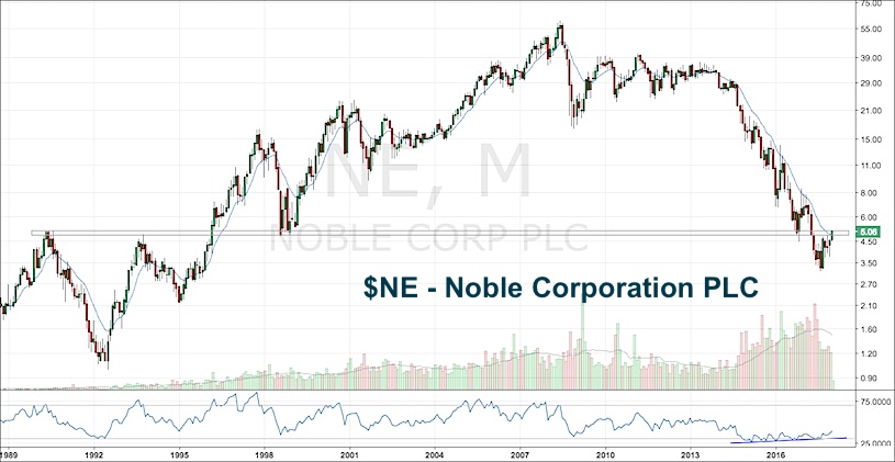
Both charts have a bullish momentum divergence building. I have found divergences on the monthly timeframe to be the most powerful. Also, here I am using the 12 month moving average as the change in trend guide.
Let’s see where these can go from here. If these aren’t your type of charts, there are plenty you can find that will fit your style. Time will tell, but I feel Energy has the potential to be the year’s best performing sector. Thanks for reading.
Twitter: @AlphaEyeCharts
The author has a long position in WTI at the time of publication. Any opinions expressed herein are solely those of the author, and do not in any way represent the views or opinions of any other person or entity.


: Showing Some Signs of Emerging Strength")
