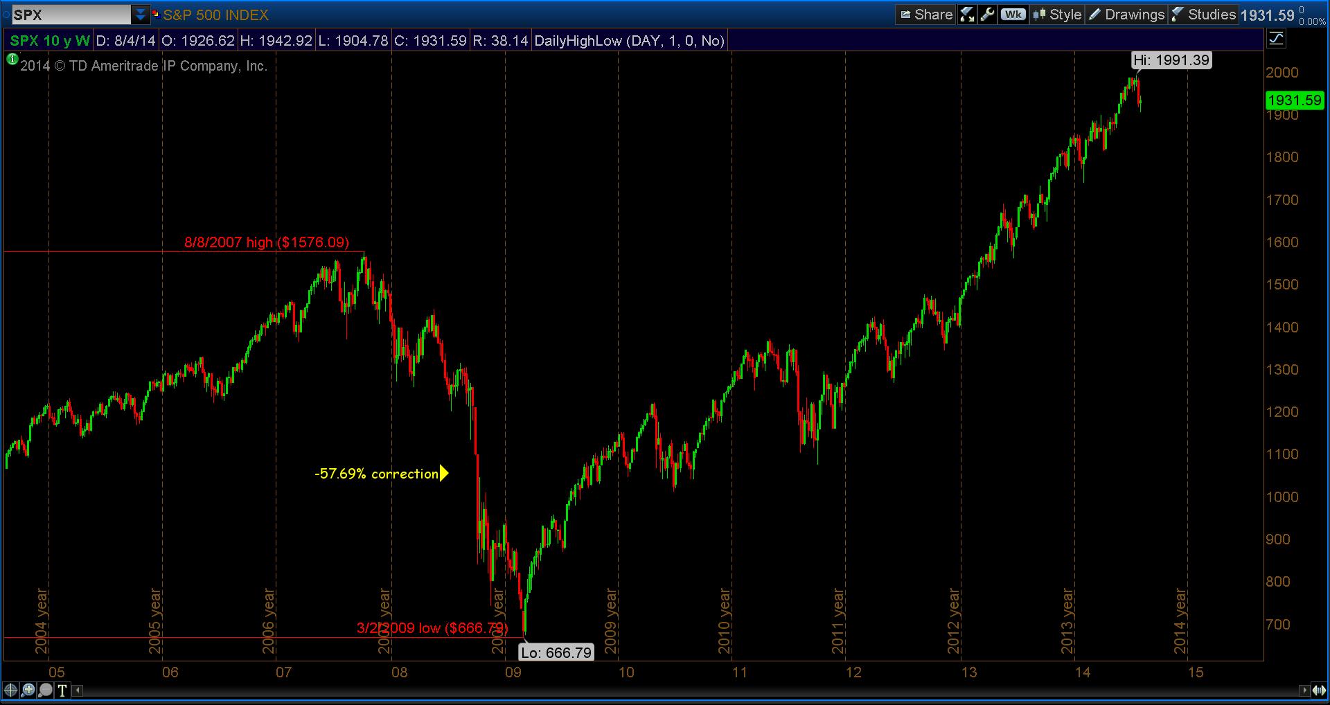
Let’s take a look at the S&P 500 from the beginning of the housing/financial fiasco in 2007 – 2008 and the following recovery; albeit Central Bank driven, numbers are numbers. We’ll also take a look at the corrections along the way.
But, first things first, let’s take a closer look at what has come to be known as The Great Recession. Technically speaking, this took place from October 8th, 2007 to March 2nd, 2009. The S&P 500 dropped -57.69% in that time period.
See the annotated chart below.
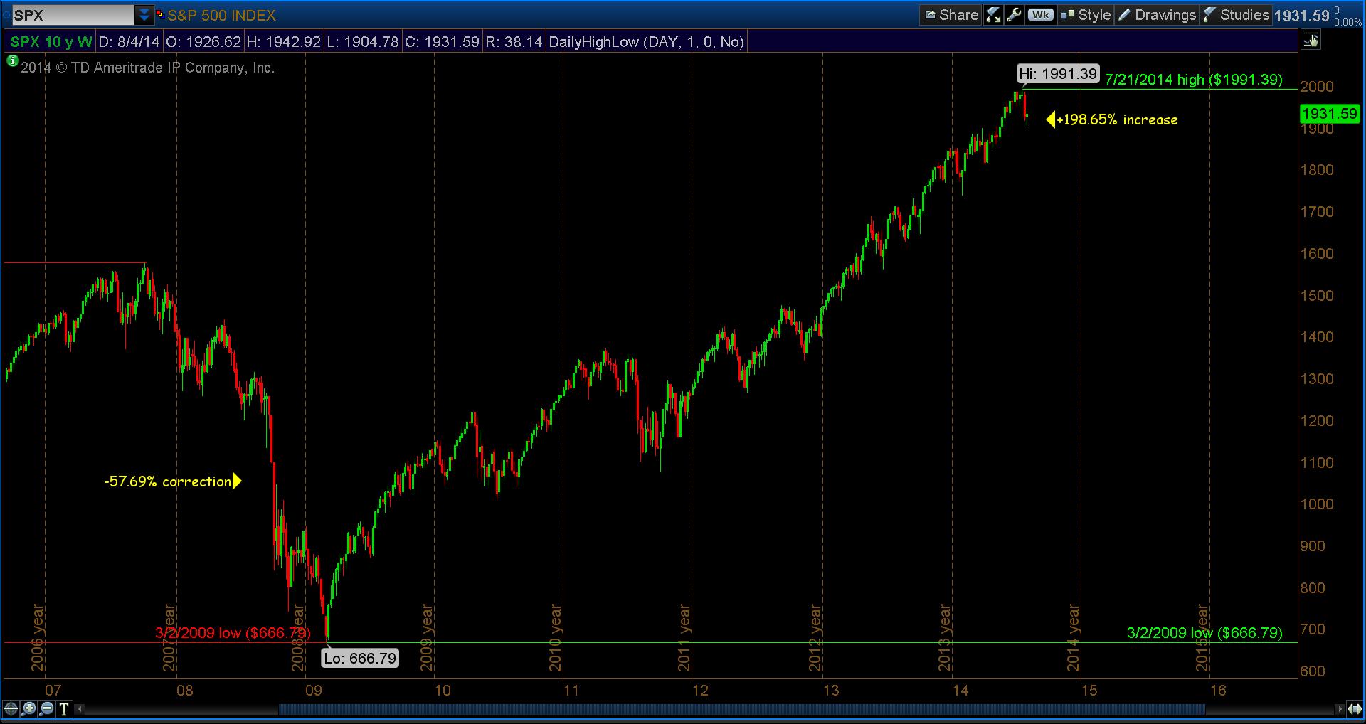
You can see in the chart below that from the low of 666.79, the S&P made a move up of +198.65% to reach an all time high of 1991.39 on July 21st, 2014.
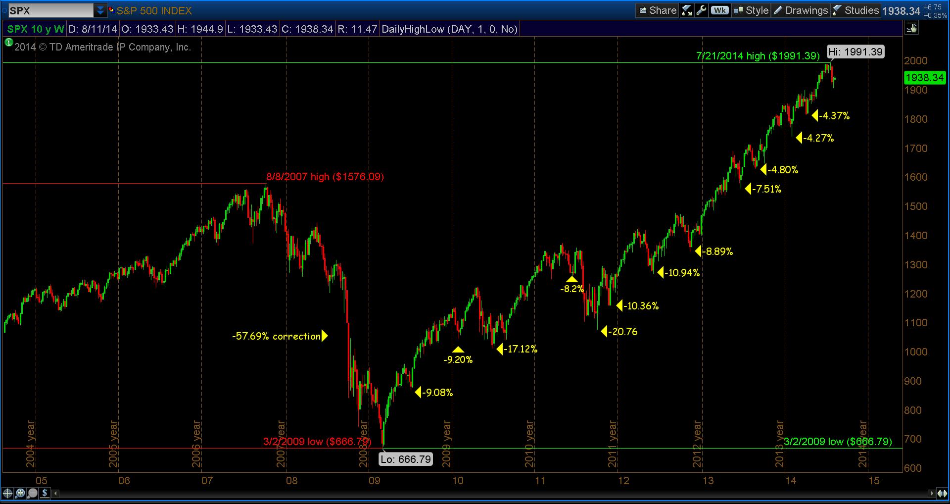
Now, let’s look closer and see what has occurred during that nearly 200% move up. In the annotated chart below, I’ve noted several stock market corrections: in sum, there were 12 times the S&P 500 pulled back at least -4% or more. What I find interesting is the last 3 pullbacks were -4.80%, -4.27% &- 4.37%, respectively. This tells me the “dip-buyers” are still expecting more upside movement.
Follow Dave on Twitter: @TheFibDoctor
No position in any of the mentioned securities at the time of publication. Any opinions expressed herein are solely those of the author, and do not in any way represent the views or opinions of any other person or entity.


